On Wed, 17 Aug 2011 20:48:48 +0200
Felix Ruoff <fe...@posaunenmission.de> wrote:
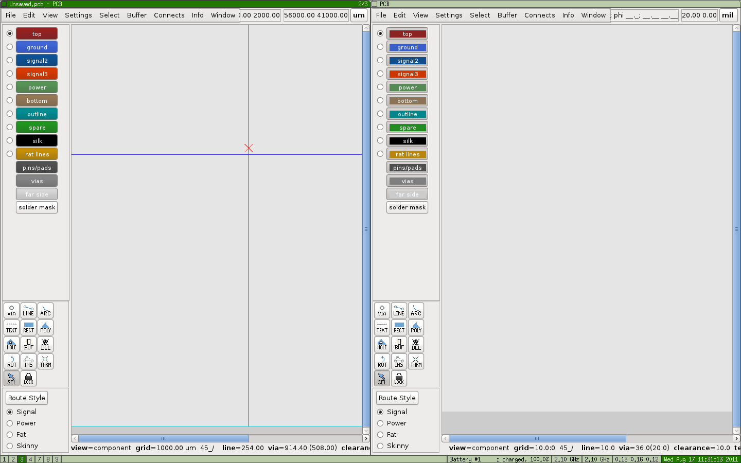
> I personally like the new style you created. Its very nice! I think
> the reason for adding this small rectangles is, that its easier to
> see, if the button is pressed.

Good point.  I do like the full color fill you show, Andrew.  However,
I think we need a better way of indicating which layers are visible.
Perhaps a little "X" or checkbox icon on the button?  I already dislike
the current buttons' indication of which layers are visible (change of
fill color and text color with inset or outset border). Maybe something
better can be done.

Regards,
Colin


> Am 18.08.2011 04:00, schrieb Andrew Poelstra:
> > Hey all,
> >
> > I am working on moving the Gtk layer-selector into its
> > own widget (see bug 699482, for example), and cleaning
> > up the code.
> >
> > A question I have for the group is: why are the backgrounds
> > of the layer buttons in little rectangles? Is there
> > opposition to making the background fill the whole buttons,
> > like so?:
> >
> > http://wpsoftware.net/andrew/dump/buttons.png
> >
> > It would simplify the code a bit and IMHO looks more modern.
> > There is a bit of an optical illusion making the new buttons
> > seem bigger, but I checked in gimp and there is no change in
> > size.


_______________________________________________
geda-user mailing list
geda-user@moria.seul.org
http://www.seul.org/cgi-bin/mailman/listinfo/geda-user