Hi Cor, *

thanks for your comments :-)
... and I'd really like to read about the opinions of any other project
members...
Cor Nouws schrieb:
Hi Bernard,

Bernhard Dippold wrote (20-9-2009 22:07)
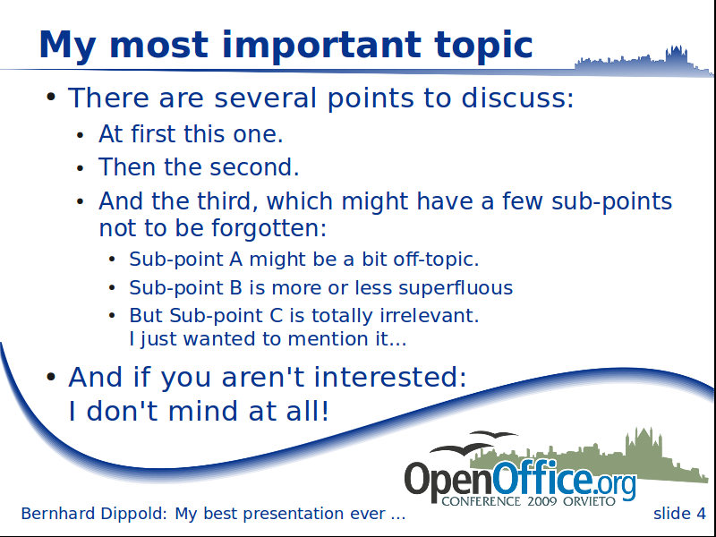
I created a new version of the slide draft, like the minimal version,
but with a small gradient for the curve and a broadened part with the
town silhouette at the top.

I uploaded it to
http://wiki.services.openoffice.org/w/images/2/23/OOoCon_slide_new.png
[...]
I like this one even more.
I was a bit careful with the full black of the first design round, since
that often does not look so good when printed black-whit.
Both the new slide and the alternative title are using raster graphics
instead of vectors - the slide looks smoother than the old version at
my 800x600 screen, but the alternative title has not been improved...
[...]
The new slides look very rough at my computer (Windows and Linux)
Do they possibly suffer from a bug, somewhere in the dev-stack, that the
original graphics were replaced by the thumbnails?
At my Ubuntu version of OOo (3.0.1) the lines look good (especially on
slide 3), but with OOoDev m58 they look rough in the working
area/preview. In the slide show they look fine again.
Apart from that, I prefer slide 1 and 4.
Me too :-)
If we don't get any other comments, I'll finish the presentation
template by adding an Agenda page.
Best regards

Bernhard
Best,
Cor
---------------------------------------------------------------------
To unsubscribe, e-mail: art-unsubscr...@marketing.openoffice.org
For additional commands, e-mail: art-h...@marketing.openoffice.org