On Wed, Nov 16, 2011 at 11:38, Jo-Erlend Schinstad <
joerlend.schins...@gmail.com> wrote:
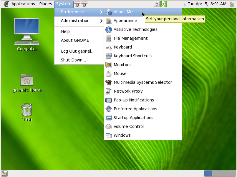
> Den 16. nov. 2011 11:13, skrev frederik.nn...@gmail.com:
>
>
>> positioning a rarely used element correctly for once is a key solution,
>> which will lead the way for the positioning of other such rarely used
>> elements.
>> and Shutdown, as rarely as it will be used, should be accessible. I would
>> feel very uncomfortable, if i didn't know where to find that "Power button"
>> immediately.
>>
>>
> Which is why it is always visible at the appropriate place; the corner of
> the screen. Why would it be better to do move it out of sight into the dash?


exactly. i don't think it would be wise to remove it from the edge of the
screen. One could keep it in the top right, make it a large button and give
it a more prominent coloring when the dash is open, but that would require
a proper visual design of the whole indicator wing at the top right.
I'm positive that will happen in the near future, my guts are telling me
so..

look at this for example:
http://www.gabsoftware.com/wp-content/uploads/2011/04/Capture-121.png
what we have now is much better already!
now it needs to be stepped up into a proper design, away from the rusty
plain old menu stuff that has been around from ever since back in the day..
_______________________________________________
Mailing list: https://launchpad.net/~ayatana
Post to     : ayatana@lists.launchpad.net
Unsubscribe : https://launchpad.net/~ayatana
More help   : https://help.launchpad.net/ListHelp