andresgutgon opened a new issue, #18071:
URL: https://github.com/apache/echarts/issues/18071
### Version 5.3.3 ### Link to Minimal Reproduction https://codesandbox.io/s/echarts-playground-forked-ulq2zv ### Steps to Reproduce In the codesandbox is the code. You can see there are 2 charts. All the same. The only difference is: ### First chart has in `xAxis` type of `time` 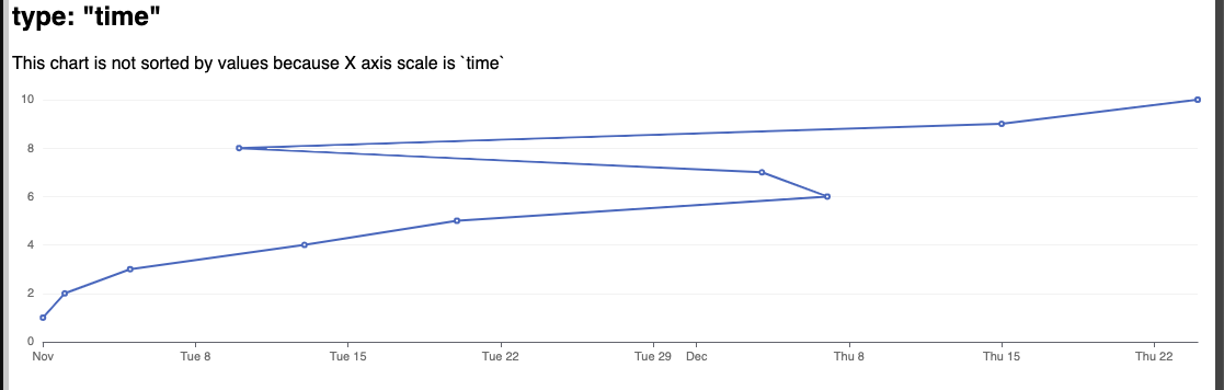 ### Second chart has in `yAxis` type of `category` 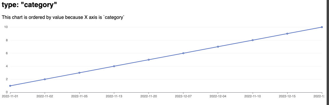 If you check the small dataset you'll see it's ordered in `ASC` order. ``` const dataset = [ ["date", "amount"], ["2022-11-01", "1"], ["2022-11-02", "2"], ["2022-11-05", "3"], ["2022-11-13", "4"], ["2022-11-20", "5"], ["2022-12-07", "6"], ["2022-12-04", "7"], ["2022-11-10", "8"], ["2022-12-15", "9"], ["2022-12-24", "10"] ]; ``` ### Current Behavior First chart where `xAxis` is of type `time` the order of the dataset is not respected. ### Expected Behavior I'm not sure if this is possible or even expected but I would love to be able to have the nice work Echarts does with `time` scale axis formatting and deciding the right amount of ticks based on volume but respecting the order of the dataset. ### Environment ```markdown - OS: - Browser: - Framework: ``` ### Any additional comments? What I would want is to have a time series axis with formatting and tick spacing but the order would be mark by dataset. -- This is an automated message from the Apache Git Service. To respond to the message, please log on to GitHub and use the URL above to go to the specific comment. To unsubscribe, e-mail: commits-unsubscr...@echarts.apache.org.apache.org For queries about this service, please contact Infrastructure at: us...@infra.apache.org --------------------------------------------------------------------- To unsubscribe, e-mail: commits-unsubscr...@echarts.apache.org For additional commands, e-mail: commits-h...@echarts.apache.org