There are 16 messages in this issue.

Topics in this digest:
1.1. Re: Georgian road signs (Re: OT: Dvorak)
From: [EMAIL PROTECTED]
1.2. Re: Georgian road signs (Re: OT: Dvorak)
From: Mark J. Reed
1.3. Re: Georgian road signs (Re: OT: Dvorak)
From: [EMAIL PROTECTED]
2a. Conlang Journal plan
From: Sai Emrys
2b. Re: Conlang Journal plan
From: Sai Emrys
3a. Re: OT: YAGTT
From: Henrik Theiling
3b. Re: OT: YAGTT
From: Tristan McLeay
3c. Re: OT: YAGTT
From: Ph. D.
3d. Re: OT: YAGTT
From: M. Czapp
3e. Re: OT: YAGTT
From: Henrik Theiling
3f. Re: OT: YAGTT
From: Eric Christopherson
3g. Re: OT: YAGTT
From: Lars Mathiesen
3h. Re: OT: YAGTT
From: Philip Newton
4a. Re: Naisek Pages Updated
From: Jeffrey Jones
4b. Re: Naisek Pages Updated
From: Jörg Rhiemeier
5. NATLANG: Re: "sz" (was: Beekes.)
From: John Vertical
Messages
________________________________________________________________________
1.1. Re: Georgian road signs (Re: OT: Dvorak)
Posted by: "[EMAIL PROTECTED]" [EMAIL PROTECTED]
Date: Mon Jul 28, 2008 1:11 pm ((PDT))
> [mailto:[EMAIL PROTECTED] On Behalf Of Mark J. Reed
> BTW, driving in this morning I looked at all the road signs and all
> the <i>'s are currently dotted. I'll check again on the way home
> (where I'll see that Delk Rd sign that showed up in the photos about
> the topic...) but it seems likely it's just random signage decay.
> Small stickers that come off after a while.
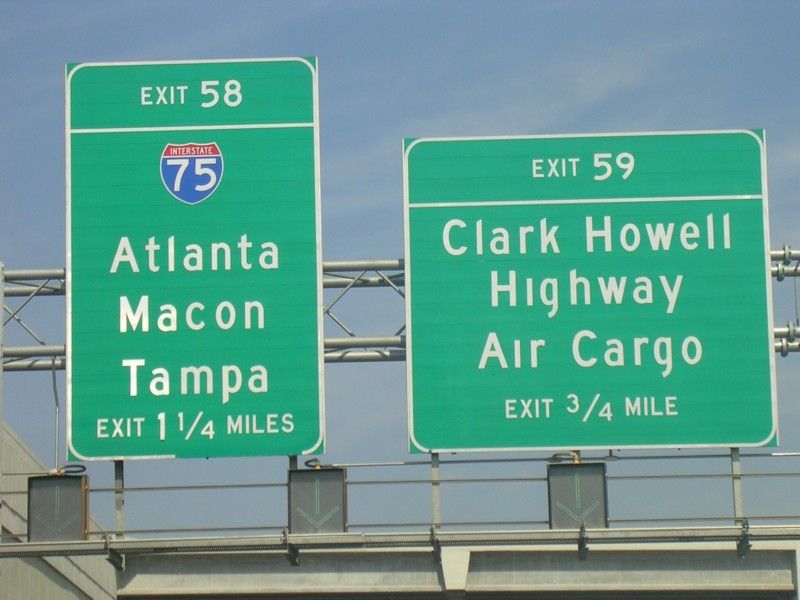
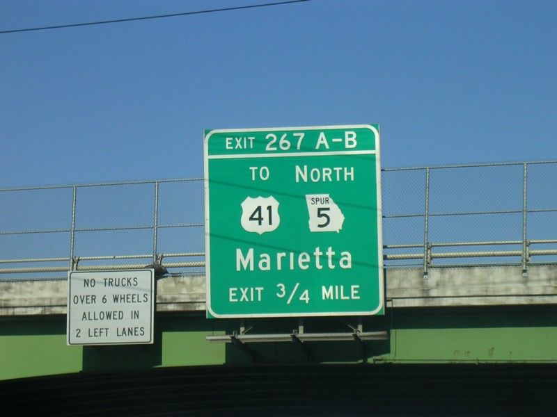
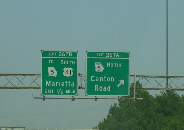
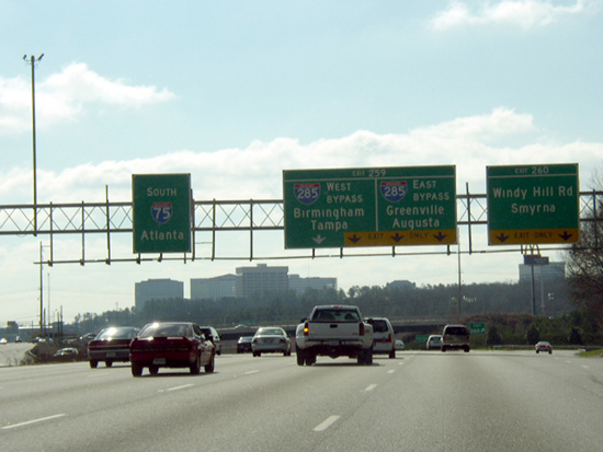
I don't think it's any type of decay. I travel around the Southeast and so far
have only seen this in Georgia. Not every sign but a lot of them.
http://www.gribblenation.com/gapics/gallery/atlanta.html
If was kind of hard to find examples on this site but here are some. I75 seems
to account for a lot. I'm sure there are more.
http://www.gribblenation.com/gapics/gallery/i285e-exit58-59-krakoff.jpg
http://www.gribblenation.com/gapics/gallery/i675at285-krakoff.jpg
http://www.gribblenation.com/gapics/gallery/us78e-exit2-krakoff.jpg
http://www.gribblenation.com/gapics/gallery/i75n-exit263-krakoff.jpg
http://www.gribblenation.com/gapics/gallery/i75n-exit265-krakoff.jpg
http://www.gribblenation.com/gapics/gallery/i75n-exit267-krakoff2.jpg
http://www.gribblenation.com/gapics/gallery/i75s-exit259-260-latta.JPG
http://www.gribblenation.com/gapics/gallery/i75n-ga120loop-krakoff.jpg
http://www.gribblenation.com/gapics/gallery/i75n-exit267-krakoff.jpg
I'm probably going back out there next week so I'll see if I can find some
others.
Messages in this topic (48)
________________________________________________________________________
1.2. Re: Georgian road signs (Re: OT: Dvorak)
Posted by: "Mark J. Reed" [EMAIL PROTECTED]
Date: Mon Jul 28, 2008 1:22 pm ((PDT))
On Mon, Jul 28, 2008 at 4:08 PM, <[EMAIL PROTECTED]> wrote:
> I don't think it's any type of decay. I travel around the Southeast and so
> far have only seen this in Georgia. Not every sign but a lot of them.
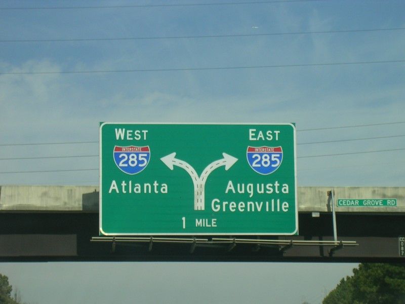
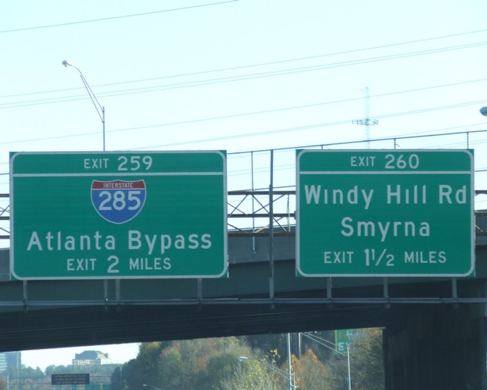
But that's my point - even for the same place name on the same type of
sign in the same part of town, it's not at all consistent. Most of
the signs telling you that you can get to "Greenville" by going up
I-85N (whether from I-75/85 downtown, or from I-285) dot the I in
"Greenville" - the one you linked to doesn't.
So I don't think the dotlessness is intentional. I think the dots
just fall off. GA DOT needs to rethink its technique.
--
Mark J. Reed <[EMAIL PROTECTED]>
Messages in this topic (48)
________________________________________________________________________
1.3. Re: Georgian road signs (Re: OT: Dvorak)
Posted by: "[EMAIL PROTECTED]" [EMAIL PROTECTED]
Date: Tue Jul 29, 2008 7:45 am ((PDT))
> [mailto:[EMAIL PROTECTED] On Behalf Of Mark J. Reed
> On Mon, Jul 28, 2008 at 4:08 PM, <[EMAIL PROTECTED]> wrote:
> > I don't think it's any type of decay. I travel around the
> Southeast and so far have only seen this in Georgia. Not
> every sign but a lot of them.
>
> But that's my point - even for the same place name on the same type of
> sign in the same part of town, it's not at all consistent. Most of
> the signs telling you that you can get to "Greenville" by going up
> I-85N (whether from I-75/85 downtown, or from I-285) dot the I in
> "Greenville" - the one you linked to doesn't.
>
> So I don't think the dotlessness is intentional. I think the dots
> just fall off. GA DOT needs to rethink its technique.
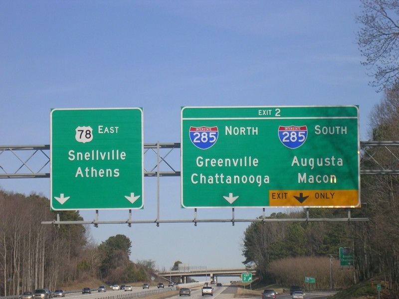
Until you look closer. There is a little consistency. The signs without dots
are all undotted and the ones with dots are all dotted. If there was a problem
with them falling off there would be a random mix, unlike here.
http://www.gribblenation.com/gapics/gallery/I-75S-exit259-260.jpg
Messages in this topic (48)
________________________________________________________________________
________________________________________________________________________
2a. Conlang Journal plan
Posted by: "Sai Emrys" [EMAIL PROTECTED]
Date: Mon Jul 28, 2008 1:53 pm ((PDT))
Re. the journal, I'd suggest that whoever is closest to Harrison
should talk to him, and propose that we could collaborate.
What we can help with:
* paying for upfront costs so it's not out of pocket
* nonprofit-rate journal shipping (significantly cheaper than standard
rate, even book rate)
* membership-linked subscriptions, so that there's a known
subscribership (and thus that one can produce larger amounts at once -
a cost savings plus an incentive to continue the work)
* people to help with graphics (e.g. Paul S., who did our seal),
editing (e.g. the 2-3 other people who were interested in starting a
journal), content, etc.
* more diverse and quantiful content because we can serve as a way to
focus the entire community's attention on one quality journal, so it's
not just a burden on him (as has been the case with EVERY attempt
previously, and caused each to die when the original editor ran out of
steam)
* perhaps e.g. one annual issue free with membership, the rest at a
membership-discounted subscription price
* print-preferred publishing - e.g. have print issues come out first,
then three months later come out with the PDF versions. Whether to
make the PDF be in snipped form for non-subscribers is a tough choice
again, and I'm 50-50 on that.
* permanent, easily found webhosting
His concerns will be:
* censorship of content by The Man (us / ?me)
* diversity & originality of content - viz the previous 'LCC =
WalMart' conversation
* print superiority (with which I'm actually inclined to agree, so
long as alternate forms are also available)
I'd like us to get this actually started soon. Suggestions for a
specific plan of action?
- Sai
Messages in this topic (2)
________________________________________________________________________
2b. Re: Conlang Journal plan
Posted by: "Sai Emrys" [EMAIL PROTECTED]
Date: Mon Jul 28, 2008 3:42 pm ((PDT))
..... wow, my face is red here.
That went to the wrong address, apologies to all. :(
- Sai
Messages in this topic (2)
________________________________________________________________________
________________________________________________________________________
3a. Re: OT: YAGTT
Posted by: "Henrik Theiling" [EMAIL PROTECTED]
Date: Mon Jul 28, 2008 5:52 pm ((PDT))
Hi!
Lars Mathiesen writes:
> 2008/7/28 Henrik Theiling <[EMAIL PROTECTED]>
>
>> Mark J. Reed writes:
>> > Huh? In a font with an fi ligature, every instance of f followed by i
>> > is ligatured, regardless of morpheme boundaries.
>>
> Not by German typesetting rules, that's the point.
>>
> Umm, if the point is that the kern of the f will break off the type
> if used before i, f, or t on a Linotype machine, wouldn't you have
> to use a ligature regardless of the sensibilities of the German
> spelling authorities?
Well, I have no idea.
> ... Or would German printers insert a thin space in such a situation
> to keep the f out of harm's way?
My wife just gave me a book that was printed with metal letters. It
has fi, ff, fl and ft ligatures. Except for the f+i case, I found all
in both the ligated and the separated form. fi without a ligature
seems to be really rare in German. But from the others it indeed
looks like a thin space. See for yourself, I took some pictures:
http://www.theiling.de/ligaturen/
**Henrik
Messages in this topic (9)
________________________________________________________________________
3b. Re: OT: YAGTT
Posted by: "Tristan McLeay" [EMAIL PROTECTED]
Date: Mon Jul 28, 2008 6:14 pm ((PDT))
Henrik Theiling wrote:
> Hi!
>
> Lars Mathiesen writes:
>> 2008/7/28 Henrik Theiling <[EMAIL PROTECTED]>
>>
>>> Mark J. Reed writes:
>>>> Huh? In a font with an fi ligature, every instance of f followed by i
>>>> is ligatured, regardless of morpheme boundaries.
>> Not by German typesetting rules, that's the point.
>> Umm, if the point is that the kern of the f will break off the type
>> if used before i, f, or t on a Linotype machine, wouldn't you have
>> to use a ligature regardless of the sensibilities of the German
>> spelling authorities?
>
> Well, I have no idea.
The rule comes from the old Fraktur typesetting. The top of a fraktur f
doesn't extend out far enough past the crossbar for a ligature to be
necessary. I don't know if the rule applies today (well, your examples
show it does as much as it can).
>> ... Or would German printers insert a thin space in such a situation
>> to keep the f out of harm's way?
>
> My wife just gave me a book that was printed with metal letters. It
> has fi, ff, fl and ft ligatures. Except for the f+i case, I found all
> in both the ligated and the separated form. fi without a ligature
> seems to be really rare in German. But from the others it indeed
> looks like a thin space. See for yourself, I took some pictures:
>
> http://www.theiling.de/ligaturen/
Nifty. I don't know that it's a thin space though, so much as just
putting the letters next to each other -- notice in particular that the
spacing of the serifs in "ffri" in "auffrischen" are quite regular.
(OTOH the spacing of "fiff" in "pfiff" is also quite regular; it might
be because the "r" overhangs ~the same about as the "f".) Notice also
that the top of the f does not extend out very far at all, so a ligature
is unnecessary and, therefore, every ligature that's added was done so
to clarify morpheme boundaries. (How's "bezweifle" divide up? is the -le
some sort of diminutive? or the equivalent of the -le/-er in English
words like chat/chatter, thumb/thimble.)
--
Tristan.
Messages in this topic (9)
________________________________________________________________________
3c. Re: OT: YAGTT
Posted by: "Ph. D." [EMAIL PROTECTED]
Date: Mon Jul 28, 2008 7:06 pm ((PDT))
Actually, it's hand-set type which has kerns that
can break off. The Linotype machine assembles
molds (one for each letter in a line), then casts a
bar of type from the assembled molds. Because
the molds can't overlap each other, f's are designed
(or redesigned) so they don't overlap.
The image you posted appears to have been set
on a Linotype. Notice how the crossbar on the f
and the bottom serif have been lengthened, so
the top loop doesn't overlap the next letter. The
f-ligatures are not needed here, but are used only
for aesthetic reasons. (And I will agree that they
make a much better looking page.)
The ligatures have their own key on the keyboard,
so the operator has to remember to use them. If
they seem to be at random (as in your example),
it may be because the operator was careless in
remembering to use them. I don't believe there
are any thin spaces used here. It's just the normal
spacing of letters in this font.
--Ph. D.
----- Original Message -----
From: "Henrik Theiling" <[EMAIL PROTECTED]>
To: <[EMAIL PROTECTED]>
Sent: Monday, July 28, 2008 8:52 PM
Subject: Re: OT: YAGTT
> Hi!
>
> Lars Mathiesen writes:
>> 2008/7/28 Henrik Theiling <[EMAIL PROTECTED]>
>>
>>> Mark J. Reed writes:
>>> > Huh? In a font with an fi ligature, every instance of f followed by i
>>> > is ligatured, regardless of morpheme boundaries.
>>>
>> Not by German typesetting rules, that's the point.
>>>
>> Umm, if the point is that the kern of the f will break off the type
>> if used before i, f, or t on a Linotype machine, wouldn't you have
>> to use a ligature regardless of the sensibilities of the German
>> spelling authorities?
>
> Well, I have no idea.
>
>> ... Or would German printers insert a thin space in such a situation
>> to keep the f out of harm's way?
>
> My wife just gave me a book that was printed with metal letters. It
> has fi, ff, fl and ft ligatures. Except for the f+i case, I found all
> in both the ligated and the separated form. fi without a ligature
> seems to be really rare in German. But from the others it indeed
> looks like a thin space. See for yourself, I took some pictures:
>
> http://www.theiling.de/ligaturen/
>
> **Henrik
Messages in this topic (9)
________________________________________________________________________
3d. Re: OT: YAGTT
Posted by: "M. Czapp" [EMAIL PROTECTED]
Date: Mon Jul 28, 2008 7:26 pm ((PDT))
Hi,
this is my first posting in CONLANG so be gentle in case I violate some
unwritten (or misremembered rules)
Mardo 29 Julio 2008, Tristan McLeay skribis:
>(How's "bezweifle" divide up? is the -le
> some sort of diminutive? or the equivalent of the -le/-er in English
> words like chat/chatter, thumb/thimble.)
It is a verb meaning 'to doubt'. It is in the first person, present tense. The
infinitive is 'bezweifeln'. Thus, the -le is part of the conjugation.
~Mechthild
--
Bitte beachten Sie, dass dem Gesetz zur Vorratsdatenspeicherung zufolge
jeder elektronische Kontakt mit mir sechs Monate lang gespeichert wird.
Please note that according to the German law on data retention,
information on every electronic information exchange with me is retained
for a period of six months.
www.vorratsdatenspeicherung.de
Messages in this topic (9)
________________________________________________________________________
3e. Re: OT: YAGTT
Posted by: "Henrik Theiling" [EMAIL PROTECTED]
Date: Mon Jul 28, 2008 7:52 pm ((PDT))
Hi!
Ph. D. writes:
>...
> The image you posted appears to have been set
> on a Linotype. Notice how the crossbar on the f
> and the bottom serif have been lengthened, so
> the top loop doesn't overlap the next letter. The
> f-ligatures are not needed here, but are used only
> for aesthetic reasons. (And I will agree that they
> make a much better looking page.)
Ah, I see.
> The ligatures have their own key on the keyboard,
> so the operator has to remember to use them. If
> they seem to be at random (as in your example),
>...
They are definitely not at random, but used following quite strictly
the rules I mentioned (I looked at *a lot* of ligatures and separated
pairs in that book, searching for the separated fi).
I was wondering about 'bezweifle', too. It may be that it is felt to
be short for 'bezweifele' and thus gets no ligature. Or it is,
possibly, a bug. Or there are rules I am not aware about, maybe that
-le is classified as a derivational suffix (which is was, actually).
I noticed that -lich was not ligatured, either.
**Henrik
Messages in this topic (9)
________________________________________________________________________
3f. Re: OT: YAGTT
Posted by: "Eric Christopherson" [EMAIL PROTECTED]
Date: Mon Jul 28, 2008 9:23 pm ((PDT))
On Jul 28, 2008, at 9:15 PM, M. Czapp wrote:
> Hi,
> this is my first posting in CONLANG so be gentle in case I violate
> some
> unwritten (or misremembered rules)
Welcome!
>
> Mardo 29 Julio 2008, Tristan McLeay skribis:
>> (How's "bezweifle" divide up? is the -le
>> some sort of diminutive? or the equivalent of the -le/-er in English
>> words like chat/chatter, thumb/thimble.)
>
> It is a verb meaning 'to doubt'. It is in the first person, present
> tense. The
> infinitive is 'bezweifeln'. Thus, the -le is part of the conjugation.
>
> ~Mechthild
Messages in this topic (9)
________________________________________________________________________
3g. Re: OT: YAGTT
Posted by: "Lars Mathiesen" [EMAIL PROTECTED]
Date: Mon Jul 28, 2008 11:41 pm ((PDT))
2008/7/29 Ph. D. <[EMAIL PROTECTED]>
> The image you posted appears to have been set
> on a Linotype. Notice how the crossbar on the f
> and the bottom serif have been lengthened, so
> the top loop doesn't overlap the next letter.
Yes, I noticed that too.
> Actually, it's hand-set type which has kerns that
> can break off.
So the question remains, what happens in a font that actually does have
kerns?
Also, to take this further adrift: Traditional German orthography has a rule
that simpifies triple letters to double, as in Schiffahrt = Schiff-fahrt --
is this based in handwriting or in a reluctance of printers to create the
fff ligature that would be needed?
Swedish (whose orthography was influenced by German printers) has the same
rule, which I find very disruptive -- for instance every time I see the word
äggula (= ägg-gula = egg yolk). I parse it as ägg-ula and experience an
unknown morpheme interrupt, so I have to back up and start over. I would
probably have the same experience with German words like Schiffahrt if I
lived there.
But then I only started reading Swedish on a daily basis at the age of 46.
Does it help if you learned reading with the system?
Lars
Messages in this topic (9)
________________________________________________________________________
3h. Re: OT: YAGTT
Posted by: "Philip Newton" [EMAIL PROTECTED]
Date: Tue Jul 29, 2008 12:53 am ((PDT))
On Tue, Jul 29, 2008 at 08:31, Lars Mathiesen <[EMAIL PROTECTED]> wrote:
> Also, to take this further adrift: Traditional German orthography has a rule
> that simpifies triple letters to double, as in Schiffahrt = Schiff-fahrt --
> is this based in handwriting or in a reluctance of printers to create the
> fff ligature that would be needed?
That rule only applied if the triple letters are followed by a vowel;
if a consonant followed, all letters were kept (e.g. Sauerstoffflasche
< Sauerstoff + Flasche was spelled that way in the traditional
orthography, too -- and those two words, Schiff(f)ahrt and
Sauerstoffflasche are the prototypical words for explaining that rule
IME.)
On the other hand, that wouldn't use a fff ligature, either, but an ff
+ an fl ligature.
> But then I only started reading Swedish on a daily basis at the age of 46.
> Does it help if you learned reading with the system?
I don't think that there are many such words, so I can't tell.
I do know that some frequent words affected by that rule are now felt
to be (almost) monomorphemic, and so their spelling was kept with two
letters when the orthography reform came along; specifically, Mittag <
Mitte + Tag "mid-day" and Drittel < dritt- + Teil "(one) third".
Cheers,
--
Philip Newton <[EMAIL PROTECTED]>
Messages in this topic (9)
________________________________________________________________________
________________________________________________________________________
4a. Re: Naisek Pages Updated
Posted by: "Jeffrey Jones" [EMAIL PROTECTED]
Date: Mon Jul 28, 2008 6:36 pm ((PDT))
On Mon, 28 Jul 2008 18:22:02 +0200, Jörg Rhiemeier
<[EMAIL PROTECTED]> wrote:
>
> Hallo!
>
> On Mon, 28 Jul 2008 00:32:43 -0400, Jeffrey Jones wrote:
>
> > I've updated the Naisek grammar pages and uploaded them to
> > http://qiihoskeh.googlepages.com/Ntoc.htm
>
> (there are simply too many conlangs around to follow them
> all with great interest),
I agree, and I'm afraid I don't look at very many of the conlang sketches on
ZBB anymore: if it's not the same old kind of thing, I find I'm unable to
follow
the explanations.
> but I find it at least much more interesting than English
> pronunciation threads or threads about alternative keyboard
> layouts. This is CONLANG, after all - a place to discuss
> constructed languages.
Again, I agree.
> Naisek, while not being very spectacular, is in my opinion
> well-designed and also well-presented.
Thanks! This is really what I wanted to do with Naisek: construct a fairly
complete and coherent grammar and document it well. I figure(d) a
spectacular language is beyond my ability (especially since I don't plan to
spend decades on a single project).
>
>... brought to you by the Weeping Elf
Messages in this topic (6)
________________________________________________________________________
4b. Re: Naisek Pages Updated
Posted by: "Jörg Rhiemeier" [EMAIL PROTECTED]
Date: Tue Jul 29, 2008 9:00 am ((PDT))
Hallo!
On Mon, 28 Jul 2008 21:36:26 -0400, Jeffrey Jones wrote:
> On Mon, 28 Jul 2008 18:22:02 +0200, Jörg Rhiemeier
> <[EMAIL PROTECTED]> wrote:
> >
> > Hallo!
> >
> > On Mon, 28 Jul 2008 00:32:43 -0400, Jeffrey Jones wrote:
> >
> > > I've updated the Naisek grammar pages and uploaded them to
> > > http://qiihoskeh.googlepages.com/Ntoc.htm
> >
> > (there are simply too many conlangs around to follow them
> > all with great interest),
>
> I agree, and I'm afraid I don't look at very many of the conlang sketches on
> ZBB anymore: if it's not the same old kind of thing, I find I'm unable to
> follow the explanations.
My problem with the conlang sketches posted on ZBB is that most
of them don't do anything interesting and are not particularly
well designed, either. They are mostly the same old things done
over and over again, and elicit no more than a "Now what?"
reaction in me, and I prefer not to comment on them. Thee are
exceptions, though.
Back when it was still customary to post conlang sketches HERE,
there were also some of that sort, but I remember many which
did interesting things.
> > but I find it at least much more interesting than English
> > pronunciation threads or threads about alternative keyboard
> > layouts. This is CONLANG, after all - a place to discuss
> > constructed languages.
>
> Again, I agree.
Many people here seem to have completely forgotten that this
list is about conlangs! They discuss English pronunciation
and similar things without end, but *never* discuss conlangs.
People, this is still CONLANG, and not SPELLING-BEE or whatever!
> > Naisek, while not being very spectacular, is in my opinion
> > well-designed and also well-presented.
>
> Thanks! This is really what I wanted to do with Naisek: construct a fairly
> complete and coherent grammar and document it well. I figure(d) a
> spectacular language is beyond my ability (especially since I don't plan to
> spend decades on a single project).
Yes. I am also not really into making "spectacular" conlangs
(many people who try come up with either something unworkable
or a "kitchen sink" conlang), even though Old Albic is quite
a sophisticated and hopefully interesting project, and I have
been working on it for years.
... brought to you by the Weeping Elf
Messages in this topic (6)
________________________________________________________________________
________________________________________________________________________
5. NATLANG: Re: "sz" (was: Beekes.)
Posted by: "John Vertical" [EMAIL PROTECTED]
Date: Tue Jul 29, 2008 2:07 am ((PDT))
>Hi!
>
>Tristan McLeay writes:
>>...
>> Hence the Hungarian <sz> is essentially the same thing as the German ß.
>>
>> I hope that's clear, or that someone can clarify --- it's a bit hard to
>> discuss this sort of thing when you can't remember the actual nature of
>> the sounds.
>
>Probably apical s vs. laminal s. Apical tends to sound like /S/ for
>speakes of languages with only laminal s.
>**Henrik
Makes sense now. There are examples of this thing elsewhere too, frex the
oldest Germanic loans into Finnic reflect a Germanic apical /s/ as */S/
initially
(modern /h/). These days its *us* who don't have /S/, and it's pretty common
for Finnish tourists be told that our /s/'s sound like /S/...
But what's the deal with Polish <s sz> = /s s`/ then? Does also having /s\/
somehow mess this correlation up?
John Vertical
Messages in this topic (1)
------------------------------------------------------------------------
Yahoo! Groups Links
<*> To visit your group on the web, go to:
http://groups.yahoo.com/group/conlang/
<*> Your email settings:
Digest Email | Traditional
<*> To change settings online go to:
http://groups.yahoo.com/group/conlang/join
(Yahoo! ID required)
<*> To change settings via email:
mailto:[EMAIL PROTECTED]
mailto:[EMAIL PROTECTED]
<*> To unsubscribe from this group, send an email to:
[EMAIL PROTECTED]
<*> Your use of Yahoo! Groups is subject to:
http://docs.yahoo.com/info/terms/
------------------------------------------------------------------------