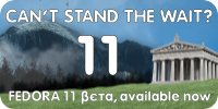
2009/3/13 Máirín Duffy <mai...@linuxgrrl.com>

>
>
> It still looks like your bottom row of text could be a bit tighter. The
> first 'F' and the last 'w' look like they are gasping for air from the
> corners. I think the top row of text could be kerned just slightly tighter
> as well. Also, I think it might be better to push the '11' to the left a
> little to add a little balance from the temple.
>
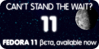
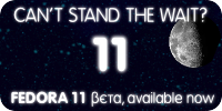
Thanks a lot for your feedback. I've posted on the wiki the third version
for both, I think that these can be considered almost definitives:

<https://fedoraproject.org/w/uploads/5/5d/Deepsky-fedora11-beta-banner_1b.png>
https://fedoraproject.org/w/uploads/9/98/Deepsky-fedora11-beta-banner_1c.svg
https://fedoraproject.org/w/uploads/5/5f/Deepsky-fedora11-beta-banner_1c.png

https://fedoraproject.org/w/uploads/0/03/Deepsky-fedora11-beta-banner_2c.svg
https://fedoraproject.org/w/uploads/d/d3/Deepsky-fedora11-beta-banner_2c.png


> Other than that, this is fantastic. Thank you for being so great about
> being on top of the web banners!! This is extremely good work; you've
> followed our general banner format / font / etc to a T.
>


Thank you for Mo your appreciations, and thanks to all in general for the
positive feedbacks. They make me very happy! :-)


--
Paolo Leoni ~ http://pleoni.altervista.org
_______________________________________________
Fedora-art-list mailing list
Fedora-art-list@redhat.com
http://www.redhat.com/mailman/listinfo/fedora-art-list