Hello,

i prefer the ApacheVelocityTools3Gradient.png as the logo.
bye Patrick

2007/12/14, Nathan Bubna <[EMAIL PROTECTED]>:
>
> On Dec 13, 2007 3:53 PM, Edward <[EMAIL PROTECTED]> wrote:
> > Another updated version, I think this version looks more like a shield
> now,
> > rather a tongue.
>
> yeah, it does.  that helps.
>
> > Black and White Version:
> >
> http://i226.photobucket.com/albums/dd53/shadowpwner/ApacheVelocityTools3BW.png
>
> nah, i prefer color.
>
> > Solid Color Version:
> >
> http://i226.photobucket.com/albums/dd53/shadowpwner/ApacheVelocityTools3Solid.png
> >
> > And one with gradient:
> >
> http://i226.photobucket.com/albums/dd53/shadowpwner/ApacheVelocityTools3Gradient.png
>
> i actually like these both pretty well.  i'd be hard pressed to pick.
> thanks for trimming some of that whitespace. :)   how's this, i'm not
> sure what Chris Townsen's feedback was, but i think you should either:
>
> a) pick one of the two color ones above and call that your submission
>
> b) or if you are having a hard time deciding, ask for people on the
> [EMAIL PROTECTED] list to vote between them.
>
> whichever way, i think we're probably about ready to wrap this up.
>
> > I'll make an example on how it'll fit the website as soon as I'm done
> with
> > my design, if its okay. :)
>
> that'd be great.  it'll be smaller than it currently is too, right?
>
> > Regards,
> >
> > Edward
> >
> >
> > On Dec 13, 2007 12:24 PM, Nathan Bubna <[EMAIL PROTECTED]> wrote:
> >
> > > On Dec 12, 2007 5:54 PM, Edward <[EMAIL PROTECTED]> wrote:
> > > > Hi,
> > > >
> > > > Thanks for giving me feedback. Heres an updated version:
> > > > [image: ApacheVelocityTools2.png picture by shadowpwner]
> > > > and a link for those who can't see it:
> > > >
> > >
> http://i226.photobucket.com/albums/dd53/shadowpwner/ApacheVelocityTools2.png
> > >
> > > The colors mesh perfectly now. :) I also like the different font
> > > weights for Velocity and Tools.
> > >
> > > > I tried to make the T look more like a T, but now to me it looks
> like a
> > > > tongue :P (See the resemblance?)
> > >
> > > Yeah, though my first thought was that it looked like a shield, which
> > > is a bit more noble than a tongue. :)  I wonder if straightening out
> > > the wings of the V would help...
> > >
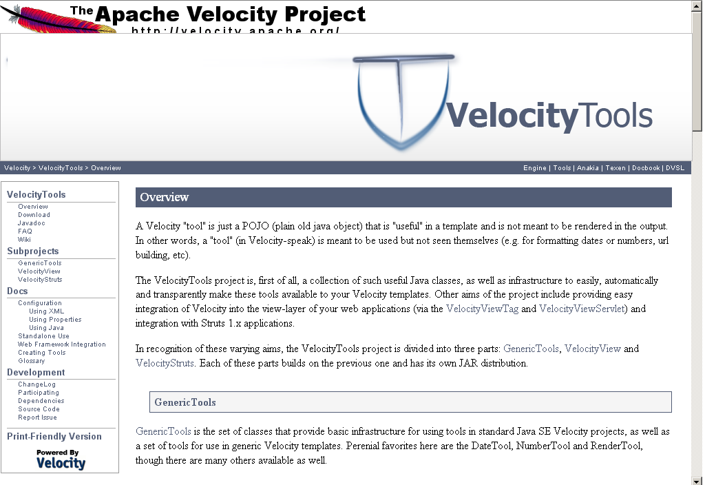
> > > > Also, here it is with the current template:
> > > >
> > > >
> > >
> http://i226.photobucket.com/albums/dd53/shadowpwner/VeltoolsNewLogoPS2.png
> > > >
> > > > The logo will probably be 50% of the current size, I enlarged it so
> you
> > > > could see the details.
> > >
> > > Cool, though i'd be curious to see how well the details compress also.
> > >  And there still seems like more whitespace than necessary on the
> > > right side and the top.
> > >
> > > > Regards,
> > > >
> > > > Edward
> > > >
> > > > On Dec 11, 2007 8:57 PM, Nathan Bubna <[EMAIL PROTECTED]> wrote:
> > > >
> > > > > Hey Edward,
> > > > >
> > > > > That's a pretty good start, though i confess that it took me a
> second
> > > > > to realize that the symbol was a V with a T inset.  The T is
> > > > > particularly hard to recognize.  Still, the symbol looks a lot
> > > > > snazzier than the current meager wrench (no offense, if you're
> still
> > > > > out there Tim Colson :).   I do think the color scheme could use
> some
> > > > > adjustment to fit better, as it clashes a bit right now.  I
> attached a
> > > > > screenshot of this draft logo in the velocitytools docs to show
> that.
> > > > >
> > > > > I think that's it for stylistic feedback.  I'm not really the best
> at
> > > > > that.  Functionally, the logo will need to be smaller and could
> > > > > probably stand to have some of the surrounding whitespace reduced
> to
> > > > > make better use of its space.
> > > > >
> > > > > Thanks for working on this!  I'm excited to have a nice logo for
> once!
> > > :)
> > > > >
> > > > > peace,
> > > > > nathan
> > > > >
> > > > > On Dec 11, 2007 7:17 PM, Edward <[EMAIL PROTECTED]> wrote:
> > > > > > Hello All,
> > > > > >
> > > > > > I entered the Google Highly Open Participation Contest for the
> > > Velocity
> > > > > > Tools logo.
> > > > > >
> > > > > > Here is my proposition so far:
> > > > > >
> > > > > > [image: ApacheVelocityTools.png picture by shadowpwner]
> > > > > >
> > > > > > In case the image doesn't show:
> > > > > >
> > > > > >
> > > > >
> > >
> http://i226.photobucket.com/albums/dd53/shadowpwner/ApacheVelocityTools.png
> > > > > >
> > > > > > Please note this will not be the final draft, but only something
> to
> > > > > start us
> > > > > > off with.
> > > > > >
> > > > > > Please give helpful comments and suggestions, to improve my
> work.
> > > > > (Example:
> > > > > > Too simple, colors don't match layout, etc.)
> > > > > >
> > > > > >
> > > > > > Regards,
> > > > > >
> > > > > > Edward
> > > > > >
> > > > > >
> > > > >
> > >
> http://code.google.com/p/google-highly-open-participation-asf/issues/detail?id=52
> > > > > >
> > > > >
> > > > >
> ---------------------------------------------------------------------
> > > > > To unsubscribe, e-mail: [EMAIL PROTECTED]
> > > > > For additional commands, e-mail: [EMAIL PROTECTED]
> > > > >
> > > > >
> > > >
> > > >
> > > > --
> > > > Light travels faster than sound. This is why some people appear
> bright
> > > until
> > > > you hear them speak.
> > > >
> > >
> > > ---------------------------------------------------------------------
> > > To unsubscribe, e-mail: [EMAIL PROTECTED]
> > > For additional commands, e-mail: [EMAIL PROTECTED]
> > >
> > >
> >
> >
> > --
> > Light travels faster than sound. This is why some people appear bright
> until
> > you hear them speak.
> >
>
> ---------------------------------------------------------------------
> To unsubscribe, e-mail: [EMAIL PROTECTED]
> For additional commands, e-mail: [EMAIL PROTECTED]
>
>


--
Patrick Diehl
Zamenhofstr.58
70197 Stuttgart

Tel.: 0711/2735204
Mobil.: 015156316139