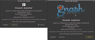
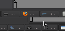
On Sat, Nov 06, 2010 at 09:09:17PM -0300, Maximi89 wrote:
> Hi guys, i proposed the use of an image called chameleon, you can see that
> image in the gnashdev site, the image chameleon and the old image:
> http://4.bp.blogspot.com/_JE4GMReEeGU/TM4pNaWaehI/AAAAAAAAAI4/4cqLQ9zCSu0/s320/Pantallazo-Acerca+de+Gnash.png
>
> And another image, the iconified window image
> http://3.bp.blogspot.com/_JE4GMReEeGU/TM8TRkWD09I/AAAAAAAAAJQ/adspWg-eaEM/s1600/Pantallazo-3.png
> What do you think about this changes?
The big one looks very nice to me.
The iconified I think is not readable. Maybe just the G part,
or even just the top portion of it, would be more readable
(compare with the firefox one...)

Rob: who made that logo ? can we ask her for an icon too ?

--strk;

  ()   Free GIS & Flash consultant/developer
  /\   http://strk.keybit.net/services.html

_______________________________________________
Gnash-dev mailing list
[email protected]
http://lists.gnu.org/mailman/listinfo/gnash-dev