Hey folks!

Don't you wanna talk about Parkes logo?
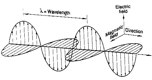
This one [1] is not bad, but I don't think that it's good enough.
The concept is nice, but I don't like the implementation:
1. It doesn't look like the actual telescope [2];
2. The glow makes it look like a car's logo [3];
3. I don't like the font because it will contrast with the current gNS
font. And I'm not sure that the font is free. Could anyone confirm
this?

I've tried to find another idea.
What do you think about these?
1. Galaxy-like shapes [4, 5, 6, 7];
2. Radio waves (Parkes is a radio telescope) [8, 9].
I've also tried to make one myself (check the attachments). I know
that it sucks. It's just a concept;
3. Keyhole [10]. This is my favourite. It'll be better if you check it
on the website [11] because I don't know how to copy the background.
I'm not sure that the author will give it for free, but I can contact
him if you want.

Maybe you have your own ideas. Feel free to tell me.

Cheers.

[1] http://www.gnewsense.org/ArtworkProjects/Parkes
[2] http://outreach.atnf.csiro.au/images/wallpapers/parkesduskmed.jpg
[3]
http://images2.wikia.nocookie.net/__cb20100719081329/logopedia/images/0/00/Hyundai_logo_file_983.jpg
[4]
http://upload.wikimedia.org/wikipedia/commons/8/8a/Spiral_galaxy_arms_diagram.svg
[5] http://www.flickr.com/photos/ethanhein/2405193401/in/set-72157603849409866
[6] http://blog.wolfram.com/data/uploads/2009/02/logos_img04.gif
[7] http://www.securityleak.com/slm/issue_05/images/galaxy.jpg
[8] http://www.mds975.co.uk/Images/radwave2.jpeg
[9] http://www.edinformatics.com/math_science/e_mag_nasa_image.gif
[10] http://thelocalgenius.com/images/thesecret.png
[11] http://thelocalgenius.com/
![]() radio_wave_word.pdf
radio_wave_word.pdf
Description: Adobe PDF document
_______________________________________________
gNewSense-dev mailing list
gNewSense-dev@nongnu.org
https://lists.nongnu.org/mailman/listinfo/gnewsense-dev