Quim Gil wrote:
> Yo! Mmm sorry if I'm too critical.

Not at all!!!! Honesty produces the best results :)
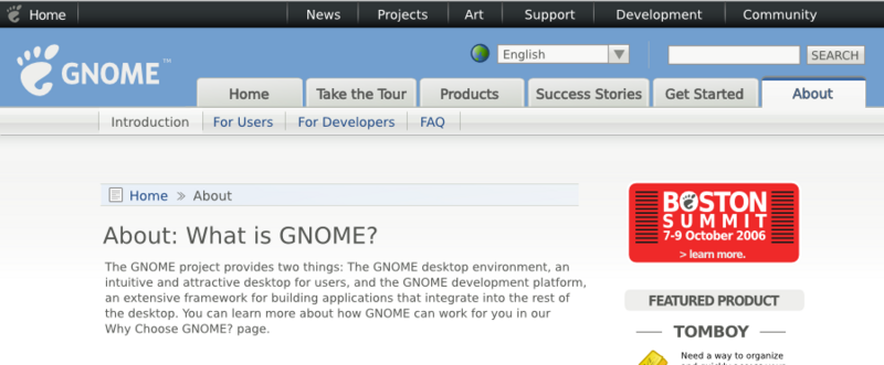
> On Sat, 2006-11-25 at 03:24 -0500, Máirín Duffy wrote:
>
>> http://mihmo.livejournal.com/34329.html
>
> In brief, why don't you make a wgo navigation bar with a primary and
> secondary level in a single piece? In the line suggested by this guy in
> your blog: http://img242.imageshack.us/img242/1899/wgojcooperql2.png
> Primary+secondary integrated is the normal approach. There is no reason
> to separate/disintegrate them, it looks confusing, make Joachim say it
> doesn't work and we loose vertical space for content.

I made a new set of mocks that I just posted:

http://mihmo.livejournal.com/34708.html

I took that guy's suggestion and made this one:

http://i61.photobucket.com/albums/h58/mairinduffy/wgo-barnav-3.png

I like that one the best now. :) It allows the header to take up the
least amount of space and just looks right - it doesn't have that extra
whitespace.

> This is why I dislike the banner-bar approach. I understand people
> caring about visuals like the mockup but... in real web pages we might
> be wasting a 1/3 of the vertical space available in the browser with the
> megaheader. On the other hand, there is no need for a breadcrumb
> navigation: the wgo navigation should be enough to tell you where are
> you.

Well, a couple things about the banner bar:

(1) I wasn't intending for it to be implemented as an image (just in
case anyone interpreted it that way.) A div with a couple of moz rounded
corners on the top with a vibrant color and header text inside.

(2) The initial mocks of it did take a lot of space! I did a couple more
variations on it just in case:

http://i61.photobucket.com/albums/h58/mairinduffy/wgo-bannernav-halfheight.png


http://i61.photobucket.com/albums/h58/mairinduffy/wgo-bannernav-halfwidth-halfheight.png

> I think that applying your good interface design skills to the structure
> suggested at http://img242.imageshack.us/img242/1899/wgojcooperql2.png
> will bring the definitive header.

Yeh, I am *really* feeling that this one is it:

http://i61.photobucket.com/albums/h58/mairinduffy/wgo-barnav-3.png

What do you think? If we all agree this one is *IT*... I think
photobucket.com is making my images blurry because they're clear before
I upload them. So, I will clean that image up and start slicing it up
and export all the little bits the CSS folks will hopefully find useful.

>> I really like the color differentiation idea!
>
> One think that we have overklooked until now is that the General top nav
> bar should reflect in which subsite are we now - like nav bars tend to
> do. This means that wgo would have the foot-home tab on the left in a
> different treatment, or art.gnome.org would have the "Art" tab with a
> different treatment. Perhaps we could do this coloring the tab with the
> same color of the header, instead of the default black.

Well the idea I had had was to color the background behind the tabs &
under the general top nav bar differently / add different artwork there
to differentiate the sites. I'm not sure if coloring the general nav bar
as well would be overkill... I can certainly mock it up. I was
definitely thinking the little clearlooks-style highlight on the
currently-selected tab (I think it's blue in most of the mocks) could
also be changed based on the site!

>> Ah ok. I've been working with thos on how art.gnome.org might use this
>> design and when you folks feel you have enough from me for this release,
>
> Cool! Of course we want that the wgo works help improving the rest opf
> GNOME subsites.

:)

~m

_______________________________________________
gnome-web-list mailing list
[email protected]
http://mail.gnome.org/mailman/listinfo/gnome-web-list