This might be super easy and I'm just having a temporary blind spot when
looking through the documentation. Below is my dummy data. The options is
what I need help with. If it's even possible.
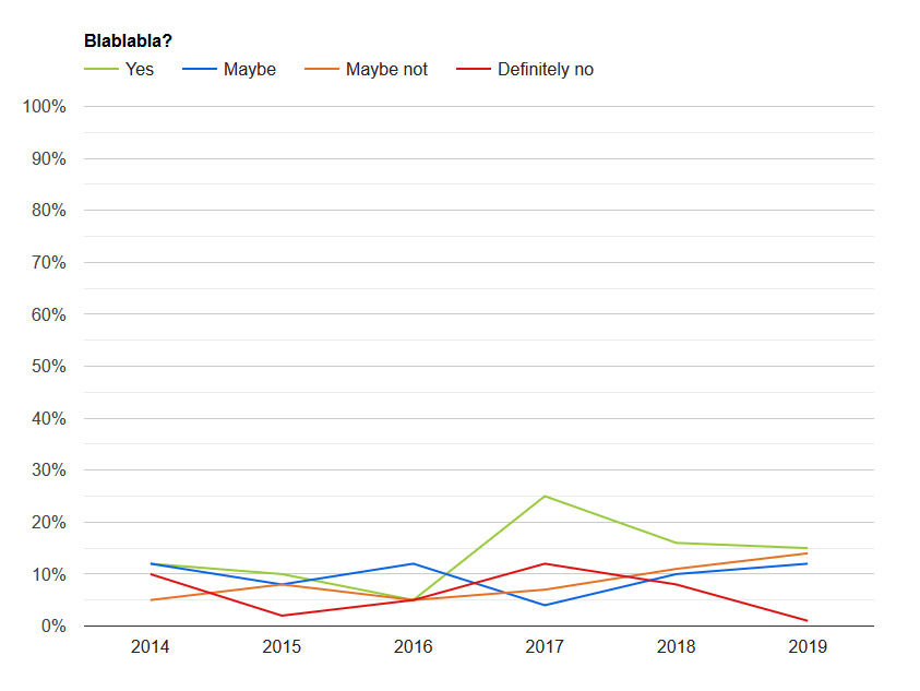
var data = google.visualization.arrayToDataTable([

['Blabla', 'Yes', 'Maybe', 'Maybe not', 'Definitely no'],

['2014', 12, 12, 5, 10],

['2015', 10, 8, 8, 2],

['2016', 5, 12, 5, 5],

['2017', 25, 4, 7, 12],

['2018', 16, 10, 11, 8],

['2019', 15, 12, 14, 1]

]);

https://i.postimg.cc/hPSgfZpN/dummy-chart.jpg


I want the graph to show the values as percentage of it's total value. So
for 2014 the values are (12+12+5+10) 39 and so the "Yes" point should be at
~31 %. (12 of 39).

Do I make any sense? Can someone shed a light on my noobness and help me
out?

Thanks in advance!

--
You received this message because you are subscribed to the Google Groups
"Google Visualization API" group.
To unsubscribe from this group and stop receiving emails from it, send an email
to [email protected].
To view this discussion on the web visit
https://groups.google.com/d/msgid/google-visualization-api/f40b9bf0-06a3-45bd-b78b-a437e31407f1%40googlegroups.com.