Aman-Mittal opened a new issue, #490:
URL: https://github.com/apache/fineract-backoffice-ui/issues/490
## What happens At phone widths the paginator row tries to fit its label, page-size select, range text and four nav buttons into ~312px on one non-wrapping line. The "Items per page:" label gets squeezed into a 31px-wide box and breaks into fragments that render as stray characters at the left edge — visually just `ıs` and `e:`, with no connection to the words they came from. 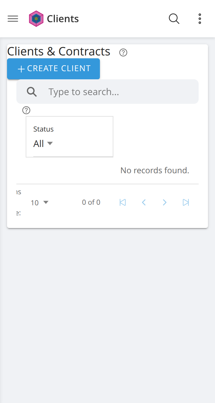 Measured at **368×691** on `/clients`: ``` .paginator width 312 flex-wrap: nowrap overflow-x: visible children: SPAN.items-per-page "Items per page:" w 31 h 54 ← 31px wide, 4 lines tall ION-SELECT page size w 72 h 44 SPAN.range-label "0 of 0" w 31 h 18 ← nowrap in a 31px box ION-BUTTON × 4 nav arrows w 28 each ``` The label is not merely tight — at 31px for a 15-character string it is genuinely unreadable. ## Cause `src/app/shared/components/paginator/paginator.component.ts` has no responsive handling: ```css .paginator { display: flex; align-items: center; justify-content: flex-end; gap: 8px; ... } .page-size-select { min-width: 72px; } .range-label { margin: 0 16px; white-space: nowrap; } ``` ```console $ grep -c "@media" src/app/shared/components/paginator/paginator.component.ts 0 ``` A fixed `min-width` on the select plus `nowrap` on the range label plus `flex-wrap: nowrap` on the row means the only element that can absorb the shortfall is the text label — so it takes all of it. ## Scope This is the shared paginator inside `app-data-table`, which is the common list component for the app. **Every list screen is affected on mobile** — Clients, Groups, Loans, Staff, Offices, Users and the rest. Confirmed independently on `/clients` and `/organization/staff` with identical symptoms, which is what establishes it as a shared-component bug rather than a per-screen one. That also makes it cheap to fix: one component, every screen. ## Suggested fix Give the paginator an actual mobile layout below a breakpoint rather than a shrunk desktop one: - drop the "Items per page:" text to just the number + dropdown (the select is self-explanatory next to page arrows), or move it into the select's own label; - allow the row to wrap, putting the range text and nav arrows on a second line; - or collapse the page-size selector behind a small menu on narrow viewports. Removing `white-space: nowrap` alone is not enough — it would wrap the range text instead of fixing the space shortage. ## Environment Reproduced against a clean checkout of `main` (`a24a06ba`) served with `ng serve`, Chrome at 368×691 with mobile emulation and touch. -- This is an automated message from the Apache Git Service. To respond to the message, please log on to GitHub and use the URL above to go to the specific comment. To unsubscribe, e-mail: [email protected] For queries about this service, please contact Infrastructure at: [email protected]

