Aman-Mittal commented on issue #574:
URL:
https://github.com/apache/fineract-backoffice-ui/issues/574#issuecomment-5764032724
Swept every record view at 390 px to see how far this goes. It is worse on savings accounts than on clients, and it reaches money-movement actions rather than just `Back`. I counted a control as unreachable only when it extends past the viewport **and** no ancestor can scroll horizontally to bring it back. | Screen | Unreachable at 390 px | Position | |---|---|---| | Savings account view | **Withdraw** | 309 → 440 (clipped mid-word) | | | **Actions** | 452 → 566 (fully off-screen) | | | **Back** | 578 → 666 (fully off-screen) | | Client view | New Account | 280 → 401 (clipped) | | | Back | 413 → 501 (fully off-screen) | | Loan view | Back | 326 → 414 | All clipped by `ion-card.header-card` with `overflow-x: hidden`, as in the description. 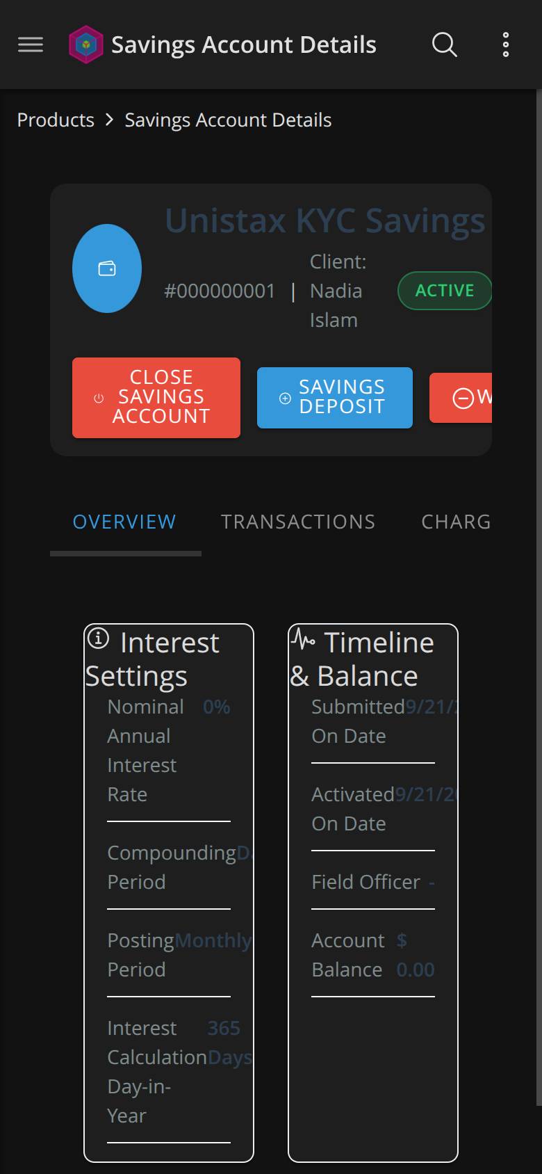 On a phone this leaves a savings account with **no reachable way to withdraw, and no Actions menu at all** — the menu being the route to most account operations. The one action that is fully visible and first in the row is `Close Savings Account`, which is both destructive and irreversible. The safe, routine operations are the ones that got cut off. That ordering is worth a look while the row is being fixed. The same pattern shows up in the Actions menu itself, where *Close Client* is the first item with no separation from the rest. Two more things from the same sweep: - **List screens are clean.** Users, Offices, Scheduler Jobs, Audit Logs, Journal Entries, Configurations and Codes had zero unreachable controls at 390 px. This is specific to the record-view header row. - **The `.info-grid` half of this issue is worse here too.** On the savings account at 390 px, label and value collide with a measured gap of **0 px** on 7 rows — `Nominal Annual Interest Rate` / `0%`, `Compounding Period` / `Daily`, `Posting Period` / `Monthly`, `Interest Calculation Day-In-Year` / `365 Days` and the three timeline rows. The text runs together rather than merely truncating. Dark-mode readability on that same screen is filed separately as #584. -- This is an automated message from the Apache Git Service. To respond to the message, please log on to GitHub and use the URL above to go to the specific comment. To unsubscribe, e-mail: [email protected] For queries about this service, please contact Infrastructure at: [email protected]

