slachiewicz opened a new pull request, #368:
URL: https://github.com/apache/maven-fluido-skin/pull/368
With the sidebar layout, a phone shows the whole menu before the page: on maven.apache.org the content starts about 1,900 px down the home page and 2,500 px down a guide. `site.vm` now writes `<main>` before the sidebar, so Bootstrap's phone layout stacks the content first and the menu below it. From 768 px, `#bodyColumn` floats right and `#leftColumn` loses its left margin, so the menu stays on the left with the same column widths and gap at every breakpoint, also with other `leftColumnClass`/`bodyColumnClass` spans. Keyboard and screen reader users also reach the content before the menu. The top bar layout (`sideBarEnabled=false`) is unchanged. A project `site.css` that relies on the menu coming first in the markup (`#leftColumn + #bodyColumn`) no longer matches. This PR adds no "Menu" link at the top on phones: the skin has no translatable text for it, and an English-only link would show on every site. Verified: maven-site `a2c5f65c` rendered with this branch → at 800, 1000, 1280 and 1400 px both columns have the same position and size as on master; at 375 px the content starts at y=302 instead of y=2164 (home page); no URL or content anchor lost; ITs 41/41. | 375 px | Before | After | |---|---|---| | Home page | 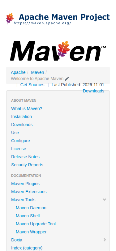 | 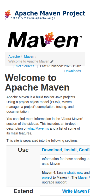 | | Introduction to the POM | 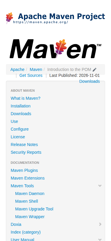 |  | Desktop, unchanged: 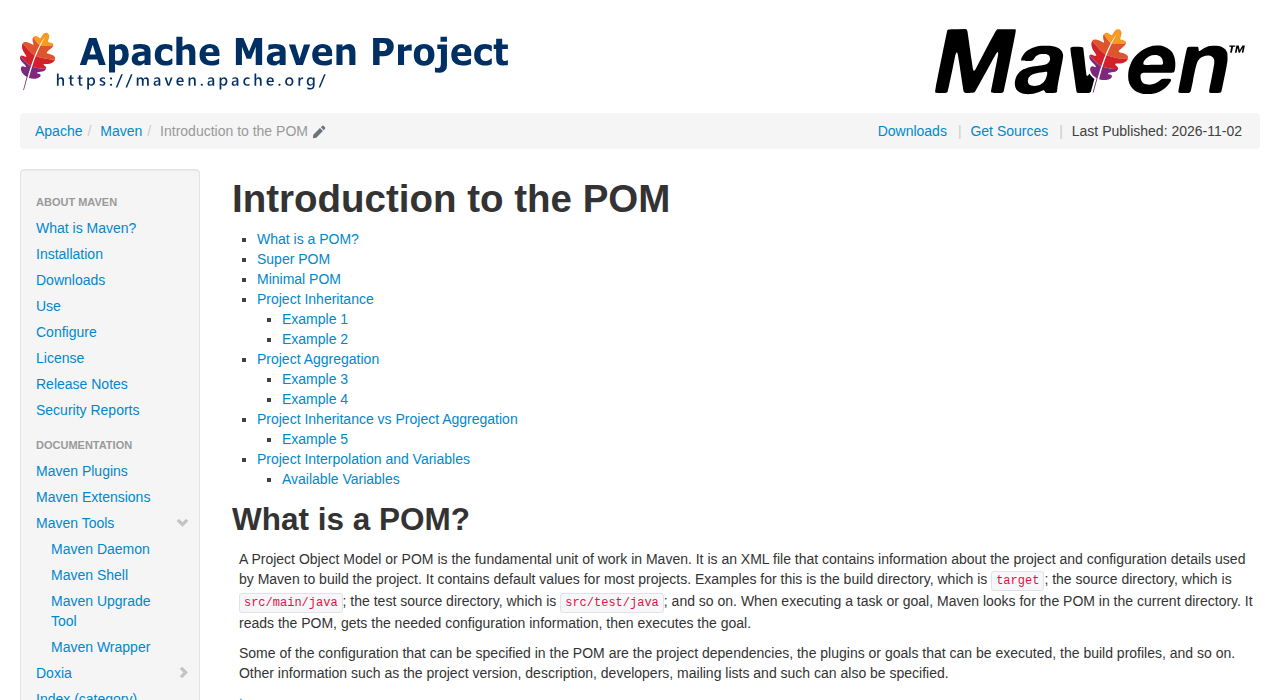 -- This is an automated message from the Apache Git Service. To respond to the message, please log on to GitHub and use the URL above to go to the specific comment. To unsubscribe, e-mail: [email protected] For queries about this service, please contact Infrastructure at: [email protected]