Hi Mirek,

Mirek M. píše v St 25. 04. 2012 v 19:23 +0200:
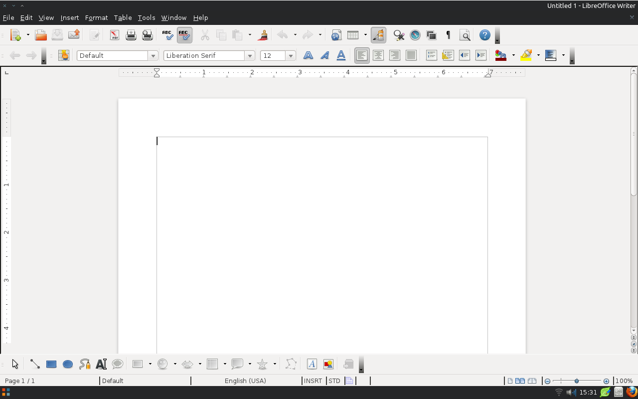
> > So - if you can propose a better looking ruler, that would be great,
> > just please so far keep in mind that it should play well with the
> > default Windows theme :-) - other than that, let's go for changing that!
> > If you can create a proposal that would be applied to a screenshot of
> > Writer, that would help a lot.
> >
>
> I'd suggest making the rulers adopt the document background, lose the
> divider between the background and the rulers, lose the black square around
> the tab insertion mode, and tone down the colors (black->gray). The result
> might look something like this:
> https://wiki.documentfoundation.org/images/4/45/Rulers.png

Beautiful, thank you so much! :-) - so now it is implemented:

http://cgit.freedesktop.org/libreoffice/core/commit/?id=778d80bc2c37e4549daff2cc1f74f8665235407b

[mostly by removing code ;-)]  Screenshots of LibreOffice master with
the changes:

http://artax.karlin.mff.cuni.cz/~kendy/design-list/lo-new-rulers.png
http://artax.karlin.mff.cuni.cz/~kendy/design-list/lo-new-rulers-scrolled.png

I am not sure if we can do any improvements wrt. the 'scrolled' version;
fading the document to the workspace would probably be ideal, but not
yet sure if doable with reasonable effort...

I'm adding the UX advise list for comments from the UX point of view.

Thank you again,
Kendy

_______________________________________________
Libreoffice-ux-advise mailing list
Libreoffice-ux-advise@lists.freedesktop.org
http://lists.freedesktop.org/mailman/listinfo/libreoffice-ux-advise