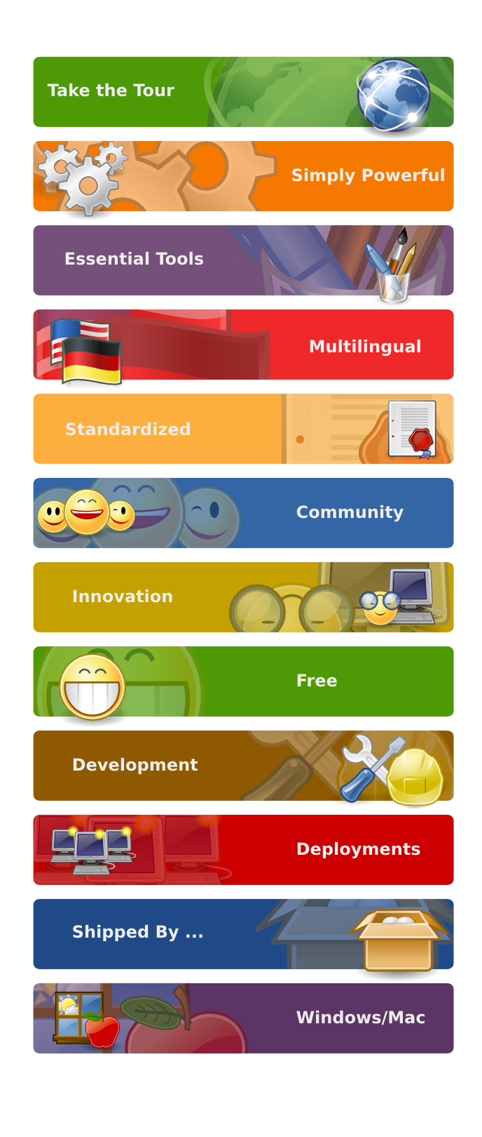
These are pretty cool! Panos was working on the graphics of Take the
Tour but well, you have been quicker, I hope we can reuse the mockup
work he did for another section.
Comments:

- No country flags, as discussed (with you?) months ago. You can
represent i18n by using different unicode fonts.

- What about a small version of these banners for a groove vertical
nav bar for this section?

- And what about a mockup of a full Take the tour page so CSS/XHTML
magicians see much better what you have in mind?

You are putting high graphic standards in this section. Hopefully this
will inspire good solutions for the rest of sections and we will have
a bright colorful wgo.

PS: I personally have no opinion about using Tango icons vs the
official GNOME ones, if anybody has an objection or a better idea you
better tell now.


On 2/27/07, Máirín Duffy <[EMAIL PROTECTED]> wrote:
> Hi,
>
> Quim Gil wrote:
> > So you see, I think it's more about doing a proper use of exisiting
> > materials rather than redesigning wheels.
>
> In this spirit I made a set of banners for the GNOME tour pages using
> Tango icons...
>
> http://people.redhat.com/duffy/gnome-brand/wgo/tour_banners/wgo-tour-banners.png
> http://people.redhat.com/duffy/gnome-brand/wgo/tour_banners/wgo-tour-banners.svg
>
> The only thing is it would be better to not have text in the banners and
> instead use the banners as the background-image of a div and have the
> bold white text as real plaintext on top so it's
> translatable/accessible... I don't know if that's possible though?
>
> ~m
>
>


--
Quim Gil /// http://desdeamericaconamor.org
--
marketing-list mailing list
marketing-list@gnome.org
http://mail.gnome.org/mailman/listinfo/marketing-list