Hello,

I've recently been working with matplotlib to create some charts of some
data I've gathered. I've been impressed with how easy it is to use, but I
have a few questions. I'd appreciate any help you can offer me with the
following:
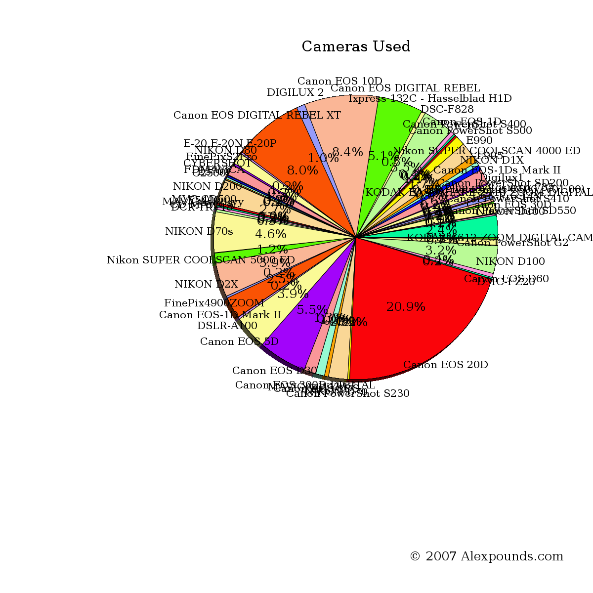
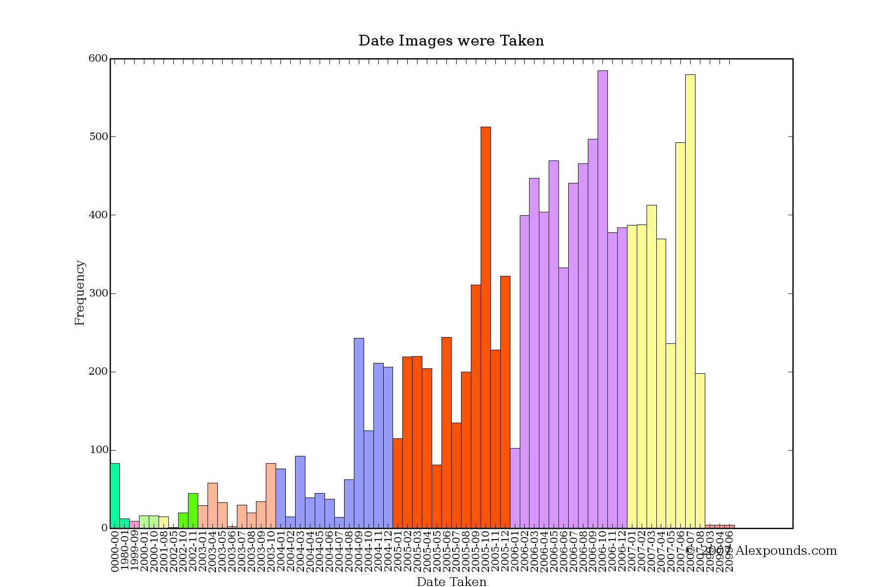
1. Just what does axes() do with pie charts, anyway? I've tried varying the
parameters, but haven't quite grasped what it's for.

2. How do I make the pie of the pie chart smaller, leaving more room for the
labels? Consider http://www.ethicsgirls.com/stuff/report/cameras_used.png
(which I may well move to a bar chart anyway). Some of the labels are
clipped at the sides. What's the best way to avoid this?

3. When plotting a chart with plot(), can I vary the alpha value of the
markers? If so, how?

4. I need to stick a footnote in the bottom corner of my charts. Can I do
this natively in matplotlib or will I have to do it with a separate library
afterwards?

5. Can I have my xtick labels oriented vertically? I'm trying to avoid an X
axis that looks like this:
http://www.ethicsgirls.com/stuff/report/date_taken.png


Thanks,

--
Alex Pounds (Creature)                  .~.       http://www.alexpounds.com/
                                        /V\      http://www.ethicsgirls.com/
                                       // \\
"Variables won't; Constants aren't"   /(   )\
                                       ^`~'^


-------------------------------------------------------------------------
This SF.net email is sponsored by: Splunk Inc.
Still grepping through log files to find problems?  Stop.
Now Search log events and configuration files using AJAX and a browser.
Download your FREE copy of Splunk now >>  http://get.splunk.com/
_______________________________________________
Matplotlib-users mailing list
[email protected]
https://lists.sourceforge.net/lists/listinfo/matplotlib-users