This is an automated email from the ASF dual-hosted git repository.

navendu pushed a commit to branch master
in repository https://gitbox.apache.org/repos/asf/apisix-website.git
The following commit(s) were added to refs/heads/master by this push:
new b1690079c66 blog: Add Resizing images on-the-fly post (#1701)
b1690079c66 is described below
commit b1690079c6667271e88fd8884442559218935b89
Author: Nicolas Fränkel <[email protected]>
AuthorDate: Thu Oct 5 12:28:18 2023 +0200
blog: Add Resizing images on-the-fly post (#1701)
---
.../en/blog/2023/10/05/resize-images-on-the-fly.md | 196 +++++++++++++++++++++
1 file changed, 196 insertions(+)
diff --git a/blog/en/blog/2023/10/05/resize-images-on-the-fly.md
b/blog/en/blog/2023/10/05/resize-images-on-the-fly.md
new file mode 100644
index 00000000000..7b7d16d50dc
--- /dev/null
+++ b/blog/en/blog/2023/10/05/resize-images-on-the-fly.md
@@ -0,0 +1,196 @@
+---
+title: Resizing images on-the-fly
+authors:
+ - name: Nicolas Fränkel
+ title: Author
+ url: https://github.com/nfrankel
+ image_url: https://avatars.githubusercontent.com/u/752258
+keywords:
+ - DevOps
+ - Performance
+ - Web Developent
+ - Cost optimization
+ - imgproxy
+description: >
+ As a web architect, one of the many issues is asset management. And the most
significant issue in assets is images. A naive approach would be to set an
image and let the browser resize the image via CSS.
+ However, it means that you download the original image. It entails two
problems: the size of the original image and the suboptimal browser-based
resizing.
+ This post will cover two alternatives: traditional and brand-new solutions.
+tags: [Ecosystem]
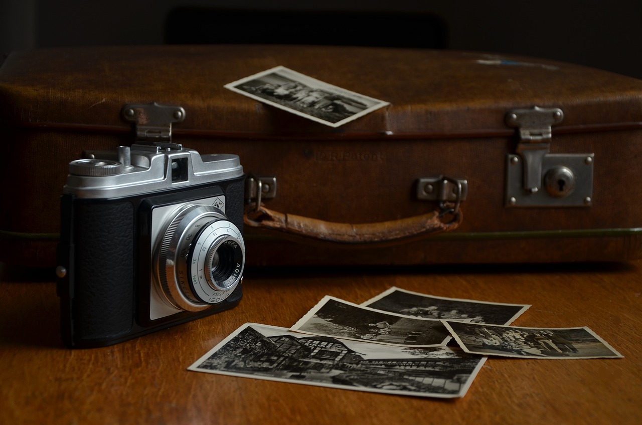
+image:
https://static.apiseven.com/uploads/2023/10/03/LuagzWfs_camera-514992.jpg
+---
+
+>As a web architect, one of the many issues is asset management. And the most
significant issue in assets is images. A naive approach would be to set an
image and let the browser resize the image via CSS:
+>
+>```css
+>img {
+> height: 100%;
+> width: 100%;
+> object-fit: contain;
+>}
+>```
+>
+>However, it means that you download the original image. It entails two
problems: the size of the original image and the suboptimal browser-based
resizing.
+>
+>This post will cover two alternatives: traditional and brand-new solutions.
+
+<!--truncate-->
+
+<head>
+ <link rel="canonical"
href="https://blog.frankel.ch/resize-images-on-the-fly/"; />
+</head>
+
+## Ahead-of-time resizing
+
+The traditional solution to a single image source has been ahead-of-time
resizing. Before releasing, designers would take time to provide multiple image
versions in different resolutions. On this blog, I'm using this technique. I
provide three resolutions to display the post's main image in different
contexts as background images:
+
+* large for the post on its page
+* medium for the post on the home page
+* small for related posts on a post page
+
+I also remove JPEG metadata for an even higher size reduction.
+
+Yet, the traditional approach is to take advantage of the HTML `picture` tag:
+
+>The `<picture>` HTML element contains zero or more `<source>` elements and
one `<img>` element to offer alternative versions of an image for different
display/device scenarios.
+>
+>The browser will consider each child `<source>` element and choose the best
match among them. If no matches are found—or the browser doesn't support the
`<picture>` element—the URL of the `<img>` element's src attribute is selected.
The selected image is then presented in the space occupied by the `<img>`
element.
+>
+>-- [The Picture element on MDN web
docs](https://developer.mozilla.org/en-US/docs/Web/HTML/Element/picture)
+
+In turn, one can use it like the following:
+
+```html
+<picture>
+ <source media="(max-width: 199px)" srcset="ai-generated-200.jpg" />
+ <source media="(max-width: 399px)" srcset="ai-generated-400.jpg" />
+ <source media="(max-width: 599px)" srcset="ai-generated-600.jpg" />
+ <source media="(max-width: 799px)" srcset="ai-generated-800.jpg" />
+ <source media="(max-width: 999px)" srcset="ai-generated-1000.jpg" />
+ <img src="ai-generated.jpg" />
+</picture>
+```
+
+This way has worked for ages, but it has two issues. First, providing multiple
resolutions for each image takes a long time. One could automate the process
and get good results with AI.
+
+However, the volume of necessary storage could be twice or thrice the size of
the original image, depending on the number of extra resolutions created. In an
assets-rich environment, _e.g._, e-commerce would significantly increase costs.
+
+## On-the-fly resizing
+
+I recently stumbled upon `imgproxy`, a component to resize images on-the-fly:
+
+>imgproxy makes websites and apps blazing fast while saving storage and SaaS
costs
+>
+>-- [imgproxy website](https://imgproxy.net/)
+
+It offers an endpoint where you can send an encoded URL that defines:
+
+* The image to resize and its location, _e.g., local, an HTTP URL, a S3
bucket, etc.
+* Different sizing parameters, _e.g._, the dimensions, whether to fit or to
fill, etc.
+* The format. imgproxy supports standard formats such as JPEG and PNG but also
more modern ones like WebP and AVIF. It can also choose the best format
depending on the ' Accept ' header.
+* Many (many!) other options, like watermarking, filtering, rotation, etc.
+
+imgproxy offers both an Open Source free version and a paid version;
everything included in this post is part of the former.
+
+One solution would be for the web developer to code each imgproxy URL in the
HTML:
+
+```html
+<picture>
+ <source media="(max-width: 199px)"
srcset="http://imgproxy:8080//rs:fill/w:200/plain/http://server:3000/ai-generated.jpg@webp";
/>
+ <source media="(max-width: 399px)"
srcset="http://imgproxy:8080//rs:fill/w:400/plain/http://server:3000/ai-generated.jpg@webp";
/>
+ <source media="(max-width: 599px)"
srcset="http://imgproxy:8080//rs:fill/w:600/plain/http://server:3000/ai-generated.jpg@webp";
/>
+ <source media="(max-width: 799px)"
srcset="http://imgproxy:8080//rs:fill/w:800/plain/http://server:3000/ai-generated.jpg@webp";
/>
+ <source media="(max-width: 999px)"
srcset="http://imgproxy:8080//rs:fill/w:1000/plain/http://server:3000/ai-generated.jpg@webp";
/>
+ <img src="ai-generated.jpg" />
+</picture>
+```
+
+It leaks topology-related details on the web page. It's not a maintainable
solution. We can solve the issue with a reverse proxy or an API Gateway. I'll
use Apache APISIX for obvious reasons.
+
+With this approach, the above HTML becomes much more straightforward:
+
+```html
+<picture>
+ <source media="(max-width: 199px)" srcset="/resize/200/ai-generated.jpg" />
+ <source media="(max-width: 399px)" srcset="/resize/400/ai-generated.jpg" />
+ <source media="(max-width: 599px)" srcset="/resize/600/ai-generated.jpg" />
+ <source media="(max-width: 799px)" srcset="/resize/800/ai-generated.jpg" />
+ <source media="(max-width: 999px)" srcset="/resize/1000/ai-generated.jpg"
/>
+ <img src="ai-generated.jpg" />
+</picture>
+```
+
+Apache APISIX intercepts requests starting with `/resize`, rewrites the URL
for `imgproxy`, and forwards the rewritten URL to `imgproxy`. Here's the
overall flow:
+
+
+
+The corresponding Apache APISIX configuration looks like the following:
+
+```yaml
+routes:
+ - uri: /resize/* #1
+ plugins:
+ proxy-rewrite: #2
+ regex_uri:
+ - /resize/(.*)/(.*) #3
+ - /rs:fill/w:$1/plain/http://server:3000/$2@webp #4
+ upstream:
+ nodes:
+ "imgproxy:8080": 1
+```
+
+1. Match requests prefixed with `/resize`
+2. Rewrite the URL
+3. Catches the width and the image in the regular expression
+4. Format the URL for `imgproxy`. `http://server:3000` is the server hosting
the original image; `@webp` indicates a preference for WebP format (if the
browser supports it)
+
+With the above, `/resize/200/ai-generated.jpg` to Apache APISIX is rewritten
as `/rs:fill/w:200/plain/http://server:3000/ai-generated.jpg@webp` to
`imgproxy`.
+
+### Testing
+
+We can set up a small testing sample with Docker Compose:
+
+```yaml
+services:
+ apisix:
+ image: apache/apisix:3.5.0-debian
+ volumes:
+ - ./apisix/config.yml:/usr/local/apisix/conf/config.yaml:ro
+ - ./apisix/apisix.yml:/usr/local/apisix/conf/apisix.yaml:ro
+ ports:
+ - "9080:9080"
+ imgproxy:
+ image: darthsim/imgproxy:v3.19
+ server: #1
+ build: content
+```
+
+1. Simple web server hosting the HTML and the main image
+
+We can now test the above setup with the browser's Developer Tools, emulating
small screen devices, _i.e._, iPhone SE. The result is the following:
+
+
+
+* Because of the screen resolution, the image requested is the 400px width,
not the original one. You can see it in the request's URL
+* The returned image is in WebP format; its weight is 14.4kb
+* The original JPEG image weighs 154kb, more than ten times as much. It's a
lot of network bandwidth saving!
+
+### Discussion
+
+Cutting your storage costs by ten is naturally a great benefit. However, it's
not all unicorns and rainbows. Computing the resized image is a
compute-intensive operation; it costs CPU time for each request. Moreover,
however efficient `imgproxy` is, it takes time to create the image. We traded
storage costs for CPU costs and now incur a slight performance hit.
+
+To fix it, we need a caching layer in front, either a custom one or, more
likely, a <abbr title="Content Delivery Network">CDN</abbr> . You may object
that we will store assets again; thus, storage costs will rise again. However,
a considerable difference is that the cache works only for **used** images,
whereas we previously paid for storing all images in the first solution. You
can also apply known recipes for caching, such as pre-warming, when you know a
group of images will be in hi [...]
+
+## Conclusion
+
+In this post, we described how to use Apache APISIX with `imgproxy` to reduce
the storage cost of images in multiple resolutions. With caching on top, it
adds more components to the overall architecture but shrinks down storage costs.
+
+This post was inspired by Andreas Lehr's talk at
[StackConf](https://stackconf.eu/talks/dynamic-image-optimization-with-imgproxy-at-schwarz-it/).
+
+The complete source code for this post can be found on
[GitHub](https://github.com/ajavageek/resize-on-the-fly).
+
+**To go further:**
+
+* [imgproxy documentation](https://docs.imgproxy.net/)
+* [imgproxy interactive demo](https://imgproxy.net/)
+
+_Originally published at [A Java
Geek](https://blog.frankel.ch/resize-images-on-the-fly/) on October
1<sup>st</sup>, 2023_