What if, when viewed at smaller than a certain size, it not only shrank down
the menu but also simplified it so that it looked more like a narrow bar on an
app? Just high enough to be usable on small touch-screen tablets or notepads
with Home and Back buttons (or Cancel and Save buttons on screens that are
being edited, or an Edit button on screens that can be edited), and a Menu
button that gives a dropdown list of the other options? It could be that
simple, or perhaps have one or two other context-sensitive buttons appear on
certain screens.
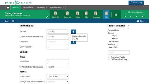
I wouldn't ever expect the client to be fully functional on a little smartphone
screen (although access to certain pieces would be really useful in a pinch),
but there are lots of scenarios where being able to use the majority of the
functions on a small tablet would be wonderful. I've also worked with library
staff who have poor vision and like their monitors to be set at extremely low
resolutions, and this type of behavior would be good for them as well.

(I like Jason's color-coding of the Cancel vs Save buttons as an additional
visual cue, too.)


Terran McCanna
PINES Program Manager
Georgia Public Library Service
1800 Century Place, Suite 150
Atlanta, GA 30345
404-235-7138
tmcca...@georgialibraries.org


----- Original Message -----
From: "Jason A Boyer" <jbo...@library.in.gov>
To: "Evergreen Discussion Group" <open-ils-general@list.georgialibraries.org>
Sent: Monday, July 13, 2015 8:23:07 AM
Subject: Re: [OPEN-ILS-GENERAL] Web Client Design - Fixed Page Elements?

I like this idea a lot, and I have a thought on how to avoid wasting a lot of
vertical space while doing it. I don't know how complex it would be since I
haven't looked at the angular code much, but if the save/cancel options could
take the place of the Check Out, Items Out, etc. options at the top that
wouldn't require any additional space. It would also make it clear that you've
chosen to edit this record and to move on to something else you need to either
choose to save it or abandon your changes. I would even go so far as to say
that I'd like to adopt the Android and iOS convention that the "data-loss"
(Cancel in this case) option be red while the Save option be blue like the
other interface elements. It's something I could see used in several places
(and possibly make the angular-ization of any interface that doesn't follow
this convention more desirable, possibly getting more hands involved, etc.)

Jason

--
Jason Boyer
Indiana State Library
http://library.in.gov/

From: Open-ils-general
[mailto:open-ils-general-boun...@list.georgialibraries.org] On Behalf Of Dan
Wells
Sent: Friday, July 10, 2015 3:14 PM
To: 'open-ils-general'
Subject: [OPEN-ILS-GENERAL] Web Client Design - Fixed Page Elements?

Hello all,

This came up in Kathy's recent thread asking about the patron editor, and
rather than hijack that thread, I'd like to broaden the conversation a little,
because the same usability issues will affect many areas of the staff client.

To cut straight to the point, I strongly believe that using fixed position for
large portions of the staff client interface will have a major positive effect
on usability.  This has been applied and proven in desktop applications for
decades, and is now being rediscovered within the browser environment as web
"pages" become applications.  There is plenty of evidence out there to support
this stance, but here is a quick read which highlights the point well:
http://www.smashingmagazine.com/2012/09/11/sticky-menus-are-quicker-to-navigate/

If we consider the mockups from our design internship a few months back, in the
screenshot Kathy referenced, the entire top area (and, in this case, the right
sidebar) would ideally be fixed position.  The only scrolling area should be
the actual form.  For any who attended my talk on design at the conference,
this is exactly the concern of rule of thumb #3: "Scroll the data, not the
interface", with "data" broadly including all information and workspaces which
are not "the program".  (Here is Kathy's screenshot link again for reference:
http://media.tumblr.com/69beec7802a938b889bdfa80c7e0d54b/tumblr_inline_nkn0okinXl1t572gy.png
 )

The main complaint driven at fixed screen elements is that they take up too
much space.  They do take up space, obviously, but with the amount of use these
elements get on a moment by moment basis, the space is well worth taking.  In
cases where more workspace is truly of benefit, we are better off using fixed
position with a "hide" option (auto or manual) than we would be with using
scroll, as we can retain the clear benefits of persistent availability and
predictability.  (Expert users might also choose to do without some toolbars
and rely on keyboard shortcuts, but that sort of use will never be feasible for
many staff client users and scenarios.)

As the Smashing Magazine article points out, the easiest way to understand the
situation is to simply imagine other software working with fully-scrolling
interfaces.  In this imaginary scenario, when you are using a word processor, a
spreadsheet application, or even a browser itself, all of your menus, toolbars,
tabs, etc., would simply scroll off the screen as soon as you tried to scroll
down to see additional content.  It's likely that some ancient desktop software
did exactly that, but if they did, they are now extinct, and not without good
reason.

Another valid concern sometimes raised is the effect a rich, fixed interface
might have on a small screen appliance, like a phone.  This topic should be
addressed, but I believe it is best kept separate from the problems at hand,
which are already large enough.  My personal stance would be that a full,
first-class staff client interface on a small screen device is not a realistic
concern for a community of our size, needs, and capabilities.  Our bar for
using the full client on phones should be "not impossible", and then we can
re-dedicate a portion of our energy to creating limited, purpose-built
interfaces for functions of known value on small devices (e.g. inventory
scanning), and which are also likely to best include some fixed top and/or
bottom elements.

I also want to emphasize that none if this is meant to disparage the work which
has been done so far.  It is much harder to make something out of nothing than
to take something and make it better.  I also acknowledge that, while I have
spent large amounts of time studying the web client, I have found zero time to
contribute to the actual web client code.  That said, if we can help establish
consensus around where we want to end up, I know I would feel more comfortable
jumping in, and I suspect others might as well.

Sincerely,
Dan


Daniel Wells
Library Programmer/Analyst
Hekman Library, Calvin College
616.526.7133