--- Begin Message ---
Feature Requests item #1743004, was opened at 2007-06-25 18:11
Message generated for change (Comment added) made by codelurker
You can respond by visiting:
https://sourceforge.net/tracker/?func=detail&atid=352915&aid=1743004&group_id=2915
Please note that this message will contain a full copy of the comment thread,
including the initial issue submission, for this request,
not just the latest update.
Category: None
Group: None
Status: Open
Priority: 5
Private: No
Submitted By: The Shady Watcher (codelurker)
Assigned to: Nobody/Anonymous (nobody)
Summary: Financial Charts
Initial Comment:
PLplot looks extremely promising. I am interested in using it as wxPlot.
Unfortunately, it lacks one of the three basic chart types that are on my
shopping list for a good charting library: financial charts - especially
candlestick ones (the other two being pie and line). Like scientific plotting,
the financial world has special needs too.
Ideally, good financial charts should include the following features:
1. Choice of chart type: line, OHLC, or candlestick.
2. A seperate volume chart below candlestick charts has been traditional since
medieval Japan, when candlestick charts were invented. Even so, this bottom
chart should be optional.
3. The candlesticks themselves should have adjustable widths and adjustable
wick widths. Ordinarily, you use one color for up days, and another for down
days; but for unknown reasons, the SharpCharts at stockcharts.com use three
colors. White candlesticks are often drawn as black outlines with black wicks,
but the wick does not continue through the body of the candle.
4. The ability to indicate buys and sells, often via green and red triangles
that point up and down, and which might appear either above or below the
candlesticks or data points.
5. Callout annotations: boxes with arrows pointing to individual candles allow
someone to point out individual features of the data.
6. Bollinger bands are very popular, but might be implemented with a simple
line chart which overlays the candlestick chart. Still, any indicators that
could be included would save programmers a lot of time recreating them: e.g.
stochastic oscillators, RSI, moving averages, etc. Moving averages and
Bollinger bands usually reside on the candlestick chart (although the former is
more often used with OHLC and line charts), whereas the other indicators
typically occur in additional windows below that. Although financial charts
can seem daunting, the matter can be simplified at first by supporting
indicators by simply allowing additional curves to be added either to the main
chart, or in a separate chart below the main one (which, of course, uses an
identical date axis, which may or may not be indicated for every chart which is
part of the plot).
Note that candlestick and OHLC charts do not typically need legends, as they
virtually all have only one data series. When more than one security (i.e.
stock) is charted, line charts are usually used.
----------------------------------------------------------------------
>Comment By: The Shady Watcher (codelurker)
Date: 2007-07-18 22:12
Message:
Logged In: YES
user_id=1541718
Originator: YES
In response to the request of arjenmarkus, I had composed a response which
I then posted to the general and development lists. I didn't even have
time to reply to arjenmarkus, nor post it here, since I was leaving on a
two week vacation, which I've just returned from. I got a message back
that my post awaited moderator approval. Apparently, it was not deemed
worthy, while my original posting, i.e. the initial feature request given
above, was admitted to the mailing list, although I NEVER POSTED IT THERE!
Whatever. In any event, here is the post with additional information that
I tried to post to the mailing list, which never made it:
*** BEGIN MAILING LIST MESSAGE ***
To all programmers engaged in the development for
PLPlot,
I made a feature request for financial charts on
SourceForge, as Feature Request item #1743004. Arjen
Markus (arjenmarkus) suggested I add some examples and
post the request to the PLPlot mailing list on
SourceForge, so here it is.
What follows then is my original request, interspersed
with examples, and a few embelishments & corrections:
------------------------------------------------------
PLPlot looks extremely promising. I am interested in
using it via the wxWidget wrapper that now comes
standard as part of its distribution. Unfortunately,
it lacks one of the three basic chart types that are
on my shopping list for a good charting library:
financial charts - especially candlestick ones (the
other two on my list being simple pie and line). Like
scientific plotting, the financial world has its
special needs too.
Ideally, good financial charts should include the
following features:
1. Choice of chart type: line, OHLC, or candlestick.
An example of these can be seen on MarketWatch.
(Ignore the box below the main chart. It is for
volume, which will be discussed presently. Also, I am
not asking for widgets to change chart settings with.)
You may have to take the following addresses, into
which Yahoo mail has inserted newlines, and make them
single line.
Line chart:
http://www.marketwatch.com/tools/quotes/intchart.asp?submitted=true&intflavor=advanced&symb=RIMM&origurl=%2Ftools%2Fquotes%2Fintchart.asp&time=7&freq=1&startdate=&enddate=&hiddenTrue=&comp=Enter+Symbol%28s%29%3A&compidx=aaaaa%7E0&compind=aaaaa%7E0&uf=0&ma=0&maval=50&lf=0&lf2=0&lf3=0&type=64&size=2&optstyle=1013
OHLC (stands for Open, High, Low, Close) chart:
http://www.marketwatch.com/tools/quotes/intchart.asp?submitted=true&intflavor=advanced&symb=RIMM&origurl=%2Ftools%2Fquotes%2Fintchart.asp&time=7&freq=1&startdate=&enddate=&hiddenTrue=&comp=Enter+Symbol%28s%29%3A&compidx=aaaaa%7E0&compind=aaaaa%7E0&uf=0&ma=0&maval=50&lf=0&lf2=0&lf3=0&type=2&size=2&optstyle=1013
(Note that the small ticks on the left of the bars
represent open, on the right - close, and the tops and
bottoms of the bars represent the high and low.
Sometimes these are lines, and sometimes small
triangles pointing right and left.)
Candlestick chart:
http://www.marketwatch.com/tools/quotes/intchart.asp?submitted=true&intflavor=advanced&symb=RIMM&origurl=%2Ftools%2Fquotes%2Fintchart.asp&time=5&freq=1&startdate=&enddate=&hiddenTrue=&comp=Enter+Symbol%28s%29%3A&compidx=aaaaa%7E0&compind=aaaaa%7E0&uf=0&ma=0&maval=50&lf=0&lf2=0&lf3=0&type=4&size=2&optstyle=1013
Note that the time scale has been shortened to improve
the visibility of the individual candlesticks. You
often may have been looking at a candlestick chart in
the past and not realized it, since when there are a
lot of data points, they begin to look a lot like OHLC
charts – sometimes referred to as bar charts (although
these are not simple bar charts either).
2. A separate volume chart below candlestick charts
has been traditional since medieval Japan, when
candlestick charts were invented. Even so, this
bottom chart should be optional.
Here is a candlestick chart with volume:
http://www.marketwatch.com/tools/quotes/intchart.asp?submitted=true&intflavor=advanced&symb=RIMM&origurl=%2Ftools%2Fquotes%2Fintchart.asp&time=5&freq=1&startdate=&enddate=&hiddenTrue=&comp=Enter+Symbol%28s%29%3A&compidx=aaaaa%7E0&compind=aaaaa%7E0&uf=0&ma=0&maval=50&lf=1&lf2=0&lf3=0&type=4&size=2&optstyle=1013
White candlesticks are often drawn as black outlines
with black “wicks”, but the wick does not continue
through the body of the candle. This rule is better
rephrased as the candle is only drawn in outline if
its color matches the background color. Candles with
closes lower than the previous day's close are
typically shown in red or black.
3. The candlesticks themselves should have adjustable
widths and adjustable wick widths; in addition to
width adjustments due to number of data points.
Ordinarily, you use one color for up days and another
for down days; but for unknown reasons, the
SharpCharts at StockCharts.com use three colors.
These candles are probably the proverbial "spinning
tops", i.e. days without much action, and are often
not much use to what are referred to as "technical
investors" (i.e. those who use charting indicators a
lot).
Here's an example of candlesticks with three colors:
http://stockcharts.com/h-sc/ui?s=RIMM&p=D&yr=0&mn=6&dy=0&id=p63977164402
You might think of having a table of values of Date,
Open, High, Low, Close and Volume data with an
additional field(s) for candle/bar color.
Alternately, the developer might pass a pointer to a
table containing Date, Open, High, Low, Close and
Volume (although another field, used by Yahoo
historical data, Adj. Close, is also a common way to
store stock data) with an index and number of points,
or alternately use start and end dates, with
additional data to indicate the colors of the bars.
Again, a candle with any other color than the
background (usually white) should have a solid body,
but should be drawn in outline (black or white) if its
color matches the background.
4. The ability to indicate buys and sells, often via
green and red triangles that point up and down, and
which might appear either above or below the
candlesticks or data points. A green triangle or
arrow, either above or below a candle indicates a buy,
and a red indicates a sell. Sometimes other colors
are used for buy and sell indicators. Here's an
example of buy and sell indicators:
http://www.stockneuromaster.com/snm-sc.htm
Note that here are extra lines above and below the
candles in this example that are neither data points
nor buy and sell indicators (per se), but will be
discussed below. In this example, he is using an up
triangle to indicate a buy, a down one to indicate a
sell, and a grey one to indicate a less strong signal.
It also has buys above the candlesticks and sells
below them, although it is not uncommon to have both
above or both below. The grey triangles are rather
unusual here. Also, sometimes arrows are used in
place of triangles:
http://www.tradestation.com/strategy_testing/st_creation.shtm
It is somewhat unusual to have text above and below
buy and sell signals, as shown in this last example,
but text overlays will probably be possible.
5. Callout annotations: boxes with arrows pointing to
individual candles allow someone to point out
individual features of the data. There may already be
such a facility in PLPlot. Here's an example of this:
http://stockcharts.com/def/servlet/Favorites.CServlet?obj=ID418831
Note that the callouts here (i.e. the text boxes) have
pointers which appear to be part of the box. Simple
arrows should suffice for this. Also visible in these
charts are A, B & C as well as 1, 2, 3 & 4 annotations
above individual data points. While these characters
above various data points are important, and may be go
higher than C or 4, they are virtually always one
character. There are no text boxes or pointers
associated with this sort of callout. This also might
simply be handled by adding text annotations and
arrows to a chart.
6. Bollinger bands are very popular, but might be
implemented with a simple line chart which overlays
the candlestick chart. They run above and below the
chart, and typically indicate a band where the stock
price had been expected to be to the second standard
deviation. You can see an example of them here:
http://www.stockneuromaster.com/snm-sc.htm
Still, any indicators that could be included would
save programmers a lot of time recreating them. Moving
averages and Bollinger bands usually reside on the
chart itself, with the same scale. Other indicators,
such as stochastic oscillators, RSI and MACD typically
occur in additional windows below the main chart and
any volume chart. Although financial indicators can
seem daunting, the matter can be simplified at first
by supporting indicators by allowing additional curves
to be added either to the main chart, or in a separate
chart below the main one (which, of course, uses an
identical date X axis, which may or may not be
indicated for every chart which is part of the plot).
Most of the indicators at Yahoo Finance, Market Watch
and StockCharts.com are on most financial charting
applications, although it is not unusual for a website
or application to have a few additional indicators
that others do not. Also, most indicators, can be
calculated from the widely available Open, High, Low,
Close and Volume data; but some rely on extra data,
such as short interest indicators or P/E. Virtually
all indicators have a handful of numbers that are used
to indicate things like the time frame certain
averages should be calculated for. Moving averages
also might be exponential moving averages (EMA’s).
Lists of commonly supported indicators can be seen
here:
http://www.marketwatch.com/tools/quotes/intchart.asp?submitted=true&intflavor=advanced&symb=RIMM&origurl=%2Ftools%2Fquotes%2Fintchart.asp&time=5&freq=1&startdate=&enddate=&hiddenTrue=&comp=Enter+Symbol%28s%29%3A&compidx=aaaaa%7E0&compind=aaaaa%7E0&uf=0&ma=0&maval=50&lf=1&lf2=0&lf3=0&type=4&size=2&optstyle=1013
in the upper and lower indicator drop down listboxes,
as well as here:
http://stockcharts.com/h-sc/ui?s=rimm
and a somewhat more modest set is here:
http://finance.yahoo.com/q/ta?s=RIMM
Good definitions for how to implement these various
indicators are here:
http://stockcharts.com/school/doku.php?id=chart_school:technical_indicators
The MACD indicator is displayed differently than other
indicators, in that it typically consists of two lines
and a histogram, i.e. a bar chart that helps one more
clearly see when one line crosses the other. Here's a
typical MACD display:
http://stockcharts.com/h-sc/ui?s=RIMM&p=D&yr=0&mn=6&dy=0&id=p15420596630
Again, while the multiplicity of indicators may seem
daunting, all can be supported by merely allowing line
charts to overlay the main chart (such as a
candlestick one), or additional charts to be added
below the main one; at least to begin with. Note that
on such financial charts, the X date axis is identical
for all charts and indicators.
Note that candlestick and OHLC charts do not typically
need legends, as they virtually all have only one data
series (i.e. stock). When more than one security (=
stock) is charted, line charts are usually used, and
then, a legend may be appropriate. Alternately, the
stock symbol, or the final value, may be indicated
immediately to the right of where a data series meets
the right edge of the plotting area. Other common
annotations are a "D" either above or below a data
point, to indicate a dividend (usually above), or an
"S" above or below to indicate a stock split (again,
usually above). A developer may wish to present the
user with a choice of stock prices with splits and
dividends indicated, or alternately with them
accounted for in the stock price, in which case the
Adj. Price may be plotted from stock data. Probably
the most popular source of stock data is Yahoo
Finance:
http://finance.yahoo.com/q/hp?s=RIMM
While it might seem tempting to rely on Yahoo for
stock price data at plot time, programmers and
investors will want to maintain their own collections
of stock price data; as different sources vary widely
in their accuracy, and whether they account for
splits, dividends, and dead tickers or not.
Another common financial chart is the growth of
$10,000 in a given time period. While there may be
multiple lines for various stocks on such a chart, it
is typically shown as a simple line chart. The only
thing special it might need is the ability to indicate
the stock ticker symbol where a line meets the right
side of the plot area to the immediate right of the
plot area, or the final value for each stock or
holding. It is not unusual for these to overwrite
each other, in which case the user will generally
select a chart with fewer symbols. They may also
overwrite axis tick marks and labels. They are often
in colored text, or white or black text with colored
backgrounds, with the color matching the lines for the
symbols. Unfortunately, an example of such a chart
currently escapes me. A legend is another common way
of identifying stocks that should also work for a
growth of $10,000 chart.
Financial charts may also have overlays like
regression channels Eliot waves, or Fibernaci rings.
Programmers will probably be happy to add them if they
need them, so long as lines and arcs can overlay a
chart in the chart's coordinates.
There are probably hundreds of other charts used in
investing and finance, such as point and figure charts
and market maps, but stock charts with lines, OHLC
bars or candlesticks, with indicators and other
annotations, are probably the most crucial common
charts which are currently missing from PLPlot, that
one looks for in a good graphics package.
P.S.: This was not part of my original reply, is
similar to showing the ticker on the Y-Axis, for which
an example of which was lacking. Here, it is the
final values of the curves shown on the Y-Axis, not the
stock ticker:
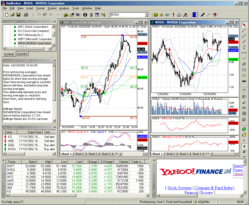
http://www.amibroker.com/gifs/full4.gif
Here's a simple example in a rival application, Ploticus, although
Ploticus
is GPL instead of LGPL, and has no wxWidget interface:
http://doc.mdcc.cx/doc/ploticus/html/gallery/candlesticks.htm
----------------------------------------------------------------------
Comment By: Arjen Markus (arjenmarkus)
Date: 2007-06-29 06:53
Message:
Logged In: YES
user_id=400048
Originator: NO
Would you have any examples of such plots? (Most of the developers have a
scientific rather than a financial background, so we are not familiar
with
the plots you describe).
Another point: we use the plplot-devel and plplot-general mailing lists
much more than the bug tracker/request system. Could you repost this
on either list? [EMAIL PROTECTED] or
plplot-devel@lists.sourceforge.net
That way more people will see your request and perhaps there are a few
people
who have code available for this type of plots.
----------------------------------------------------------------------
You can respond by visiting:
https://sourceforge.net/tracker/?func=detail&atid=352915&aid=1743004&group_id=2915
--- End Message ---