Dear all,
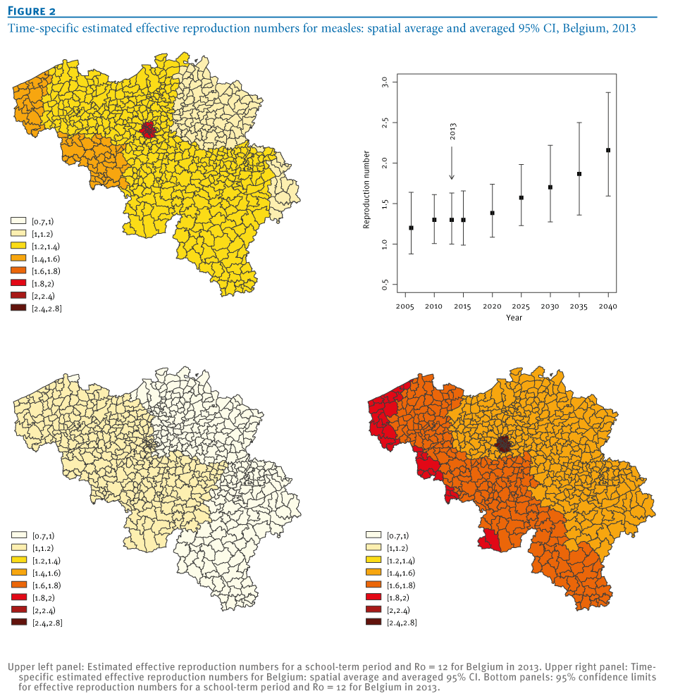
I am quite new to R and have a question related to making graphs based on
postal codes.

I have a dateset in which each element has a postal code in Belgium,
dataset$zip. There are some other attributes like the exposure in days,
dataset$exposure.

I would like to make a plot of the map of Belgium, with for different ranges of
exposures different colors per postal code. It could for example resemble
something like this (not the upper right graph):

[http://www.eurosurveillance.org/images/dynamic/EE/V20N01/Hens_fig2.png]


How can I achieve this?


Thanks in advance,

Bestregards,

Isa-May

        [[alternative HTML version deleted]]

_______________________________________________
R-sig-Geo mailing list
R-sig-Geo@r-project.org
https://stat.ethz.ch/mailman/listinfo/r-sig-geo