 >
 >
 >Create 5 CDEFs, each acting on its own range.  For instance:
 >
 >20 and less: CDEF:C1=value,20,LE,value,UNKN,IF
 >20-40:       CDEF:C2=value,20,40,LIMIT
 >40-60:       CDEF:C3=value,40,60,LIMIT
 >60-80:       CDEF:C4=value,60,80,LIMIT
 >80 and more: CDEF:C5=value,80,GE,value,UNKN,IF
 >
 >Each CDEF is unknown if it is outside the specified range.
 >
 >Now plot them:
 >
 >AREA:C5#FF0000:color5
 >AREA:C4#0FF000:color4
 >AREA:C3#00FF00:color3
 >AREA:C2#000FF0:color2
 >AREA:C1#0000FF:color1
 >
 >You can make it more complex, using a lot of if-then-else, you can
 >stack area's upon the previous one, etc.  But these are the basics.
 >
 >
 >HTH
 >--
 >Alex van den Bogaerdt
 >http://www.vandenbogaerdt.nl/rrdtool/
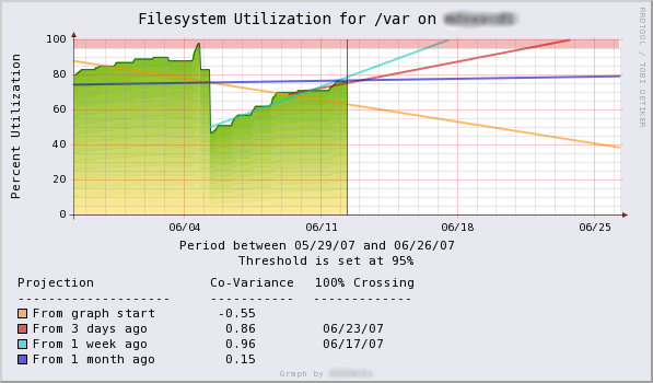
Hi Alex!

It's not exactly what I would create.
This creates a graph with different colors, but where the values goes over 60
(in example), it takes the same color from 0 to over 60 and not 4
different colors.
I would like someting like this:

http://oss.oetiker.ch/rrdtool/gallery/fsu_predict.png

It's shown into RRDTool Gallery.

I ASCII something like this:


100|        C
080|      BBBBB     BB
060|     AAAAAAA    AA
040|    ZZZZZZZZ    ZZZZ    Z
020|  YYYYYYYYYY    YYYY    Y
000|XXXXXXXXXXXXXXXXXXXXXXXXX


hope the ASCII will be shown correctly afer sending the mail ;)

Any Ideas?

Thank's!

Simon

_______________________________________________
rrd-users mailing list
rrd-users@lists.oetiker.ch
https://lists.oetiker.ch/cgi-bin/listinfo/rrd-users