[GitHub] [apisix-website] 1502shivam-singh commented on pull request #214: fix: additional increase in button size due to #213
1502shivam-singh commented on pull request #214:
URL: https://github.com/apache/apisix-website/pull/214#issuecomment-789555248


   > In m- y opinion, use full-width buttons in this hero section will improve
20% of UI, not use full-width buttons will improve 3% of UX, I won't trade 20%
UI improvement for 3% UX improvement.

   Those numbers are actually pretty ambiguous and biased towards your case.
For some user they can be reversed too.

   @qier222 By the way did you try my centered button solution above with some
top margin. As I said, it solves of both ours's problems.

   Still if you insist, so much I don't really have much of objection with
full-width CTA, it's your call.


This is an automated message from the Apache Git Service.
To respond to the message, please log on to GitHub and use the
URL above to go to the specific comment.

For queries about this service, please contact Infrastructure at:
us...@infra.apache.org
[GitHub] [apisix-website] 1502shivam-singh commented on pull request #214: fix: additional increase in button size due to #213
1502shivam-singh commented on pull request #214:
URL: https://github.com/apache/apisix-website/pull/214#issuecomment-789130107


   Extra top margin to separate the left aligned slogan and subtitle with the
centered buttons. Keeping them distant will make the hero section look better,
as then alignment-flow wouldn't be a problem (both sections are separate now).


This is an automated message from the Apache Git Service.
To respond to the message, please log on to GitHub and use the
URL above to go to the specific comment.

For queries about this service, please contact Infrastructure at:
us...@infra.apache.org
[GitHub] [apisix-website] 1502shivam-singh commented on pull request #214: fix: additional increase in button size due to #213
1502shivam-singh commented on pull request #214: URL: https://github.com/apache/apisix-website/pull/214#issuecomment-789118205 Also, if I am right you have issue that the button is left aligned but the text is centered. > > How about this (initially I was trying not to change too much of the original design as he/she must have had their thoughts behind it, but now I feel you are fine with it. So here we go ) > > 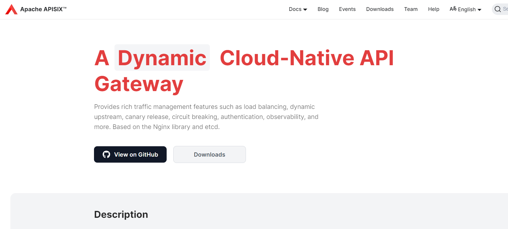 > > I removed the Apisix title, as it looked repeated (written in navbar too), Increased the font size for highest focus, and changed its color to match the color scheme. > > Made the text wrap, as the sub head copywriting is too long, reader might lose his eye position in the middle. > > Also made the buttons a little thinner, for best results > > On mobile - > > 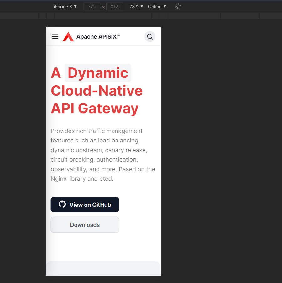 > > Sorry for the slow response. > > I designed this page, I was planning to make the logo on the navbar hidden when the logo in the hero section is visible, but I haven't done this. I think you can remove the logo in the hero section now. > > The "View on GitHub" and "Downloads" buttons are center-aligned inside and left-aligned outside, looks weird to me, I still think make these buttons full-screen wide is a better option. Maybe we can center align the slogan on mobile devices? then I have a solution that can serve both of ours's needs. **Which is to Center align the buttons**. Then your issue is solved and I have my white space too. You like this @qier222 This is an automated message from the Apache Git Service. To respond to the message, please log on to GitHub and use the URL above to go to the specific comment. For queries about this service, please contact Infrastructure at: us...@infra.apache.org
[GitHub] [apisix-website] 1502shivam-singh commented on pull request #214: fix: additional increase in button size due to #213
1502shivam-singh commented on pull request #214:
URL: https://github.com/apache/apisix-website/pull/214#issuecomment-789114048


   No no no, you are getting my point wrong here, I am not saying it that we
should stop using clickable lists or surface that can click and we have to
scroll over them. I am saying that **if we can solve the problem for that
particular person easily without much loss** (phone has bad touch) then why not
do it? **The email list example is actually a problem for that user**, but we
can't do much about it as its designed already, and also this doesn't mean the
app has bad UX.

   There is a simple solution for the above problem, give user space with
non-clickable elements, and this solution doesn't really hurt the structure of
the hero section.

   Sure, users can have the worst phones, with the worst problems and we will
surely not be able to solve all of them. "**But if we can solve the problems
that are visible to us then why not solve them?**" This is my point


This is an automated message from the Apache Git Service.
To respond to the message, please log on to GitHub and use the
URL above to go to the specific comment.

For queries about this service, please contact Infrastructure at:
us...@infra.apache.org
[GitHub] [apisix-website] 1502shivam-singh commented on pull request #214: fix: additional increase in button size due to #213
1502shivam-singh commented on pull request #214: URL: https://github.com/apache/apisix-website/pull/214#issuecomment-789058506 Also, sometimes we should not just focus only on making the stuff "look good". **Don't get me wrong, beautiful UI is Paramount**, but I feel we should hit the middle ground between top-class UI and top-class UX. The reason I gave for not to put full-width buttons is a UX focussed decision, mistouch is possible on full-width buttons, (Especially when you have a phone with a bad touch screen, as my brother's phone , and you just don't change it for some weird reason and you code too. **This leads to a bad UX for that person**) and more chances when you have **2 of them**. We should try to avoid these issues, especially when they feel minimal. This is one reason why we don't see full-width buttons more often, if used they have some special reason for usage. Also, the fact that we have to focus on button widths to make our hero section look good, is an indicator that our hero section lacks a focal point. This is an automated message from the Apache Git Service. To respond to the message, please log on to GitHub and use the URL above to go to the specific comment. For queries about this service, please contact Infrastructure at: us...@infra.apache.org
[GitHub] [apisix-website] 1502shivam-singh commented on pull request #214: fix: additional increase in button size due to #213
1502shivam-singh commented on pull request #214: URL: https://github.com/apache/apisix-website/pull/214#issuecomment-789025861 > > > Looks good on my phone樂 >  I don't have any issue with keeping the buttons, not full width. It's just that we have to decide on one thing and follow it, not deviate from it. You designed the website previously and I was just respecting your judgment . If all agree, and this is final then I am fine with it completely . This is an automated message from the Apache Git Service. To respond to the message, please log on to GitHub and use the URL above to go to the specific comment. For queries about this service, please contact Infrastructure at: us...@infra.apache.org
[GitHub] [apisix-website] 1502shivam-singh commented on pull request #214: fix: additional increase in button size due to #213
1502shivam-singh commented on pull request #214: URL: https://github.com/apache/apisix-website/pull/214#issuecomment-789022767 > > >  > > Also, how about making this part align from two sides? @juzhiyuan did you mean this -  Justify alignment can mess up things sometimes. To be honest we are solving an interesting design problem, which is to make a section look good with a minimal number of extra elements added, just typography. This is an automated message from the Apache Git Service. To respond to the message, please log on to GitHub and use the URL above to go to the specific comment. For queries about this service, please contact Infrastructure at: us...@infra.apache.org
[GitHub] [apisix-website] 1502shivam-singh commented on pull request #214: fix: additional increase in button size due to #213
1502shivam-singh commented on pull request #214: URL: https://github.com/apache/apisix-website/pull/214#issuecomment-789019165 @qier222 This one looks good to me. > > > How about this? > > https://user-images.githubusercontent.com/68148142/109617775-c580b700-7b71-11eb-8f24-cf3ac78c688e.png;> For the rest, you designed the page previously, and the buttons were left-aligned previously too with text-centered, so you must have had some thought behind it then. I am just following that flow, what I feel your thought would be is to keep the buttons left aligned because the section itself is left-aligned, the best example of a similar website-hero-section is the stripe website - 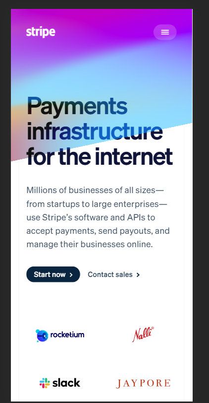 I guess we should first decide on one layout for the hero, then extend further on it. Full-width CTA buttons I have discussed earlier too for left-aligned sections. **This I agree on that a center-aligned hero section would support full-width buttons better** [Github](https://github.com/) website is an example, but they also have it because one field requires an email for which it's full width and the button below it is full width to match the field width for uniformity. Also, something I noticed is when this section is center aligned, the animating text breaks the layout every transition (Try it, you will see), it's just noisy seeing that "A" move around . This is an automated message from the Apache Git Service. To respond to the message, please log on to GitHub and use the URL above to go to the specific comment. For queries about this service, please contact Infrastructure at: us...@infra.apache.org
[GitHub] [apisix-website] 1502shivam-singh commented on pull request #214: fix: additional increase in button size due to #213
1502shivam-singh commented on pull request #214:
URL: https://github.com/apache/apisix-website/pull/214#issuecomment-787947127


   Guys have encountered a problem while pushing to this branch. Created a new
pull request
[PR](https://github.com/apache/apisix-website/pull/222#issue-582052786) for
this integration. Please merge that pull request after reviewing. @juzhiyuan
@gxthrj


This is an automated message from the Apache Git Service.
To respond to the message, please log on to GitHub and use the
URL above to go to the specific comment.

For queries about this service, please contact Infrastructure at:
us...@infra.apache.org
[GitHub] [apisix-website] 1502shivam-singh commented on pull request #214: fix: additional increase in button size due to #213
1502shivam-singh commented on pull request #214:
URL: https://github.com/apache/apisix-website/pull/214#issuecomment-787853261


   Wait a bit, just let me push these changes to the branch


This is an automated message from the Apache Git Service.
To respond to the message, please log on to GitHub and use the
URL above to go to the specific comment.

For queries about this service, please contact Infrastructure at:
us...@infra.apache.org
[GitHub] [apisix-website] 1502shivam-singh commented on pull request #214: fix: additional increase in button size due to #213
1502shivam-singh commented on pull request #214: URL: https://github.com/apache/apisix-website/pull/214#issuecomment-787831019 @juzhiyuan what's your feedback to these edits and the mobile screenshot in this one > How about this (initially I was trying not to change too much of the original design as he/she must have had their thoughts behind it, but now I feel you are fine with it. So here we go ) > >  > > I removed the Apisix title, as it looked repeated (written in navbar too), Increased the font size for highest focus and changed its color to match the color scheme. > > Made the text wrap, as the sub head copywriting is too long, reader might lose his eye position in the middle. > > Also made the buttons a little thinner, for best results > > On mobile - > >  This is an automated message from the Apache Git Service. To respond to the message, please log on to GitHub and use the URL above to go to the specific comment. For queries about this service, please contact Infrastructure at: us...@infra.apache.org
[GitHub] [apisix-website] 1502shivam-singh commented on pull request #214: fix: additional increase in button size due to #213
1502shivam-singh commented on pull request #214: URL: https://github.com/apache/apisix-website/pull/214#issuecomment-787828897 Yup, your orgs website is failing on this point of accessibility. The API architecture image is just not clear to see at the size which it is currently at. Also the hero section feels empty at the moment , and the copywriting on hero section and other sections can be made smaller and concise. This is an automated message from the Apache Git Service. To respond to the message, please log on to GitHub and use the URL above to go to the specific comment. For queries about this service, please contact Infrastructure at: us...@infra.apache.org
[GitHub] [apisix-website] 1502shivam-singh commented on pull request #214: fix: additional increase in button size due to #213
1502shivam-singh commented on pull request #214: URL: https://github.com/apache/apisix-website/pull/214#issuecomment-787437781 How about this (initially I was trying not to change too much of the original design as he/she must have had their thoughts behind it, but now I feel you are fine with it. So here we go )  I removed the Apisix title, as it looked repeated (written in navbar too), Increased the font size for highest focus and changed its color to match the color scheme. Made the text wrap, as the sub head copywriting is too long, reader might lose his eye position in the middle. Also made the buttons a little thinner, for best results On mobile -  This is an automated message from the Apache Git Service. To respond to the message, please log on to GitHub and use the URL above to go to the specific comment. For queries about this service, please contact Infrastructure at: us...@infra.apache.org
[GitHub] [apisix-website] 1502shivam-singh commented on pull request #214: fix: additional increase in button size due to #213
1502shivam-singh commented on pull request #214: URL: https://github.com/apache/apisix-website/pull/214#issuecomment-787426072 Didn't get the statement "buttons are bigger than logo and slogan" . By slogan do you mean "A...Gateway" ? And the button widths looks fine to me, they are big enough to drag user attention. Do you have issues with the width of the "downloads" button ? This is an automated message from the Apache Git Service. To respond to the message, please log on to GitHub and use the URL above to go to the specific comment. For queries about this service, please contact Infrastructure at: us...@infra.apache.org
[GitHub] [apisix-website] 1502shivam-singh commented on pull request #214: fix: additional increase in button size due to #213
1502shivam-singh commented on pull request #214: URL: https://github.com/apache/apisix-website/pull/214#issuecomment-787414263 Oe Oe Oe! 藍藍 Run down your scales on this one, then 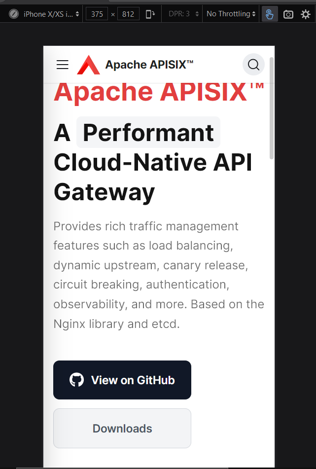 This is an automated message from the Apache Git Service. To respond to the message, please log on to GitHub and use the URL above to go to the specific comment. For queries about this service, please contact Infrastructure at: us...@infra.apache.org