[GitHub] [apisix-website] qier222 commented on pull request #214: fix: additional increase in button size due to #213
qier222 commented on pull request #214:
URL: https://github.com/apache/apisix-website/pull/214#issuecomment-789429091


   In my opinion, use full-width buttons in this hero section will improve 20%
of UI, not use full-width buttons will improve 3% of UX, I won't trade 20% UI
improvement for 3% UX improvement.


This is an automated message from the Apache Git Service.
To respond to the message, please log on to GitHub and use the
URL above to go to the specific comment.

For queries about this service, please contact Infrastructure at:
us...@infra.apache.org
[GitHub] [apisix-website] qier222 commented on pull request #214: fix: additional increase in button size due to #213
qier222 commented on pull request #214: URL: https://github.com/apache/apisix-website/pull/214#issuecomment-789079456 > Also, sometimes we should not just focus only on making the stuff "look good". **Don't get me wrong, beautiful UI is Paramount**, but I feel we should hit the middle ground between top-class UI and top-class UX. > > The reason I gave for not to put full-width buttons is a UX focussed decision, mistouch is possible on full-width buttons, (Especially when you have a phone with a bad touch screen, as my brother's phone , and you just don't change it for some weird reason and you code too. **This leads to a bad UX for that person**) and more chances when you have **2 of them**. > > We should try to avoid these issues, especially when they feel minimal. This is one reason why we don't see full-width buttons more often, if used they have some special reason for usage. > > Also, the fact that we have to focus on button widths to make our hero section look good, is an indicator that our hero section lacks a focal point. I get your point, but I don't think use full-width buttons will have a large impact on UX. Your example is your brother's phone has a bad touch screen, it does not make much sense to me, is the phone make the UX worst, not the application. Email app has an email list, and every list item is clickable. If a phone with a bad screen can cause mistouch the full-width buttons on a website, then it definitely can cause mistouch on an email list or any clickable list, does it mean we should stop using clickable list? This is an automated message from the Apache Git Service. To respond to the message, please log on to GitHub and use the URL above to go to the specific comment. For queries about this service, please contact Infrastructure at: us...@infra.apache.org
[GitHub] [apisix-website] qier222 commented on pull request #214: fix: additional increase in button size due to #213
qier222 commented on pull request #214: URL: https://github.com/apache/apisix-website/pull/214#issuecomment-789030107 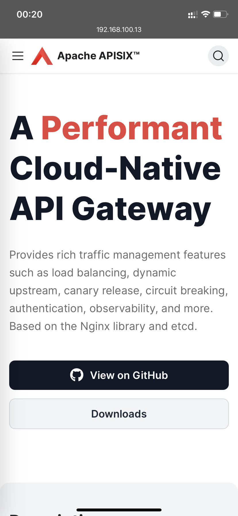 This is an automated message from the Apache Git Service. To respond to the message, please log on to GitHub and use the URL above to go to the specific comment. For queries about this service, please contact Infrastructure at: us...@infra.apache.org
[GitHub] [apisix-website] qier222 commented on pull request #214: fix: additional increase in button size due to #213
qier222 commented on pull request #214: URL: https://github.com/apache/apisix-website/pull/214#issuecomment-789022611 Looks good on my phone樂 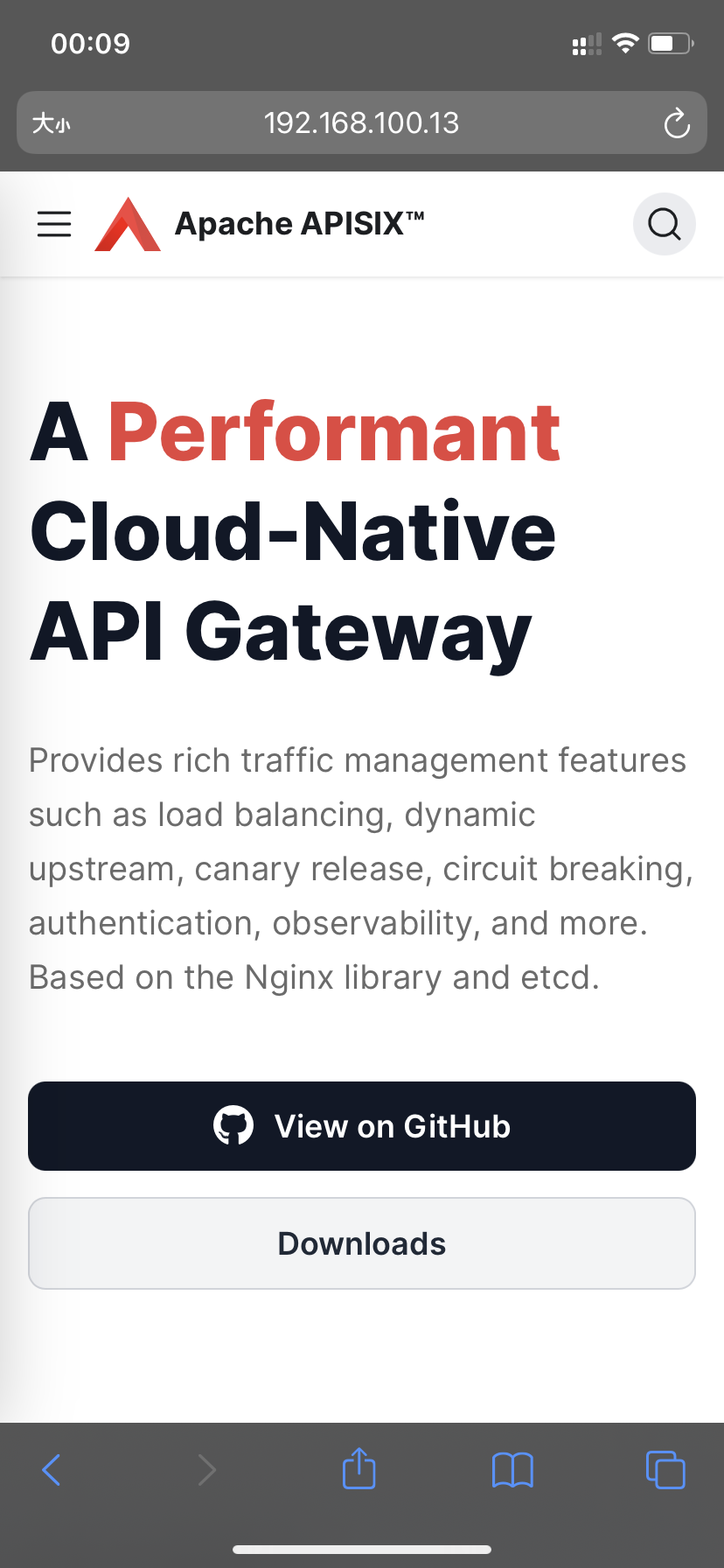 This is an automated message from the Apache Git Service. To respond to the message, please log on to GitHub and use the URL above to go to the specific comment. For queries about this service, please contact Infrastructure at: us...@infra.apache.org
[GitHub] [apisix-website] qier222 commented on pull request #214: fix: additional increase in button size due to #213
qier222 commented on pull request #214:
URL: https://github.com/apache/apisix-website/pull/214#issuecomment-788708321


   How about this?

   https://user-images.githubusercontent.com/68148142/109617775-c580b700-7b71-11eb-8f24-cf3ac78c688e.png;>


This is an automated message from the Apache Git Service.
To respond to the message, please log on to GitHub and use the
URL above to go to the specific comment.

For queries about this service, please contact Infrastructure at:
us...@infra.apache.org
[GitHub] [apisix-website] qier222 commented on pull request #214: fix: additional increase in button size due to #213
qier222 commented on pull request #214: URL: https://github.com/apache/apisix-website/pull/214#issuecomment-788648424 > How about this (initially I was trying not to change too much of the original design as he/she must have had their thoughts behind it, but now I feel you are fine with it. So here we go ) > > 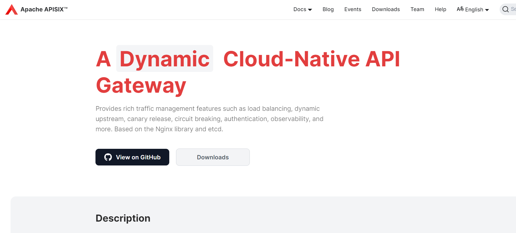 > > I removed the Apisix title, as it looked repeated (written in navbar too), Increased the font size for highest focus, and changed its color to match the color scheme. > > Made the text wrap, as the sub head copywriting is too long, reader might lose his eye position in the middle. > > Also made the buttons a little thinner, for best results > > On mobile - > > 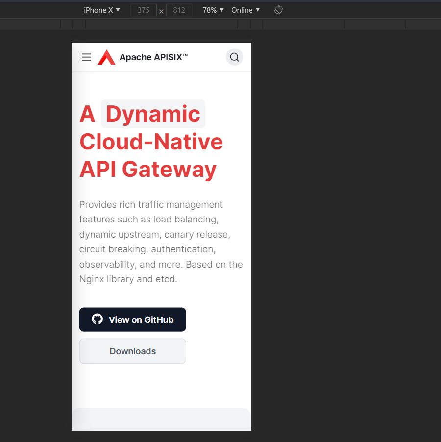 Sorry for the slow response. I designed this page, I was planning to make the logo on the navbar hidden when the logo in the hero section is visible, but I haven't done this. I think you can remove the logo in the hero section now. The "View on GitHub" and "Downloads" buttons are center-aligned inside and left-aligned outside, looks weird to me, I still think make these buttons full-screen wide is a better option. Maybe we can center align the slogan on mobile devices? This is an automated message from the Apache Git Service. To respond to the message, please log on to GitHub and use the URL above to go to the specific comment. For queries about this service, please contact Infrastructure at: us...@infra.apache.org
[GitHub] [apisix-website] qier222 commented on pull request #214: fix: additional increase in button size due to #213
qier222 commented on pull request #214: URL: https://github.com/apache/apisix-website/pull/214#issuecomment-787431578 The height of the "View on GitHub" button is higher than the "A Dynamic Cloud-Native API Gateway" text, and the "View on GitHub" is almost black, attract way too much attention than the slogan text and brand text. 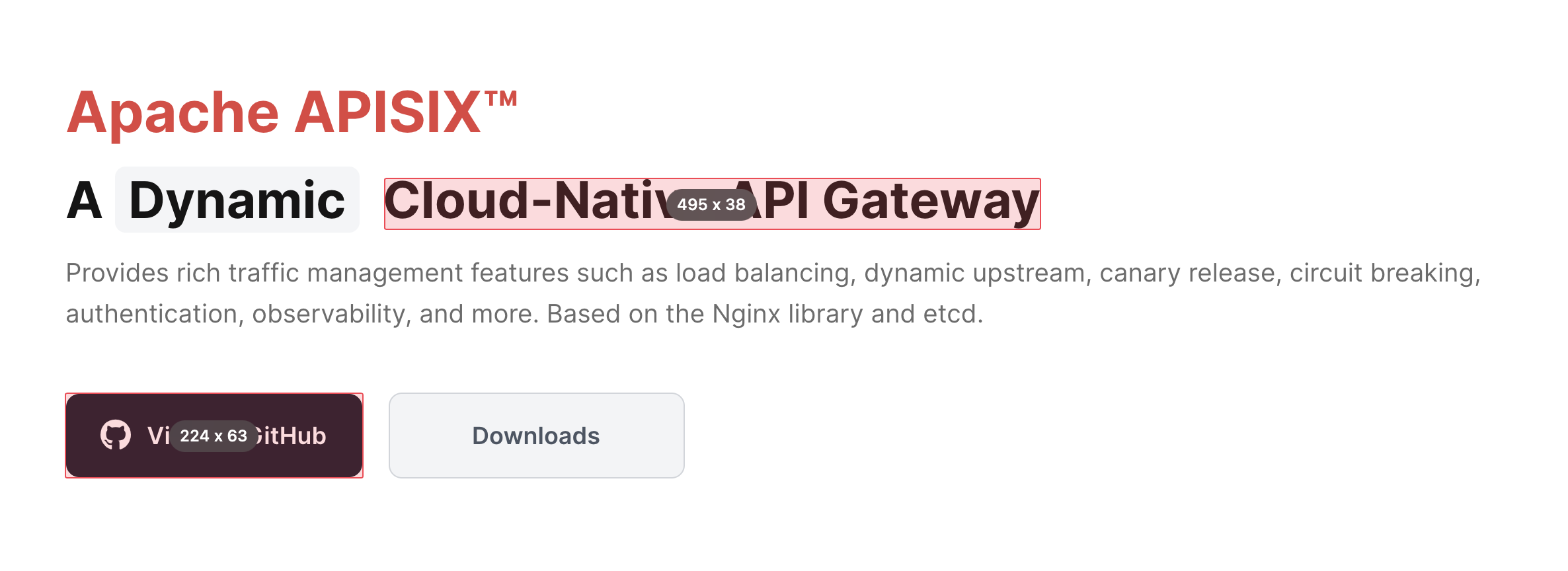 Here is some example how other designers handle slogan and primary button.   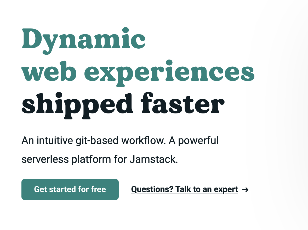 This is an automated message from the Apache Git Service. To respond to the message, please log on to GitHub and use the URL above to go to the specific comment. For queries about this service, please contact Infrastructure at: us...@infra.apache.org
[GitHub] [apisix-website] qier222 commented on pull request #214: fix: additional increase in button size due to #213
qier222 commented on pull request #214: URL: https://github.com/apache/apisix-website/pull/214#issuecomment-787422691 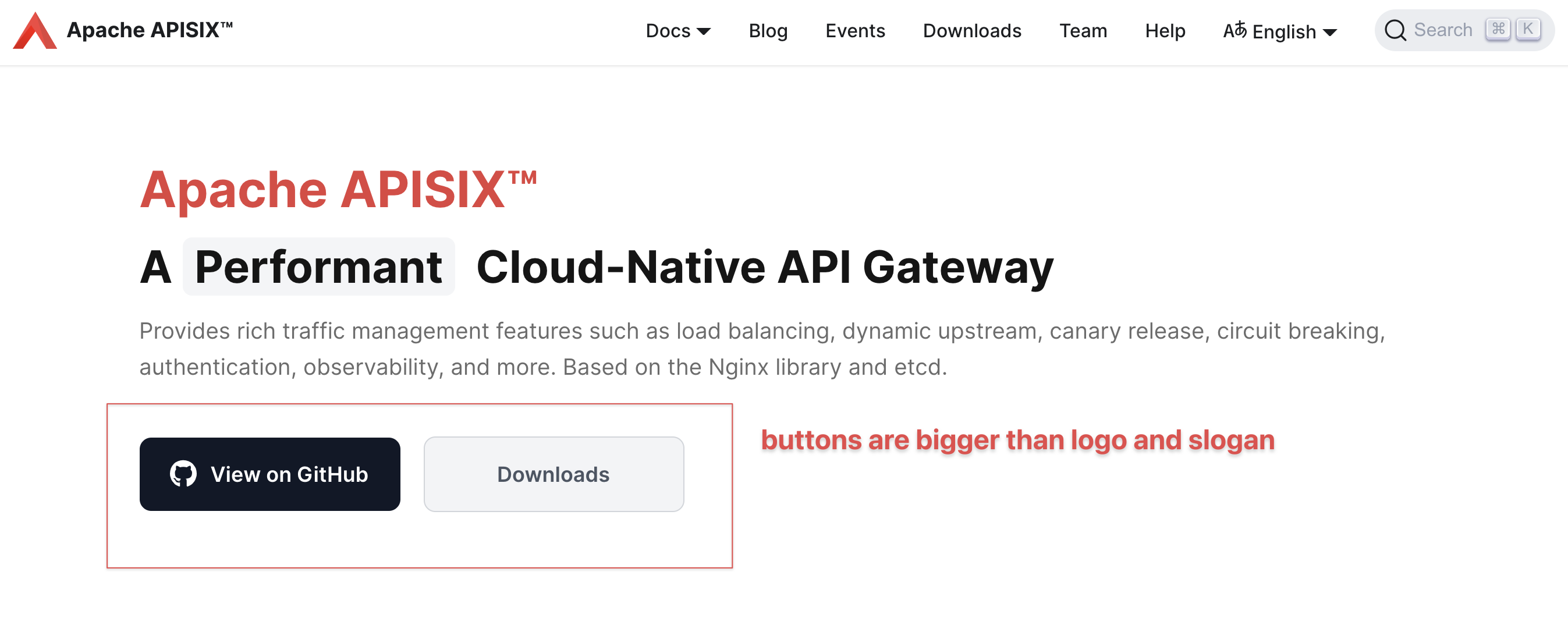 This is an automated message from the Apache Git Service. To respond to the message, please log on to GitHub and use the URL above to go to the specific comment. For queries about this service, please contact Infrastructure at: us...@infra.apache.org
[GitHub] [apisix-website] qier222 commented on pull request #214: fix: additional increase in button size due to #213
qier222 commented on pull request #214:
URL: https://github.com/apache/apisix-website/pull/214#issuecomment-787220248


   樂
   https://user-images.githubusercontent.com/68148142/109405582-f2d03800-79ac-11eb-9138-34322a70bd31.png;>


This is an automated message from the Apache Git Service.
To respond to the message, please log on to GitHub and use the
URL above to go to the specific comment.

For queries about this service, please contact Infrastructure at:
us...@infra.apache.org