I'm a CFD student and I wish to learn to make high-quality plots from my
calculations using matplotlib. However, I'm a complete novice in using
matplotlib and python and I didn't find any earlier posts so here goes.
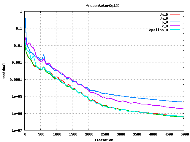
I have data form Ansys Fluent in the following form
continuity     x-velocity           y-velocity          energy
k                       epsilon
1                 0.00011115784  1.5359586e-07  1.0506172e-07   0.0032920227
0.40809903
1                 0.16584706        0.0047719572   2.7355736e-07
0.026478255      0.19814095
0.5674         0.044237841      0.0026294924   2.8202695e-07   0.030139321
0.13935529

The first line is for the first iteration, the second line for the second
iteration etc. Basically, I would like to have plot this data and have a
picture like  http://openfoamwiki.net/images/f/ff/Pump_residuals.png this

Any help would be much appreciated.

BR Jack
--
View this message in context:
http://old.nabble.com/Beginner-and-plotting-CFD-data-from-file-tp30705461p30705461.html
Sent from the matplotlib - users mailing list archive at Nabble.com.


------------------------------------------------------------------------------
Protect Your Site and Customers from Malware Attacks
Learn about various malware tactics and how to avoid them. Understand
malware threats, the impact they can have on your business, and how you
can protect your company and customers by using code signing.
http://p.sf.net/sfu/oracle-sfdevnl
_______________________________________________
Matplotlib-users mailing list
Matplotlib-users@lists.sourceforge.net
https://lists.sourceforge.net/lists/listinfo/matplotlib-users