#22174: Choose what colors we should use for the consensus-health line graphs
--------------------------------------+--------------------------
 Reporter:  tom                       |          Owner:  linda
     Type:  defect                    |         Status:  assigned
 Priority:  Medium                    |      Milestone:
Component:  Metrics/Consensus Health  |        Version:
 Severity:  Normal                    |     Resolution:
 Keywords:                            |  Actual Points:
Parent ID:                            |         Points:
 Reviewer:                            |        Sponsor:
--------------------------------------+--------------------------
Comment (by linda):
This is a complex question, but it depends what kind of data you are
trying to represent. Data is commonly split into three categories:
a) increasing values along a single dimension
b) diverging values around the center of a scale
c) discrete categories
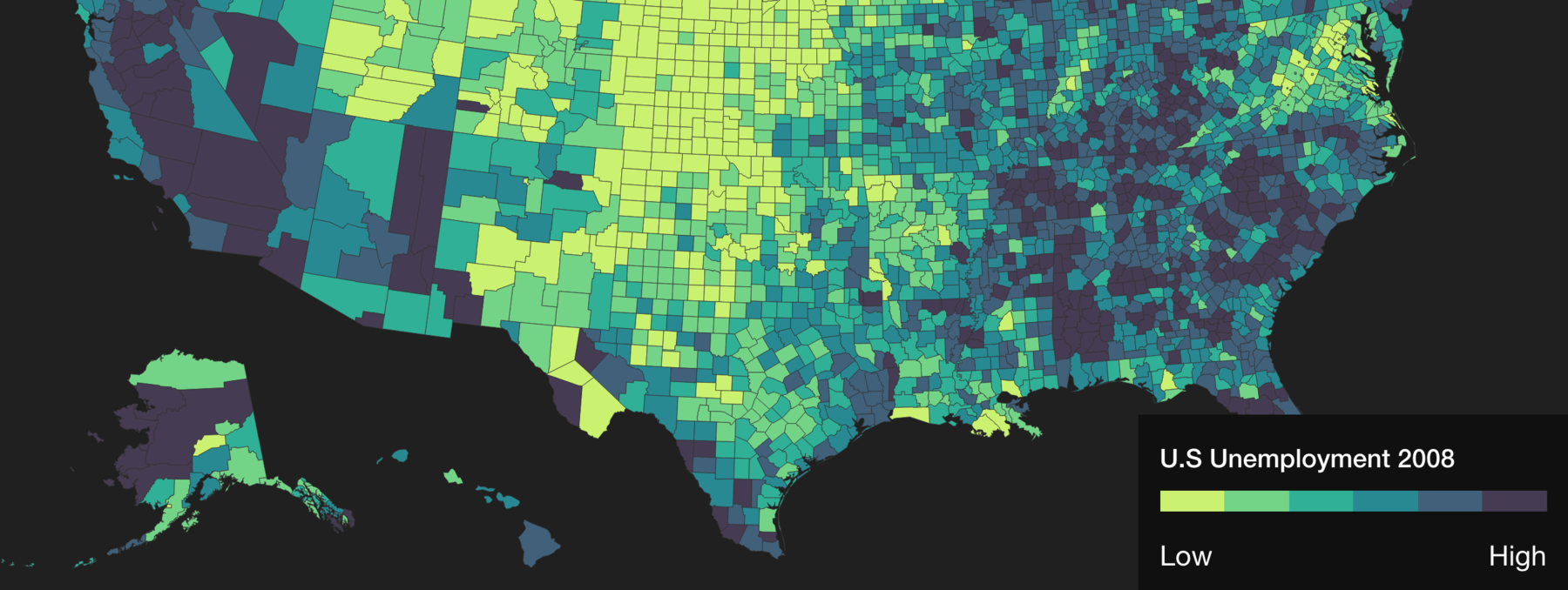
This will determine the kind of colors you would want to use. For a), it
is typical to have few colors and use varying shades of darkness to
display information
[https://lisacharlotterost.github.io/pic/160423-colorpicker1.png example],
whereas this is not true for b) and c). Since I don't know the type of
information the health consensus data will look like, you will need to
have a look at it before determining what coloring scheme to use.
My initial instinct is that the data looks like either a) or b), because
when I think of "health," I think of "mildly healthy to invincibly
healthy"(a) or "really sick to really healthy"(b), but I could be wrong.
So check this out as a starting place:
* color schemes to use for increasing values in a single dimension
("mildly healthy to invincibly healthy," a), where you want 9-11 colors
and to prefer them be colorblind safe:
[http://colorbrewer2.org/#type=sequential&scheme=BuGn&n=9 9 color
palettes, colorblind safe]
* color schemes to use for in divergent values around the center of a
scale ("really sick to really healthy," b) where you want 9-11 colors and
to prefer them be colorblind safe:
[http://colorbrewer2.org/#type=diverging&scheme=BrBG&n=11 11 color
palettes, colorblind safe]
Those above links are from a tool called ColorBrewer, where Cynthia Brewer
did a bunch of research, wayyy more than me. Her research is incorporated
into R's ggplot, and a whole bunch of things that are the standard for
information visualization. So I defer to her expertise on this one. (I am
not opposed to just telling you my most favorite 11 colors if it tickles
your fancy, but I advise against this.)
As you will see in the links above, the palette offer multiple coloring
options. Take the
[http://colorbrewer2.org/#type=sequential&scheme=BuGn&n=9 first link]---
and look at the gradient of green vs the gradient of red. That can send a
different type of message, due to psychological associations with color.
Green looks like a calm map of the highlights while red seems like a
doomsday map. So, all the colorblindness-proofing and color-distinciveness
being equal, pick the message you want to send with the colors or pick the
one that "feels" the best to you!
I suggest using this tool above and picking one of those palettes, but if
this is not satisfactory, or if you want to verify my claims, try poking
around online with keywords such as "information visualization," "visually
distinct colors," or "color perception." I hope this helps!
ヽ(•◡•)ノ
--
Ticket URL: <https://trac.torproject.org/projects/tor/ticket/22174#comment:2>
Tor Bug Tracker & Wiki <https://trac.torproject.org/>
The Tor Project: anonymity online
_______________________________________________
tor-bugs mailing list
tor-bugs@lists.torproject.org
https://lists.torproject.org/cgi-bin/mailman/listinfo/tor-bugs