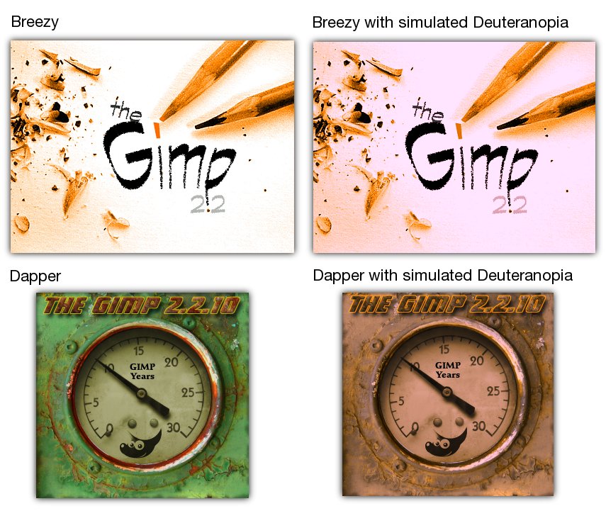
On Wed, 2006-04-12 at 18:58 +0200, Frank Schoep wrote:
> Hello Ubuntu Art Team,
>
> I wanted to discuss the posibilities of changing the current GIMP splash
> screen. I documented my thoughts and reasoning behind this proposal in the
> following bug report on Launchpad:
> https://launchpad.net/malone/bugs/38968
>
> As you can see, the package maintainers pointed me towards the Art mailing
> list and it seemed like a very good proposition. I searched the archives of
> March and April 2006, but only found the following thread related to The
> GIMP:
> https://lists.ubuntu.com/archives/ubuntu-art/2006-March/000740.html
>
> In the bugreport, I wrote the following:
>
> "
> GIMP's splash screen in Dapper feels rather unpolished compared to the one
> found in Breezy (will attach a comparison shortly). This is not strictly a
> bug in Dapper, but in my opinion a rather poor choice upstream. My suggestion
> would be to reuse the Breezy splash screen in Dapper, I'll elaborate a bit
> more on why I'm proposing this change.
>
> The current Dapper splash screen is the result of a competition set up by the
> GIMP Team celebrating the tenth anniversary of the program. I followed this
> contest from the start and I feel that none of the entries matches the
> elegance and polish displayed by the current splash screen in Breezy.
>
> Especially the winner, and thus the current splash, lacks in a few
> departments:
>  - The GIMP title text is barely legible due to the font, shadow and bordering
>  - Legibility gets worse for the color blind, try using the "Deuteranopia"
> display filter on the new splash, it becomes one big washed out gray area
>  - A rusty dial doesn't instill confidence or inspire creativity
>  - The green color doesn't match any element in the Dapper theme and feels
> out
> of place
>
> The current Breezy splash offers the following advantages:
>  - The orange base color blends in perfectly in the new Ubuntulooks theme and
> the overall appearance of the desktop environment
>  - The GIMP name is sharp and has a good contrast compared to the white
> background
>  - The pencils are appropriately themed and (for me) do inspire creativity
>  - The white background makes the splash screen uplifting and clean instead
> of
> depressing (the green in the new one is kind of dark)
>  - The version number doesn't list the minor release so it could be reused
> without any further changes
>
> To rehash: I would feel that the Ubuntu Dapper release would benefit greatly
> by reverting a bad aesthetical choice upstream. I haven't held a popularity
> contest or something, but I hope I've been able to convey my thoughts and
> feelings on this subject with a solid list of arguments.
>
> If the Breezy splash is not an option, the Dapper example content also
> provides a GIMP splash screen which looks better than the current Dapper one.
> Look for this one in the Examples folder in your home directory on Dapper.
>
> All of the above is purely subjective and represents my view on the subject,
> please take this in consideration.
> "
>
> I attached a comparison image to the bugreport, which can be found online
> here:
> http://www.ffnn.nl/media/external/ubuntu/gimp-splash-compare.jpg
>
> I hope I can set off a spark to make Dapper better and feel more integrated
> and polished. Thanks for reading this far and I'd be glad to receive your
> thoughts on this matter.
>
> With kind regards,
>
> Frank Schoep
>
>
>
> (Sorry if this one's a dupe, I previously sent this message from a different
> account)
>
I'd be happy to offer the two that I posted earlier and are already in
the example content package. You can find the XCF at
http://klepas.org/temp/gimp-ubuntu-splash.xcf

and the PNG/JPEG on my site, ought to be the first splash in the page:
http://klepas.org/splash-screens


Happy easter and kind regards,
Pascal
![]() signature.asc
signature.asc
Description: This is a digitally signed message part
--
ubuntu-art mailing list
ubuntu-art@lists.ubuntu.com
https://lists.ubuntu.com/mailman/listinfo/ubuntu-art