On Fri, Jul 18, 2008 at 11:05 AM, Kim Kahns <[EMAIL PROTECTED]> wrote:
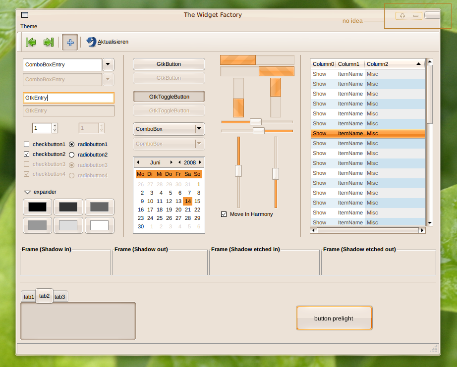
> Am 18.07.2008 08:31:08 schrieb(en) Nicholas Kraak:
> > Your theme is a good start Kimmik, but it really is too similar to
> > Human,
> > and looks a little clunky as well, which is one of the main problems
> > with
> > Human in my opinion. Also, the orange colour isn't orange enough IMO,
> > try
> > something similar more deep and rich.
>
> You are right, it looked a bit clunky.
> I tried something different with the toolbars and used more orange.
>
> I also modified the kin emerald theme to match the gtk theme I'm
> working on. But I have no idea what kind of close/min/max buttons would
> fit.
>
> Screenshot: https://wiki.ubuntu.com/Artwork/Incoming/Intrepid/
> Intrepid_Ibex_GTK_proposal?action=AttachFile&do=get&target=test3.png<https://wiki.ubuntu.com/Artwork/Incoming/Intrepid/Intrepid_Ibex_GTK_proposal?action=AttachFile&do=get&target=test3.png>
>
> Wiki: https://wiki.ubuntu.com/Artwork/Incoming/Intrepid/
> Intrepid_Ibex_GTK_proposal
>
>
> ~Kim Kahns (Kimmik)


How about using what you just did for the close button in the screenshot,
but instead of from the right side corner, the 'button' comes over from the
top of the window. This can be the same for close/min/max buttons?

Also how about a little more contrast between the gtkbuttons and the
window..

~Arjuna
--
ubuntu-art mailing list
ubuntu-art@lists.ubuntu.com
https://lists.ubuntu.com/mailman/listinfo/ubuntu-art