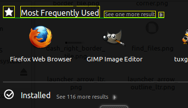
Initial problem: the extend text is not base-aligned to section name.

What happens: the icon on left, the section name, the extend label and
the extend icon are vertically centered (see middle.png).
The proposed change: all cited itens should be bottom aligned.

Other problem: the extend icon on right has dimension of 24x24 pixels
and it will seems too high (see bottom.png).

Proposed solution: resize the icon to 12x12 pixels (see bottom-
resized.png).

The solution above was applied and the initial problem was solved (see
result.png and result2.png).

The new problem: when the section has no expand text (like the Shortcuts
section on dash's main screen), the expand icon will seems too low (see
problem.png and problem2.png).

Proposed solution:

1. Does not allow the Shortcuts section to be expanded/contrated
2. Does not change the current layout: leaves the texts and icons vertically
centered
3. Add an expand text on Shortcuts section
4. Hack dash to center the expand icon if no expand text is defined

What do you think?

** Attachment added: "result2.png"

https://bugs.launchpad.net/unity/+bug/748101/+attachment/1975429/+files/result2.png

--
You received this bug notification because you are a member of Ubuntu
Bugs, which is subscribed to Ubuntu.
https://bugs.launchpad.net/bugs/748101

Title:
  "See more..." line should be base-aligned with section header in Dash

--
ubuntu-bugs mailing list
ubuntu-bugs@lists.ubuntu.com
https://lists.ubuntu.com/mailman/listinfo/ubuntu-bugs