Thanks cbds! Awesome response and thanks for reassigning, there are so
many packages with similar names :-)
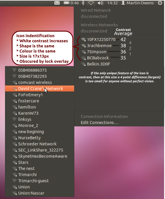
I've attached a design break down of what I mean to help the designers
and developers understand what I'm seeing. The basic problem is that the
icons are not different enough at small scales and rely on keen eyesight
to spot a very slight different in contrast.

** Attachment added: "signal-decomposition.png"

https://bugs.launchpad.net/ubuntu/+source/network-manager-applet/+bug/874579/+attachment/2660828/+files/signal-decomposition.png

--
You received this bug notification because you are a member of Ubuntu
Bugs, which is subscribed to Ubuntu.
https://bugs.launchpad.net/bugs/874579

Title:
  UI Issue: WiFi network stength hard to see with many networks.

To manage notifications about this bug go to:
https://bugs.launchpad.net/ubuntu/+source/network-manager-applet/+bug/874579/+subscriptions

--
ubuntu-bugs mailing list
ubuntu-bugs@lists.ubuntu.com
https://lists.ubuntu.com/mailman/listinfo/ubuntu-bugs