-----BEGIN PGP SIGNED MESSAGE-----
Hash: SHA1

Hi!
Manu Cornet wrote:
>>1.
>>I guess usally the user want's to shutdown the computer (or restart).
>>In my eyes, "logout" is less important. So why is it the most
>>conspicuous button?
>>
>>Why is the most important button (=shutdown) the last one the user sees
>>(the users reads from left to right and from top to bottom). Further it
>>should not be near to the Cancel-Button, which drops much more attention
>>because of its border.
>
>
> Should invert things to do something like :
>
> Suspend Hibernate Shut Down
> Restart Log Out
I would prefer:
Shut Down Log Out
Restart Suspend Hibernate
Here are my "reasons":
Shut-Down is most used. I guess this place is most flashy.
Log-Out is very similar to Shut-Down .. you use it when you've finished
your work on the computer.
Restart is also used very common. And usually their is no shortcut on
your keyboard for doing this.
At all events, Suspend and Hibernate should be neighbors - they are
thematically very similar.
Another possibility would be:
Shut down Restart Log Out
Suspend Hibernate
>>2.
>>Borders are important. I dislike flat buttons, because for new users it
>>is not clear evident that they can click on the icons. Take a look at
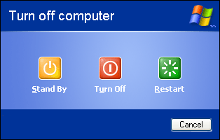
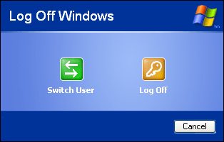
>>the windows-logout-button. They do it right.
>>http://www.guidebookgallery.org/pics/gui/startupshutdown/shutdownwindow/winxppro.png
>>http://www.guidebookgallery.org/pics/gui/startupshutdown/logout/winxppro.png
>
>
> All right, I can do this. I just found that the default button
> appearance seemed a little too "heavy" in this case.
Hm, well, could be. Any alternatives?
>>3.
>>It might be a good idea to divide logout and shutdown functionallity
>>like seen in the screenshots. It is something completely different.
>>Novell has made some studies that users find it difficult to shutdown
>>the computer because the menu-entry is named "Log-Out".
>
>
> I completely agree that the menu entry's name should be changed.
Any suggestions for the new name?
>>4.
>>Why do all buttons have the same size? Are they all same-important? Try
>>to make the the important buttons bigger (Fitz-Law: The bigger a button
>>is, the easier it is to click.... very simple rule, very effective).
>
>
> Ah, this is interesting... I'm not sure the dialog would look nice,
> though... ?
Well, if you don't use any borders (ignoring point 2), you would not see
anything - except on mouse-over.
>>5.
>>The text above ("Do you really want to log out") is not appealing to the
>>user. Maybe he wants to Shutdown. Do we really need a question here. No
>>question = no necessity for the user to read.
>
>
> I agree that the text should be changed. What do you suggest ?
I would prefer to drop it completly.
>>6.
>>If he wants to save the session is less important and could be found on
>>bottom of the dialog
>
>
> Right ! I had hesitated to do that at first :)
Greetings
Frederic
- --
Frederic Gaus pgp-key: 93E6903C
fingerprint: 0C55 4517 CC1E 5F7F 9059 3535 AB54 D8E8 93E6 903C
-----BEGIN PGP SIGNATURE-----
Version: GnuPG v1.4.1 (GNU/Linux)
iD8DBQFDl03Qq1TY6JPmkDwRAhy0AJ9VdXHkISAEUxKrN50OBwbIsxzKMACfQYiS
ayK8c3U0UZmPFtJvNImMiLU=
=YB4W
-----END PGP SIGNATURE-----
--
ubuntu-desktop mailing list
ubuntu-desktop@lists.ubuntu.com
http://lists.ubuntu.com/mailman/listinfo/ubuntu-desktop