Yes - it calls the "ordinary" one the Yaxis,
and the second one the YRightAxis (or YRAxis) in various places, and
draws it on the right of the graph.
It currently doesn't do a title on the second (right) axis - but should
be 10 minutes for me to add that if you want it - just let me know. (And
I should admit that I haven't used, or tested, them as thoroughly as
most other aspects of the library).
Alex

On 04/06/2019 19:23, Glen Bojsza via use-livecode wrote:
Hi Alex,

I will take a look at it...thanks.

Can it do dual Y axis graphs?

On Tue, Jun 4, 2019 at 8:50 PM Alex Tweedly via use-livecode <
[email protected]> wrote:
Hi Glen,
Sounds like the graph widget won't do it.
You could try using my GraphMaker library. I gave a brief talk about it
at the conference, but since I got back I've been so busy I haven't yet
got around to making a general announcement.
You can get the library from
https://github.com/alextweedly/LivecodeGraphMaker
This includes the library (a script-only stack), a demo example (binary
UI stack) and a text file of notes.
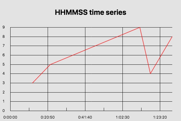
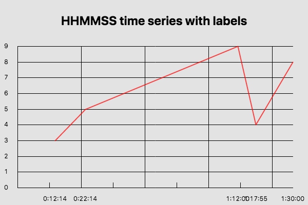
I've added a couple of new examples, covering two different ways to
approach your example; they both convert the time-series to seconds, and
plot that. Then:
- graph 7 uses a custom formatting function to convert the 'seconds'
values into the desired hh:mm:ss to produce a few well-spaced out labels
- graph 8 uses explicit X-axis labels for each data point.
I'm not sure which of those (or some variant of them) might be what you
want.
Feel free to ask me any questions if anything is unclear, or needs
changing.
You can see the output at
https://www.kilmelford.com/images/graph7.jpg
https://www.kilmelford.com/images/graph8.jpg
<https://www.kilmelford.com/images/graph7.jpg>
and the required input setup in the demo stack.
Alex.
On 04/06/2019 07:20, Glen Bojsza via use-livecode wrote:
Hello,

I am trying to use the Line Graph Widget to grapg a time series (x axis)
where the time is in the format 2:45:16

The time data is being treated like text and therefore tries to plot
using
every x series as a x label.

Optimally I would like to see only a handful of x labels spread that
covers
the time period as x labels.

I also tried just using linear data series for the x axis and the Line
Graph Widget wants to put a label for every number.

Is there a property that could be set that recognizes the x data series
as
a number or time?

thanks,

Glen
_______________________________________________
use-livecode mailing list
[email protected]
Please visit this url to subscribe, unsubscribe and manage your
subscription preferences:
http://lists.runrev.com/mailman/listinfo/use-livecode
_______________________________________________
use-livecode mailing list
[email protected]
Please visit this url to subscribe, unsubscribe and manage your
subscription preferences:
http://lists.runrev.com/mailman/listinfo/use-livecode
_______________________________________________
use-livecode mailing list
[email protected]
Please visit this url to subscribe, unsubscribe and manage your subscription
preferences:
http://lists.runrev.com/mailman/listinfo/use-livecode
_______________________________________________
use-livecode mailing list
[email protected]
Please visit this url to subscribe, unsubscribe and manage your subscription
preferences:
http://lists.runrev.com/mailman/listinfo/use-livecode