> On May 5, 2022, at 4:53 PM, Toby Thain via cctalk <cctalk@classiccmp.org>
> wrote:
>
> On 2022-05-05 1:43 p.m., John Robertson via cctalk wrote:
>> On 2022/05/05 10:26 a.m., Toby Thain via cctalk wrote:
>>> On 2022-05-05 1:03 p.m., John Herron via cctalk wrote:
>>>> Someone at work pointed this out and I've never really thought about it. Is
>>>> anyone here aware of the decision or reason to use a different 1 character
>>>> for the last 1 vs the first 1?
>>>
>>> Got a picture?
>> They may have run out of that original font if they were setting the type
>> with something like Lettraset in the day.
>
> An easy contemporary solution to that would have been to use a process camera
> and make a copy.
>
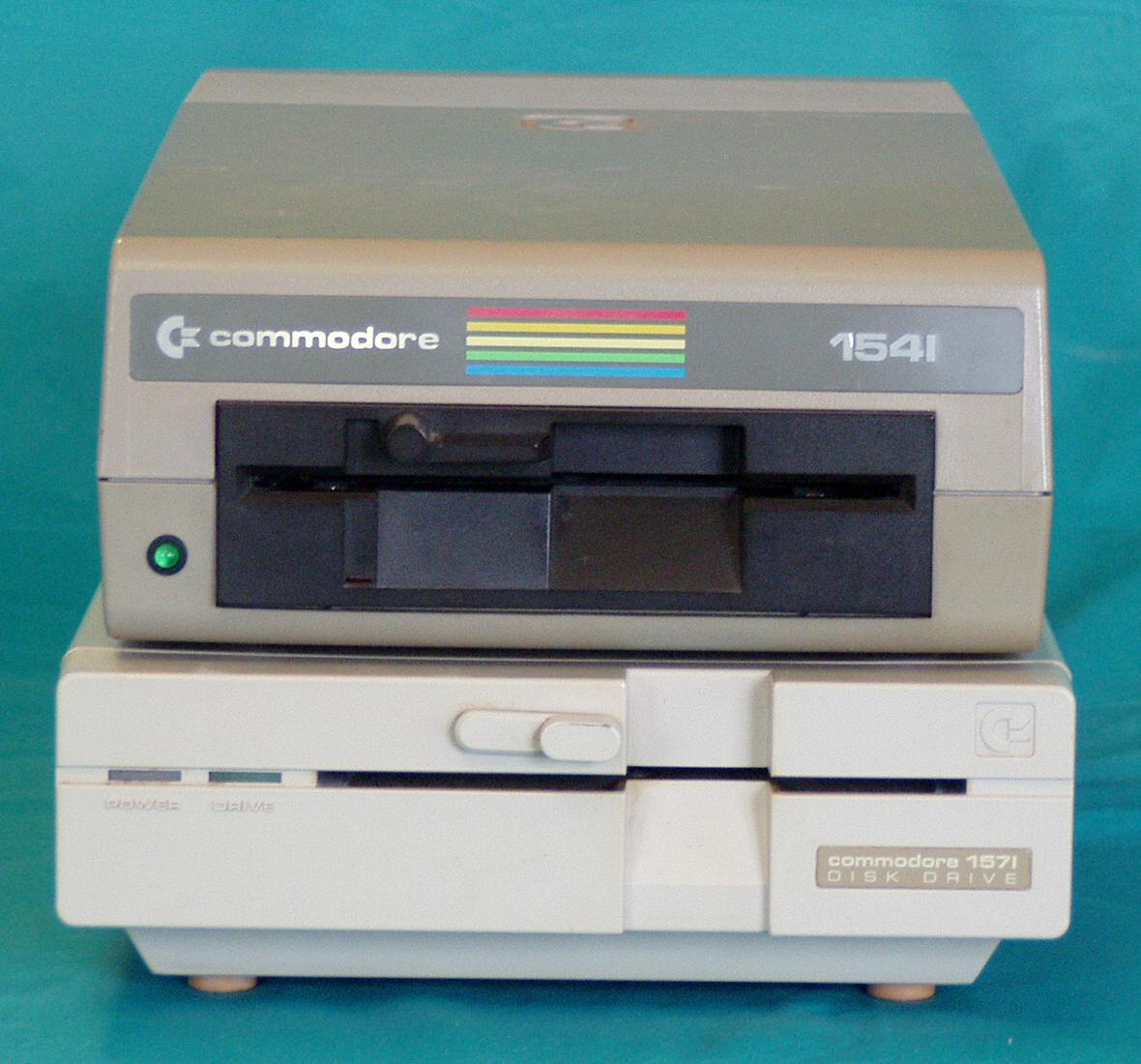
> However, based on this picture:
> http://dunfield.classiccmp.org/c64/h/diskf.jpg , there *is* a good
> typographic reason to cut the serif off the second '1'; if you didn't, it
> would look ridiculous. The typographer's rule is, "If it _looks_ right, it
> _is_ right," and the decal as shipped looks fine, typographically. We make
> these slight "adjustments" all the time, it's a big part of the job
> (especially for logos) - and reveals that a professional was involved.
> Usually people don't even notice them, because that's the other rule of
> typography.
There are other examples in our field of lettering that changes according to
context: the font used by DEC on the PDP-11 handbook covers and a number of
peripheral device panels. The letters "t" come in "big loop" and "small loop"
forms. The big loop is used when there isn't another letter after; the small
loop is used to avoid looking silly when another letter follows. Look at
"digital equipment corporation" on the inside cover page of the PDP-11
processor and peripheral handbooks, it shows it clearly.
I digitized that font and gave the same treatment to f, j and r, though I
haven't seen those differentiated in the examples I looked at.
paul