List,

I have not run into this situation before and I am hoping I am just over
thinking it or it's a "can't see the forest for the trees" kind of thing.
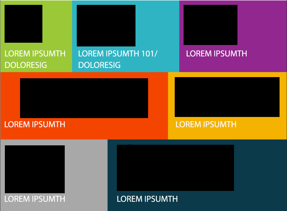
Given this layout:
http://tomliv.com/css-d/grid-of-diff-sizes/grid-with-diff-sizes.jpg

The black boxes represent svg graphics. Text would be live text (not part
of the graphics).

If this layout were in a narrower viewport than shown, and keeping the grid
as shown, in my mind the graphics in the middle row would begin to scale
before the rest. They are widest and their combined width would be the
first to match the viewport width and therefore scale before the rest
causing different line widths etc. Also, even if the graphics were all the
same width, three across would scale before two across.

How would you style this situation in a responsive page?

It's possible to change widths or stack at a certain breakpoint, but I fear
this would cause ugly 'small elements in a large width' issues.

Thanks in advance for any thoughts


--

Tom Livingston | Senior Front End Developer | Media Logic |
ph: 518.456.3015x231 | fx: 518.456.4279 | medialogic.com


#663399
______________________________________________________________________
css-discuss [[email protected]]
http://www.css-discuss.org/mailman/listinfo/css-d
List wiki/FAQ -- http://css-discuss.incutio.com/
List policies -- http://css-discuss.org/policies.html
Supported by evolt.org -- http://www.evolt.org/help_support_evolt/