(Sent two messages before this one. Not sure if they made it through, but this
is both combined. Sorry for the spam)
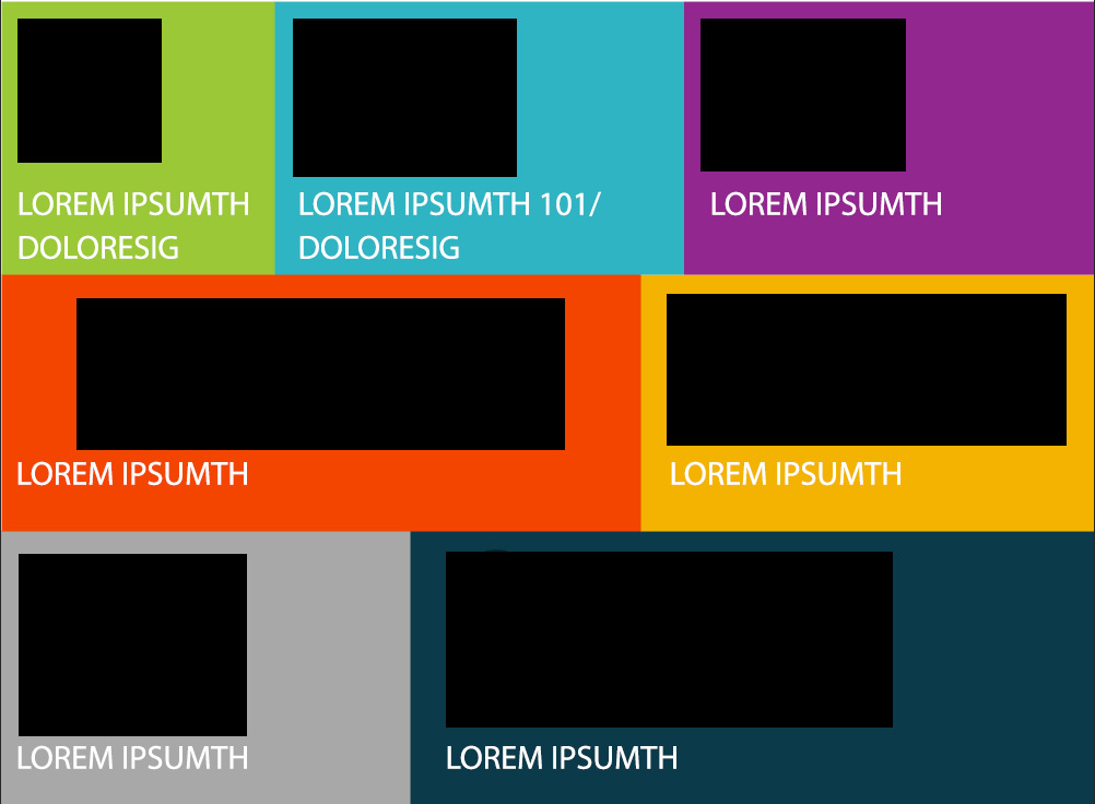
Hi Tom,
I would have IMGs set to 100% width height auto and the IMG containers set to
100% width except they have a max-width and min-width set.
The max-width size keeps them from becoming too large on a big screen and the
min-width keeps them from becoming too small.
Any width that is between the max-width and min-width would have 100% width
containers and thus 100% width IMGs.

Also, the containers don't have to be 100%, they can be a pixel size too or a
different percentage.
For instance, the green box with the image, I would set that image container to
70% because it looks to take up 70% of the green box
and set a max-width of say 150px because that looks to be how big it is with a
wide screen.

At least that is how I do it and it works great for my situations.

Best,

Karl DeSaulniers
Design Drumm
http://designdrumm.com


On Jun 29, 2016, at 3:57 PM, Tom Livingston <[email protected]> wrote:

> List,
>
> I have not run into this situation before and I am hoping I am just over
> thinking it or it's a "can't see the forest for the trees" kind of thing.
>
> Given this layout:
> http://tomliv.com/css-d/grid-of-diff-sizes/grid-with-diff-sizes.jpg
>
> The black boxes represent svg graphics. Text would be live text (not part
> of the graphics).
>
> If this layout were in a narrower viewport than shown, and keeping the grid
> as shown, in my mind the graphics in the middle row would begin to scale
> before the rest. They are widest and their combined width would be the
> first to match the viewport width and therefore scale before the rest
> causing different line widths etc. Also, even if the graphics were all the
> same width, three across would scale before two across.
>
> How would you style this situation in a responsive page?
>
> It's possible to change widths or stack at a certain breakpoint, but I fear
> this would cause ugly 'small elements in a large width' issues.
>
> Thanks in advance for any thoughts
>
>
> --
>
> Tom Livingston | Senior Front End Developer | Media Logic |
> ph: 518.456.3015x231 | fx: 518.456.4279 | medialogic.com
>
>
> #663399
> ______________________________________________________________________
> css-discuss [[email protected]]
> http://www.css-discuss.org/mailman/listinfo/css-d
> List wiki/FAQ -- http://css-discuss.incutio.com/
> List policies -- http://css-discuss.org/policies.html
> Supported by evolt.org -- http://www.evolt.org/help_support_evolt/

______________________________________________________________________
css-discuss [[email protected]]
http://www.css-discuss.org/mailman/listinfo/css-d
List wiki/FAQ -- http://css-discuss.incutio.com/
List policies -- http://css-discuss.org/policies.html
Supported by evolt.org -- http://www.evolt.org/help_support_evolt/