2012/12/22 janI <[email protected]>

> I am no designer, but I have tried to make a suggestion to better explain
> what I mean.
>
> The current proposals all have squares / circles etc. and apart from the
> original similarity with windows8 that has a special signal value.
>
> A surface (square/circle etc) especially with a border, signal:
>   - limitation or positive a product that fullfills a single purpose
>   - closeness or positive a product the specialize in one function
>
> AOO is in my mind much more, we are open at levels where normal products
> can only dream to go:
> - AOO is used in nearly every corner of the earth.
> - AOO is open for translation to no matter how small a language group
> - AOO is open for developers who want to hack their own specialized
> versions
> - AOO is open for repackaging supplying the core of a wider extented
> product.
> I could go on.....
>
> I think it is important that our logo signals this freedom and openess
> after all we are OPEN office.
>
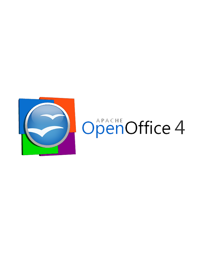
+1. The ring around the orb give the idea of boundaries, limits, and we are
trying to go beyond every limit ;)


>
> I know my design is not professional, it is NOT meant to be so please dont
> judge it on that. It is simply a "thought out of the box", and hopefully it
> can trigger some ideas.
>
> You can see my "proposal" here:
> http://people.apache.org/~jani/aoo.png


I like the idea. No sure if it fits well on a page header,
but definitely is a good idea for announcements, t-shirts and a lot of
other situations where a big logo is needed.

Regards
Ricardo


>
>
> Have a nice christmas, whereever you are in the world.
> Jan I.
>
>
> On 21 December 2012 20:56, Michael Acevedo <[email protected]> wrote:
>
> > Thanks for the links with logos Armin, I will examine them shortly...
> >
> > Have a good afternoon...
> >
> > On Fri, Dec 21, 2012 at 1:23 PM, Armin Le Grand <[email protected]
> > >wrote:
> >
> > >     Hi Michael,
> > >
> > > this (https://svn.apache.org/repos/**asf/openoffice/ooo-site/trunk/**
> > > content/images/AOO_logos/<
> >
> https://svn.apache.org/repos/asf/openoffice/ooo-site/trunk/content/images/AOO_logos/
> > >)
> > > might help, these are the checked-in logos. You can access it with a
> > > browser. Look at the SVG directory there; I am not sure if the complete
> > > gulls will be extractable; I fear they are 'cut', but maybe repaired by
> > > using the other wing.
> > >
> > > Looking forward to your suggestions :)
> > >
> > > Sincerely,
> > >     Armin
> > >
> > >
> > > On 21.12.2012 17:48, Michael Acevedo wrote:
> > >
> > >> Hello Armin,
> > >>
> > >> I was tempted to make a rounded corner marquee for the current logo
> but
> > >> desisted of the idea after the vereditct of the Apple v. Samsung case
> > >> where
> > >> they were able to sue Samsung on using rounded corners for apps on
> their
> > >> flavor of android. Still I find the rounded corners tempting and is
> > >> actually reflected on the second logo that appeared on the last jpeg
> > file
> > >> I
> > >> sent yesterday.
> > >>
> > >> All of these are good suggestions and I am now thinking of something
> on
> > >> updating the orb, maybe keeping the basic shape of the logo which is a
> > >> circle. I am rambbling here but I might be able to come up with
> > something
> > >> tangible during the next few hours.
> > >>
> > >> Now the only thing I would need to find is an EPS or PSD
> > >> high-res version of the AOO gulls. Where can I find that?
> > >>
> > >> Thanks for the suggestions.
> > >>
> > >>
> > >> On Friday, December 21, 2012, Armin Le Grand wrote:
> > >>
> > >>       Hi Michael,
> > >>>
> > >>> thanks for investigating here. While I like the original orb and the
> > >>> colored rects seem to lead to windows trademark stuff, what about:
> > >>>
> > >>> - only slightly changing the AOO logo
> > >>> - replacing the orb with a shape also very popular today
> > >>> - keeping the color, keeping the seagulls
> > >>> ...but as shape, take the now famous 'app' form - a rounded rectangle
> > >>> instead of the orb, using exactly the dimensions of app logos, and
> the
> > >>> color blending of app logos (they use some 'bow' on the middle,
> making
> > >>> the
> > >>> upper half slightly lighter than the lower one).
> > >>> Just as on iOS devices. Maybe looking nice ;-) Will look modern :-)
> > >>>
> > >>> HTH!
> > >>> Sincerely,
> > >>>      Armin
> > >>>
> > >>> On 20.12.2012 02:33, Michael Acevedo wrote:
> > >>>
> > >>>  Greetings to the AOO Team!
> > >>>>
> > >>>> Hello, after a few months of inactivity I've decided to get back in
> > >>>> touch
> > >>>> with the AOO community. First, congratulations to the AOO team on
> > >>>> a successful graduation into a top-level Apache project from the
> > Apache
> > >>>> Incubator.
> > >>>>
> > >>>> Now the reason on why I am writing this email is to formally submit
> a
> > >>>> logo
> > >>>> proposal for the next version of the Apache OpenOffice 4.X logo.
> > >>>> Previously, I submitted an initial logo on the Apache OpenOffice
> > Google+
> > >>>> community but I went back to the drawing board and created a second
> > >>>> version
> > >>>> of the logo that both pays respect to the previous Apache OpenOffice
> > >>>> orb,
> > >>>> but modernizes the look of the overall logo by adding 4 colored
> > squares
> > >>>> that represent the four corners of our office suite (Writer, Calc,
> > >>>> Impress,
> > >>>> and Base) and utilizing a streamlined font.
> > >>>>
> > >>>> Without further introductions, below I present my official
> submission
> > >>>> for
> > >>>> the Apache OpenOffice 4.X logo.
> > >>>>
> > >>>> This first logo, is the proposed official logo for the project that
> > >>>> would
> > >>>> be used for our webpage and some other materials.
> > >>>>
> > >>>> https://lh3.googleusercontent.****com/-lETVSrwcgJc/**UNJpH6G1sxI/**
> > >>>> AAAAAAAAABg/JnpNrXdRgUo/s653/****AOO%25204%2520LOGO%2520v2-5%****
> > >>>> 2520Small%2520copy.jpg<https:/**/lh3.googleusercontent.com/-**
> > >>>> lETVSrwcgJc/UNJpH6G1sxI/**AAAAAAAAABg/JnpNrXdRgUo/s653/**
> > >>>> AOO%25204%2520LOGO%2520v2-5%**2520Small%2520copy.jpg<
> >
> https://lh3.googleusercontent.com/-lETVSrwcgJc/UNJpH6G1sxI/AAAAAAAAABg/JnpNrXdRgUo/s653/AOO%25204%2520LOGO%2520v2-5%2520Small%2520copy.jpg
> > >
> > >>>> >
> > >>>>
> > >>>>
> > >>>> There's a secondary logo, which is basically the same logo but
> changes
> > >>>> the
> > >>>> proportion of the OpenOffice orb making it better suited for the
> > splash
> > >>>> screen that appears at the launch of the application.
> > >>>>
> > >>>> https://lh4.googleusercontent.****com/-uy8gU24uBZw/**UNJpH8UiKiI/**
> > >>>>
> AAAAAAAAABk/xfXTQjO8iQg/s912/****AOO%25204%2520LOGO%2520v2-2.****png<
> > >>>> https://lh4.**googleusercontent.com/-**uy8gU24uBZw/UNJpH8UiKiI/**
> > >>>> AAAAAAAAABk/xfXTQjO8iQg/s912/**AOO%25204%2520LOGO%2520v2-2.**png<
> >
> https://lh4.googleusercontent.com/-uy8gU24uBZw/UNJpH8UiKiI/AAAAAAAAABk/xfXTQjO8iQg/s912/AOO%25204%2520LOGO%2520v2-2.png
> > >
> > >>>> >
> > >>>>
> > >>>>
> > >>>> Hope you guys like it and Happy holidays!
> > >>>>
> > >>>>
> > >>>>
> > >
> >
> >
> > --
> > Best,
> > Michael
> >
>