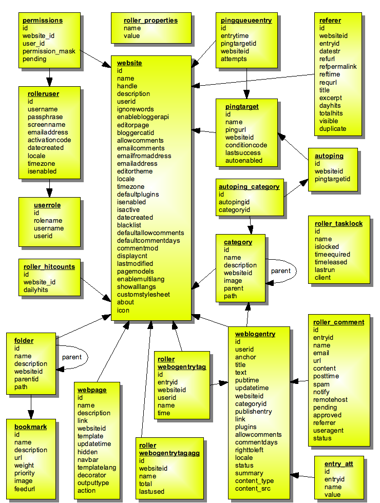
That looks really complicated. what's the purpose of the diagram? to
show the general relationships or to try and be a comprehensive diagram
of the entire data model?
IMO doing a comprehensive diagram is somewhat useless. It's hard to
maintain and keep up to date and ultimately a decent programmer should
be able to read the sql schema and understand it, it's not that
complicated. On the other hand a basic diagram which is meant to show
the relationships can be useful and likely can be made in such a way
that it doesn't have to be changed very often, so that's what I would
aim for. In specific I would ...
* not put all the table columns, just put a few of the most important
ones and use "..." to indicate there are more columns in the table.
* spread things out a bit to organize things better visually and show
the most important relationships.
* try and group related components together, such as the pings tables.

* move all of the standalone tables off to one side.

-- Allen


Dave wrote:
I did not forget! Somebody must have stripped that thing out.

Here's the image:
http://rollerweblogger.org/roller/resource/datamodel40.png

- Dave


On 6/2/07, Matt Raible <[EMAIL PROTECTED]> wrote:
Did you forget an attachment?

On 6/1/07, Dave <[EMAIL PROTECTED]> wrote:
> Here's a simple Open Office diagram (in PNG form) that I'm working on
> for the dev guide. It shows the 4.0 data model, not including the
> Planet tables. I think it's reasonably complete. Suggestions for
> improvement?
>
> - Dave
>


--
http://raibledesigns.com