It does raise some interesting issues. The names of foreign key columns is pretty standard except for some obvious differences, e.g. table entry_att has a foreign key named entryid to the weblogentry table, as does table webogentrytag (typo?). And this typo suggests to me that the diagram is hand crafted. So it needs to be date-stamped so people can see which bits it corresponds to. I'm assuming that it will need to be updated at some point as we change stuff...
Craig

On Jun 2, 2007, at 8:57 AM, Anil Gangolli wrote:
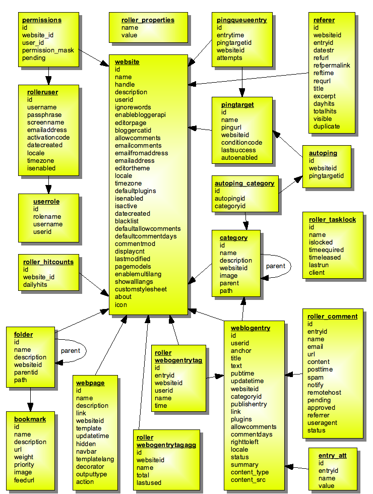
I like the diagram.It also reminds me that there is a dead (never-been-used) portion of the data model for ping support (the autoping_category). Category restrictions were part of the original ping support proposal that were never implemented and there hasn't really been any interest in completing this. I think I should remove this and the corresponding Java objects.--a. ----- Original Message ----- From: "Denis Balazuc" <[EMAIL PROTECTED]> To: <[email protected]> Sent: Saturday, June 02, 2007 6:31 AM Subject: Re: Roller 4.0 data model diagramHi allIt doesn't look complicated to me and I find it a very good helper. The only thing I think is missing is the indication of which field is used as the FK to another table's key (arrows aren't enough). There aren't that much tables to require this document to be split in sections or cut on the list of displayed fields, and it's great to have it in one piece. That's the fate of data models, they need a lot of room and cubicle space to display their best attributes :-))I also disagree when Allen says "decent programmers" should be able understand a datamodel such as the Roller one from its SQL schema. When there's more than 4 or 5 tables, said programmers start drawing boxes on a sheet of paper or a PNG file. Thanks Dave I didn't had to do it :-)Cheers All Allen Gilliland wrote:That looks really complicated. what's the purpose of the diagram? to show the general relationships or to try and be a comprehensive diagram of the entire data model?IMO doing a comprehensive diagram is somewhat useless. It's hard to maintain and keep up to date and ultimately a decent programmer should be able to read the sql schema and understand it, it's not that complicated. On the other hand a basic diagram which is meant to show the relationships can be useful and likely can be made in such a way that it doesn't have to be changed very often, so that's what I would aim for. In specific I would ...* not put all the table columns, just put a few of the most important ones and use "..." to indicate there are more columns in the table.* spread things out a bit to organize things better visually and show the most important relationships.* try and group related components together, such as the pings tables.* move all of the standalone tables off to one side. -- Allen Dave wrote:I did not forget! Somebody must have stripped that thing out. Here's the image: http://rollerweblogger.org/roller/resource/datamodel40.png - Dave On 6/2/07, Matt Raible <[EMAIL PROTECTED]> wrote:Did you forget an attachment? On 6/1/07, Dave <[EMAIL PROTECTED]> wrote:> Here's a simple Open Office diagram (in PNG form) that I'm working on > for the dev guide. It shows the 4.0 data model, not including the> Planet tables. I think it's reasonably complete. Suggestions for > improvement? > > - Dave > -- http://raibledesigns.com
Craig Russell
Architect, Sun Java Enterprise System http://java.sun.com/products/jdo
408 276-5638 mailto:[EMAIL PROTECTED]
P.S. A good JDO? O, Gasp!
![]() smime.p7s
smime.p7s
Description: S/MIME cryptographic signature