Hi all,

Thanks a lot for the feedback!
I had similar thoughts, and I now have some ideas I want to test :-)

Best,

Markos


On 12/29/25 16:24, Richard Zowalla wrote:
Hi Markos, hi all,

Thanks a lot for the update and for explaining the design process; it’s clear a
lot of care went into this, and it shows :-)

I think you missed to attach the GitHub image (or ASF mailing list did drop the
image attachment in which case you would need to upload it some where).

One suggestion that might help further improve the logo would be to optimize it
a bit more for very small sizes (favicons, headers): slightly thicker legs,
fewer tiny details, and keeping the red accent focused mainly on the lightning
bolt so it remains the clear focal point. Simplifying the silhouette a little
could also help with readability across different backgrounds (that was a + of
the first draft). I think shrinking the spider could also help.

What we would need is the colored version and a monochrome version.

Overall, this is a strong direction already, imho :) - if we get some further
input we might be able to do a vote soon.

Gruß
Richard
Am 28.12.2025 um 17:31 schrieb Markos Volikas <[email protected]>:

Hi all,
I think I managed to improve it.
I have attached the icon itself and the full logo as SVG files. I have also
attached a screenshot that shows how it will be rendered on top of GitHub's
dark background.
For anyone interested, I started with a real spider image that I simplified and
vectorized using LLM tools and Inkscape tracing. I then assembled the pieces,
refined the details, and adjusted the colors so that it is visible on top of
both light and dark backgrounds. The red color is a dark shade of the ASF Style
Guide, and the font used is the recommended one (Montserrat).
In my honest opinion, it is minimal (no shades, very sharp edges, or tiny
details) while keeping most of the character of the original.
I would be glad to hear your opinions, and I wanted to mention that it was a
really fun process for me, regardless of whether we are going to choose it in
the end :-).
Thanks, and my best wishes for the new year,
Markos
On 12/25/25 18:14, Markos Volikas wrote:
Happy to hear :-)

I might be able to improve it a bit now that I have some time. The colors also
need some adjustments to have sufficient contrast on both light and dark
backgrounds.

Merry Christmas,

Markos

On 12/24/25 13:38, Julien Nioche wrote:
Yes,  looks good to me

Happy Christmas to you all

Julien

On Wed, 24 Dec 2025, 11:09 Richard Zowalla, <[email protected]> wrote:
Hi,

I totally forgot about that discussion. Actually, I like the SVG you have
sent, Markos.
Aside from the "TM" (which we need to follow up on), it looks fine, imho.

What does the rest think of it?

Gruß
Richard

On 2025/07/17 19:43:19 Markos Volikas wrote:
Hi there,

I play around with inkscape from time to time and I had attempted to
create a minimal version of the stormcrawler logo :-)

The spider was generated mostly by chatgpt with some tweaks by me
afterwards, but I was not very satisfied with the result. The text part
follows the apache style and I think looks nice. I share it anyway.

Best,

Markos


On 7/17/25 11:26, Julien Nioche wrote:
It was someone I found online more than 10 years ago. Here are the
original
files he delivered
https://dw3i9sxi97owk.cloudfront.net/uploads/stream/2015/11/452959/25183545/Logo.ai
https://dw3i9sxi97owk.cloudfront.net/uploads/stream/2015/11/452959/25183555/Logo.png
and the individual parts
https://dw3i9sxi97owk.cloudfront.net/uploads/stream/2015/11/452959/25183909/Spider.png
https://dw3i9sxi97owk.cloudfront.net/uploads/stream/2015/11/452959/25183917/StormCrawler.png
On Thu, 17 Jul 2025 at 09:01, Sebastian Nagel
<[email protected]> wrote:
Hi,

[2] is a formally PDF (created with Adobe Illustrator): converting it
using
pdf2svg [4] results in a small (40 kiB) SVG.

    >  The current tooling doesn’t handle the .ai file well

Looks like it's because of the canvas.


    > Possibly add “Apache” to our logo

We need the font as well. Looks like, [4] was used.

Or is there an "official" ASF font to switch to?
Need to look into [5,6] or ask about it.


But maybe the main question:
@Julien, do you still have contacts to the creator of the logo?
We should first ask them before anybody "amateurishly" modifies the
logo.
~Sebastian


[3] https://manpages.ubuntu.com/manpages/focal/man1/pdf2svg.1.html
[4] https://fontm.com/adam-font/
[5] https://www.apache.org/foundation/press/kit/
[6]
https://apache.org/foundation/press/kit/ApacheFoundation_StyleGuide.pdf
On 7/16/25 13:44, Richard Zowalla wrote:
Hi,
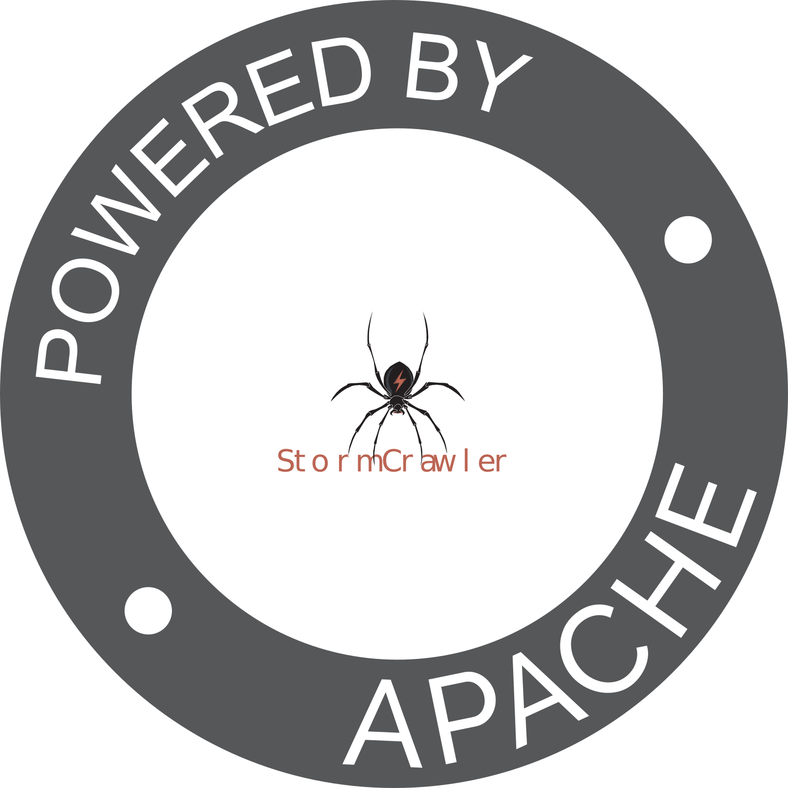
We uploaded our StormCrawler logo for automatic logo generation [1].
The
source file is available here [2] or in our StormCrawler website
repository.
Does anyone have decent Photoshop skills? I think we should consider
the
following: *
Update our logo by creating an SVG version that scales properly for
graphics. The current tooling doesn’t handle the .ai file well, which
makes
the generated “powered by” logo look terrible [1]. *
Possibly add “Apache” to our logo similar to how it’s done with the
Storm logo here [3]; I believe it would improve the overall look. This
might also be important, if we plan for the Trademark route.
What do you think?

Gruß
Richard______________________________________________________________________________
References:
[1] https://www.apache.org/logos/poweredby/stormcrawler.png
[2]
https://svn.apache.org/repos/asf/comdev/project-logos/originals/stormcrawler.ai
[3] https://www.apache.org/logos/poweredby/storm.png
<sc-new-icon.svg><sc-new-logo.svg>