Hi Markos,
Hi all,

I like it - aligns with other ASF logos, imho.
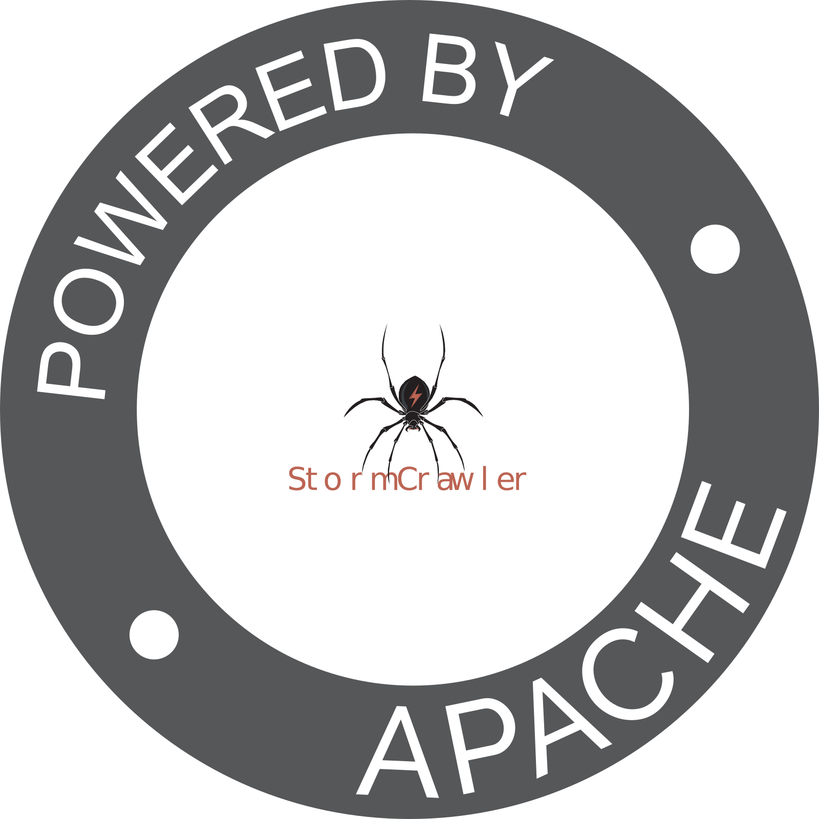
Any other thoughts / feedback from the rest?

Gruß
Richard

> Am 04.01.2026 um 20:03 schrieb Markos Volikas <[email protected]>:
>
> Hi all,
>
> Thanks again, Richard, for the feedback. I think I have improved the design.
> :-)
>
> Please find attached the logos.
>
> I made the following changes:
>
> Removed tiny details that were rendered as noise for small sizes.
> Made the spider symmetric.
> Made thin parts thicker and decreased the length of very fine shapes. Made
> the bounding box as close to a square as possible. (This is also important
> for the ASF "Powered by" badge)
> Used negative space instead of multiple colors (like in the Apache Parquet
> logo). This is also nice because it reflects the "Component" nature of
> StormCrawler.
> IMHO, it looks much cleaner while retaining the top level characteristics. It
> also appears to render nicely when resized, although I wouldn't recommend
> less than 64px.
>
> I tried multiple alternatives and further simplification rounds, but then the
> spider starts looking more like an octopus and the logo loses anything
> distinctive.
>
> Regarding the colors, the idea was that the gray variants should work for
> both light and dark backgrounds. Having separate versions would be better,
> but I'm not sure if GitHub supports rendering the version based on the theme.
>
> What do you think?
>
> Best,
>
> Markos
>
> On 12/30/25 20:02, Markos Volikas wrote:
>> Hi all,
>>
>> Thanks a lot for the feedback!
>>
>> I had similar thoughts, and I now have some ideas I want to test :-)
>>
>> Best,
>>
>> Markos
>>
>>
>> On 12/29/25 16:24, Richard Zowalla wrote:
>>> Hi Markos, hi all,
>>>
>>> Thanks a lot for the update and for explaining the design process; it’s
>>> clear a lot of care went into this, and it shows :-)
>>>
>>> I think you missed to attach the GitHub image (or ASF mailing list did drop
>>> the image attachment in which case you would need to upload it some where).
>>>
>>> One suggestion that might help further improve the logo would be to
>>> optimize it a bit more for very small sizes (favicons, headers): slightly
>>> thicker legs, fewer tiny details, and keeping the red accent focused mainly
>>> on the lightning bolt so it remains the clear focal point. Simplifying the
>>> silhouette a little could also help with readability across different
>>> backgrounds (that was a + of the first draft). I think shrinking the spider
>>> could also help.
>>>
>>> What we would need is the colored version and a monochrome version.
>>>
>>> Overall, this is a strong direction already, imho :) - if we get some
>>> further input we might be able to do a vote soon.
>>>
>>> Gruß
>>> Richard
>>>
>>>
>>>> Am 28.12.2025 um 17:31 schrieb Markos Volikas <[email protected]>
>>>> <mailto:[email protected]>:
>>>>
>>>> Hi all,
>>>> I think I managed to improve it.
>>>> I have attached the icon itself and the full logo as SVG files. I have
>>>> also attached a screenshot that shows how it will be rendered on top of
>>>> GitHub's dark background.
>>>> For anyone interested, I started with a real spider image that I
>>>> simplified and vectorized using LLM tools and Inkscape tracing. I then
>>>> assembled the pieces, refined the details, and adjusted the colors so that
>>>> it is visible on top of both light and dark backgrounds. The red color is
>>>> a dark shade of the ASF Style Guide, and the font used is the recommended
>>>> one (Montserrat).
>>>> In my honest opinion, it is minimal (no shades, very sharp edges, or tiny
>>>> details) while keeping most of the character of the original.
>>>> I would be glad to hear your opinions, and I wanted to mention that it was
>>>> a really fun process for me, regardless of whether we are going to choose
>>>> it in the end :-).
>>>> Thanks, and my best wishes for the new year,
>>>> Markos
>>>> On 12/25/25 18:14, Markos Volikas wrote:
>>>>> Happy to hear :-)
>>>>>
>>>>> I might be able to improve it a bit now that I have some time. The colors
>>>>> also need some adjustments to have sufficient contrast on both light and
>>>>> dark backgrounds.
>>>>>
>>>>> Merry Christmas,
>>>>>
>>>>> Markos
>>>>>
>>>>> On 12/24/25 13:38, Julien Nioche wrote:
>>>>>> Yes,  looks good to me
>>>>>>
>>>>>> Happy Christmas to you all
>>>>>>
>>>>>> Julien
>>>>>>
>>>>>> On Wed, 24 Dec 2025, 11:09 Richard Zowalla, <[email protected]>
>>>>>> <mailto:[email protected]> wrote:
>>>>>>
>>>>>>> Hi,
>>>>>>>
>>>>>>> I totally forgot about that discussion. Actually, I like the SVG you
>>>>>>> have
>>>>>>> sent, Markos.
>>>>>>> Aside from the "TM" (which we need to follow up on), it looks fine,
>>>>>>> imho.
>>>>>>>
>>>>>>> What does the rest think of it?
>>>>>>>
>>>>>>> Gruß
>>>>>>> Richard
>>>>>>>
>>>>>>> On 2025/07/17 19:43:19 Markos Volikas wrote:
>>>>>>>> Hi there,
>>>>>>>>
>>>>>>>> I play around with inkscape from time to time and I had attempted to
>>>>>>>> create a minimal version of the stormcrawler logo :-)
>>>>>>>>
>>>>>>>> The spider was generated mostly by chatgpt with some tweaks by me
>>>>>>>> afterwards, but I was not very satisfied with the result. The text
>>>>>>>> part
>>>>>>>> follows the apache style and I think looks nice. I share it anyway.
>>>>>>>>
>>>>>>>> Best,
>>>>>>>>
>>>>>>>> Markos
>>>>>>>>
>>>>>>>>
>>>>>>>> On 7/17/25 11:26, Julien Nioche wrote:
>>>>>>>>> It was someone I found online more than 10 years ago. Here are the
>>>>>>> original
>>>>>>>>> files he delivered
>>>>>>>>>
>>>>>>>>>
>>>>>>> https://dw3i9sxi97owk.cloudfront.net/uploads/stream/2015/11/452959/25183545/Logo.ai
>>>>>>>
>>>>>>> https://dw3i9sxi97owk.cloudfront.net/uploads/stream/2015/11/452959/25183555/Logo.png
>>>>>>>>> and the individual parts
>>>>>>>>>
>>>>>>>>>
>>>>>>> https://dw3i9sxi97owk.cloudfront.net/uploads/stream/2015/11/452959/25183909/Spider.png
>>>>>>>
>>>>>>> https://dw3i9sxi97owk.cloudfront.net/uploads/stream/2015/11/452959/25183917/StormCrawler.png
>>>>>>>>> On Thu, 17 Jul 2025 at 09:01, Sebastian Nagel
>>>>>>>>> <[email protected]>
>>>>>>>>> <mailto:[email protected]> wrote:
>>>>>>>>>
>>>>>>>>>> Hi,
>>>>>>>>>>
>>>>>>>>>> [2] is a formally PDF (created with Adobe Illustrator): converting
>>>>>>>>>> it
>>>>>>>>>> using
>>>>>>>>>> pdf2svg [4] results in a small (40 kiB) SVG.
>>>>>>>>>>
>>>>>>>>>>     >  The current tooling doesn’t handle the .ai file well
>>>>>>>>>>
>>>>>>>>>> Looks like it's because of the canvas.
>>>>>>>>>>
>>>>>>>>>>
>>>>>>>>>>     > Possibly add “Apache” to our logo
>>>>>>>>>>
>>>>>>>>>> We need the font as well. Looks like, [4] was used.
>>>>>>>>>>
>>>>>>>>>> Or is there an "official" ASF font to switch to?
>>>>>>>>>> Need to look into [5,6] or ask about it.
>>>>>>>>>>
>>>>>>>>>>
>>>>>>>>>> But maybe the main question:
>>>>>>>>>> @Julien, do you still have contacts to the creator of the logo?
>>>>>>>>>> We should first ask them before anybody "amateurishly" modifies the
>>>>>>> logo.
>>>>>>>>>> ~Sebastian
>>>>>>>>>>
>>>>>>>>>>
>>>>>>>>>> [3] https://manpages.ubuntu.com/manpages/focal/man1/pdf2svg.1.html
>>>>>>>>>> [4] https://fontm.com/adam-font/
>>>>>>>>>> [5] https://www.apache.org/foundation/press/kit/
>>>>>>>>>> [6]
>>>>>>>>>>
>>>>>>> https://apache.org/foundation/press/kit/ApacheFoundation_StyleGuide.pdf
>>>>>>>>>> On 7/16/25 13:44, Richard Zowalla wrote:
>>>>>>>>>>> Hi,
>>>>>>>>>>> We uploaded our StormCrawler logo for automatic logo generation [1].
>>>>>>> The
>>>>>>>>>> source file is available here [2] or in our StormCrawler website
>>>>>>> repository.
>>>>>>>>>>> Does anyone have decent Photoshop skills? I think we should consider
>>>>>>> the
>>>>>>>>>> following: *
>>>>>>>>>>> Update our logo by creating an SVG version that scales properly for
>>>>>>>>>> graphics. The current tooling doesn’t handle the .ai file well, which
>>>>>>> makes
>>>>>>>>>> the generated “powered by” logo look terrible [1]. *
>>>>>>>>>>> Possibly add “Apache” to our logo similar to how it’s done with the
>>>>>>>>>> Storm logo here [3]; I believe it would improve the overall look.
>>>>>>>>>> This
>>>>>>>>>> might also be important, if we plan for the Trademark route.
>>>>>>>>>>> What do you think?
>>>>>>>>>>>
>>>>>>>>>>> Gruß
>>>>>>>>>>>
>>>>>>> Richard______________________________________________________________________________
>>>>>>>>>>> References:
>>>>>>>>>>> [1] https://www.apache.org/logos/poweredby/stormcrawler.png
>>>>>>>>>>> [2]
>>>>>>> https://svn.apache.org/repos/asf/comdev/project-logos/originals/stormcrawler.ai
>>>>>>>>>>> [3] https://www.apache.org/logos/poweredby/storm.png
>>>>>>>>>>>
>>>> <sc-new-icon.svg><sc-new-logo.svg>
> <logos.zip>