On Thursday, 21 January 2016 at 23:46:26 UTC, anonymous wrote:
The logo is repeatedly being called out as a weak spot of the D
brand. But so far Walter has been adamant about keeping it the
way it is.
I agree with him that changing it to a completely different one
would probably not be a good move, losing whatever brand
recognition we have. But I think we should adapt the logo to
the needs at hand.
It's obvious to me that the D and the moons (the two circles to
the upper right of the D) make the recognizable core of the
logo. I know that others see it the same way. That means, the D
and the moons should be kept intact. Their shapes and positions
should not change.
However, I believe we can take away a lot of the decorations of
the current logo, and it will still be recognized immediately
as the same brand.
Here's a little progression of simplifications, in the context
of dlang.org:
http://i.imgur.com/eJaKFtx.png
The first one is the current logo. The last one shows just the
core shape (D + moons), of course.
I'm not nearly the first one to do this, but I'd like to
propose adopting the core shape as the official logo. Then
specify some specific shade of red as the official brand color.
(We're using #B03931 on dlang.org.)
We could provide multiple variants of the logo for different
use cases, and with varying levels of decoration:
* Core shape in different color combinations (black one white,
red on white, white on red).
* Versions that include the background arc (I'm interpreting
that as Mars), possibly in different colors.
* The full version with border and shadow. I.e. the current
logo with adjusted colors, and maybe some details changed, like
number of borders or amount of shininess.
For dlang.org, I'd choose the version with the wide background
arc. I think it looks nice on the menu bar, and it puts a
little more emphasis there than just the core shape. But just
the core shape looks fine, too.
This is something I've been vocal about before. The logo should
stay the same but you do have artistic license to play with the
structure. For example the third from the top of this image
http://i.imgur.com/eJaKFtx.png
is perfectly acceptable because the logo is intact, it's just
used in a slightly different way.
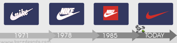
Think of the nike tick and how it has changed and been used over
the years but it's always a tick.
http://lh3.ggpht.com/_9F9_RUESS2E/SxploMIEQjI/AAAAAAAABuc/EcOJ2hPM7PY/s800/logo-evolution-brand-companies-nike-swoosh.jpg