I think you mean
http://upload.wikimedia.org/wikipedia/en/archive/b/bc/20100513062230!Wiki.png.
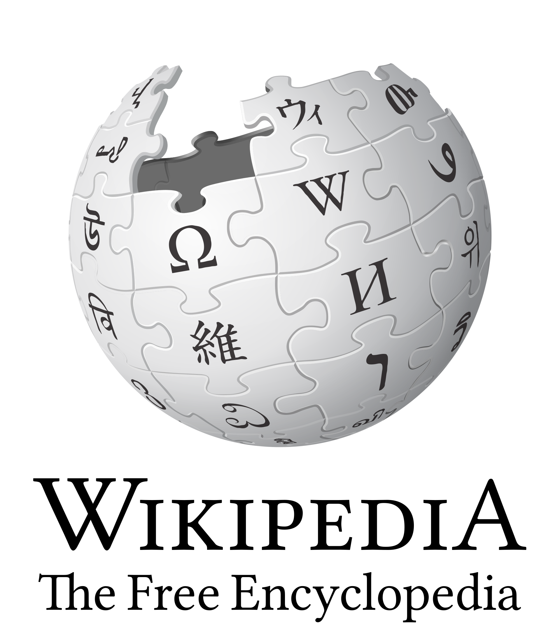
On Thu, May 13, 2010 at 4:34 PM, Platonides <platoni...@gmail.com> wrote:
> Mike.lifeguard wrote:
>> The globe isn't actually too small, I think it just _looks_ that way
>> because:
>>
>> 1) the new logo has more space in it, in particular at the top
>>
>> 2) the new logo is typically viewed with Vector, which has more space
>> around the logo than monobook did. Take a look at the new logo with
>> ?useskin=monobook and I think you'll find it looks "larger". In fact,
>> monobook crowded the logo a bit uncomfortably.
>>
>> For use in Vector, I think the logo could be made larger, as it
>> currently does not fill the space set aside for it. Vector handles the
>> spacing; the logo doesn't need to have padding in the image as well.
>>
>> --Mike
>
> Come on. The v2 *is* smaller.
> Open http://upload.wikimedia.org/wikipedia/en/b/bc/Wiki.png and
> http://upload.wikimedia.org/wikipedia/commons/d/d6/Wikipedia-logo-v2-en.png
> on two different tabs and switch between them.
> You will notice the change from italic to normal, that the W was bigger
> (bolder?) on the previous logo (we may want to increase it on v2) and
> that the ball was bigger.
> And by bigger I mean that on the previous logo the borders of the circle
> reached the left border of the W and the right of the A.
> The v2 goes from the middle of the W to 25% of the A.
>
> This is not a visual effect. Put your cursor on the right border of the
> globe and change tabs. Whoops, now there is almost a full piece to the
> border.
>
>
>
>
> _______________________________________________
> foundation-l mailing list
> foundation-l@lists.wikimedia.org
> Unsubscribe: https://lists.wikimedia.org/mailman/listinfo/foundation-l
>


--
- Brian

_______________________________________________
foundation-l mailing list
foundation-l@lists.wikimedia.org
Unsubscribe: https://lists.wikimedia.org/mailman/listinfo/foundation-l