On Thu, 18 Aug 2011 01:05:33 +0200
Kai-Martin Knaak <k...@familieknaak.de> wrote:
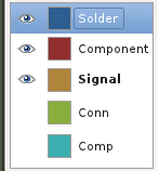
> Andrew Poelstra wrote:
>
> > I think such a thing would look like:
> > http://wpsoftware.net/andrew/dump/selector.png
> >
> > What do people think of this?
>
> Invisibility by greyed out buttons is much more easily grasped
> on a glance than presence or abcense of an eye icon. I'd prefer to
> not have eye icons and signal visibility by greying out.
>
> Fat print of the current layer is a nice way to signal the current
> layer. Maybe the background of the layer name can be highlighted in
> some way, too. The current layer is one of the most important bits
> of information the layer block delivers.
>
> Buttons should be all the same size, rather than just the
> size of the respective layer name.
>
> If you go for such a radical change, please make it so, that
> the larger button selects the current layer. Select of a layer
> is much more common than change of visibility.
>
> ---<)kaimartin(>---

I'd just like to give my "+1" to this idea.  Colored boxes, "eyes", and plain
text as Andrew showed, plus bold text and a subtle highlight to the background
behind the "selected" layer.

It would be a good idea to add a border around each button, perhaps only
visible on mouseover, to imply to new users that those items can be clicked on.

I can't say I like the idea of a greyed-out button though, as this to my mind
says "disabled and won't respond if clicked on", rather than simply "hidden".

--
"There are some things in life worth obsessing over.  Most
things aren't, and when you learn that, life improves."
http://digitalaudioconcepts.com
Vanessa Ezekowitz <vanessaezekow...@gmail.com>


_______________________________________________
geda-user mailing list
geda-user@moria.seul.org
http://www.seul.org/cgi-bin/mailman/listinfo/geda-user