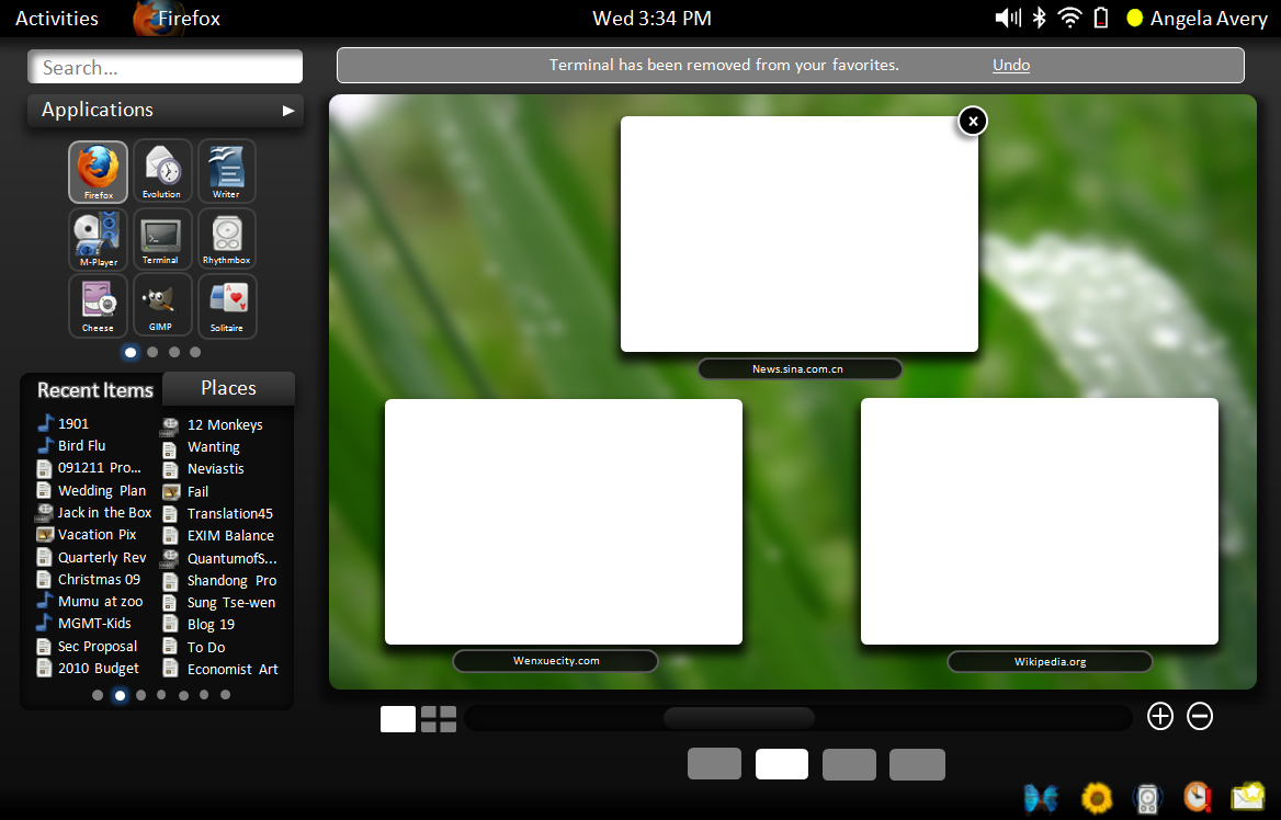
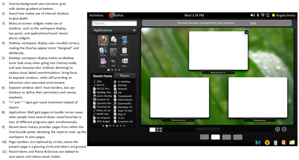
Hi,

I recently went back and looked at the first drafts of the Gnome-shell [1], and
it struck me how sophisticated it looked compared to the current all black
design.  The black looks interesting at first, but does not allow for the same
visual depth for widgets as with the gray because it is impossible to represent
shadows, gradations, or depth of any kind.  So I started playing with the SVG
images from William Jon Mccann's last blog, and made some graphical changes.
Anyway, I think this looks a little more "classy," for what its worth.
Mockup: http://farm3.static.flickr.com/2553/4183933978_a0191e1965_o.png

Explanation: http://farm3.static.flickr.com/2777/4183171961_ec78dbf65c_b.jpg

Although these pictures also contain some UI modifications that I just wanted
to play with, I really want people to keep thinking creatively about the
gestalt impression that different colors and shades can create.  Although the
gnome-shell design team may be intentionally leaving the overlay black as a
blank canvas for individual distributions to fill in (or not, I am not sure), I
think it may be a good idea to over-design rather than under-design, to show
downstream distributions what is possible and provide a reference.

Regards,
Brian

[1] http://live.gnome.org/Boston2008/GUIHackfest/WindowManagementAndMore
_______________________________________________
gnome-shell-list mailing list
[email protected]
http://mail.gnome.org/mailman/listinfo/gnome-shell-list