Hi
- remove the "grey" screenshot on the home page, and use instead more
proeminent screenshots that shows Windows and GNOME integration (I think that's what
people such as Cocoa devs are interested in and not GNUstep as a NeXT-like desktop
environment)… A clean NeXT theme screenshot could be added if we want to; the current
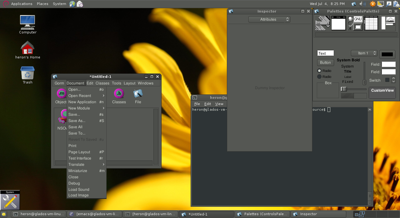
overcrowded one doesn't look clean and appealing, I mean this one
http://gnustep.org/images/full-screenshot1.png
I think the grey screenshot is necessary because this show the OpenStep
specifications (maybe update it). But add others screenshot of GNUstep
running in others desktops and Windows too.
Yes, I am in favour of treating the theme, still the screenshot is just
plain ugly, crowded... We should show things with the essential stuff to
be clear and concise, not just a "personal destkop screenshot" with all
the docks and shelfs full of items! Also better it is better to create
one screenshot per application, without stacking.
You are also right to show off the themes and illustrate application
portability.
I'm going to create comparable images on different themes to show this
best and put them on the site. It will take some time, doing the well
requires care!
Riccardo

_______________________________________________
Gnustep-dev mailing list
[email protected]
http://lists.gnu.org/mailman/listinfo/gnustep-dev