Luis Felipe López Acevedo writes:

> Hello list,
>
> As part of the Guile project I imagine, I'd like to propose these visual
> modifications for the logo and the website.
>
> Logo
> https://multimedialib.files.wordpress.com/2015/09/guile-logo-proposal-2015-06-16.png
>
> Website mockup (some rough sketches here)
> https://multimedialib.files.wordpress.com/2015/09/website-mockup-2015-09-15.png
>
> My intention with this proposal is, hopefully, to modernize the image of
> the project a bit and make it more attractive to potential users.
>
>
> Your comments are very welcomed,
First of all, I think this looks *amazing*! Will it keep these kind of
nice black and white drawings, or will the final result have a more
refined look? Either way, I like the childrens' book type
illustrations. (My request would be that if they do become colored, the
two children-programmers whose bodies are somewhat visible have
different skin tones for diversity reasons. I think they look gender
ambiguous enough because of the suits.) Honestly I think the rough
black and white versions look very nice as-is though, and I am not sure
how to color them without a kind of watercolor look. Very "Where the
Wild Things Are" meets robots. A good combination!
Second, a friend of mine pointed out a couple of things:
- The "Guile is an extension language platform" section gives the
impression maybe overly that it's an extension language far and above
being an independent language. Guile is certainly optimized for
this, especially for legacy reasons, but more and more Guile
applications seem to be written entirely within Guile itself. Maybe
the text could be something like:
"Guile contains a neat and highly optimized virtual machine.
It can be used out of the box to write programs in Scheme, or
can easily be integrated with C and C++ programs.
Guile is the GNU Ubiquitous Intelligent Language for Extensions,
and the official extension language of the GNU project."
That's a bit more verbose than the present text; I wonder if it can
be cleaned up?
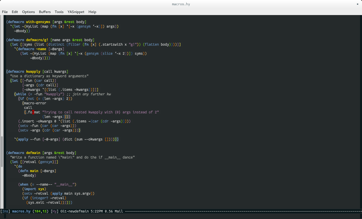
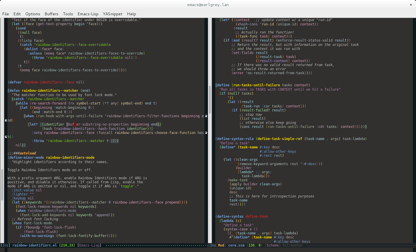
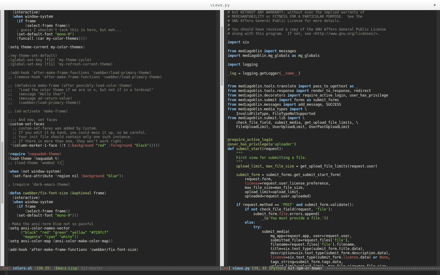
- It may be nice to show code examples. Lisp is often interpreted as
being hard to read; I have found that a nice theme and
rainbow-parentheses has reduced that fear for some users. Here's
some examples of screenshots I have taken of my own emacs with
various lisps... none of them are perfect, and this isn't scheme
code, but to get the general idea:
http://dustycloud.org/tmp/emacs_lisp_setup.png
^- Probably could do without the highlighting?
http://dustycloud.org/tmp/emacs-rainbow-all-the-things.png
^- Probably could do without the rainbow-delimeters?
http://dustycloud.org/tmp/emacs_wombat.png
^- Something different, but also a nice theme
I'm not 100% confident on this; showing "real code" might actually
clutter things or make things more intimidating. The present
design I think is fairly intimidation-free.
Anyway, what do you think?
I love the designs... keep on rocking! I can't wait to see this
deployed!
- Chris