Aman-Mittal opened a new issue, #491:
URL: https://github.com/apache/fineract-backoffice-ui/issues/491
## What happens
At a standard modern phone width the dashboard's widget area stays in a
two-column grid. The columns end up 193px and 123px wide, which is narrower
than the content they hold, so headings wrap to two or three lines and body
text wraps to one word per line.
Measured at **390×844** on `/dashboard`:
```
.dashboard-layout grid-template-columns: 193.031px 123px (total 318px
in a 390px viewport)
.main-column w 193 heading "Pending Approvals" → 2 lines
.side-column w 123 heading "Loan Status Distribution" → 3 lines
```
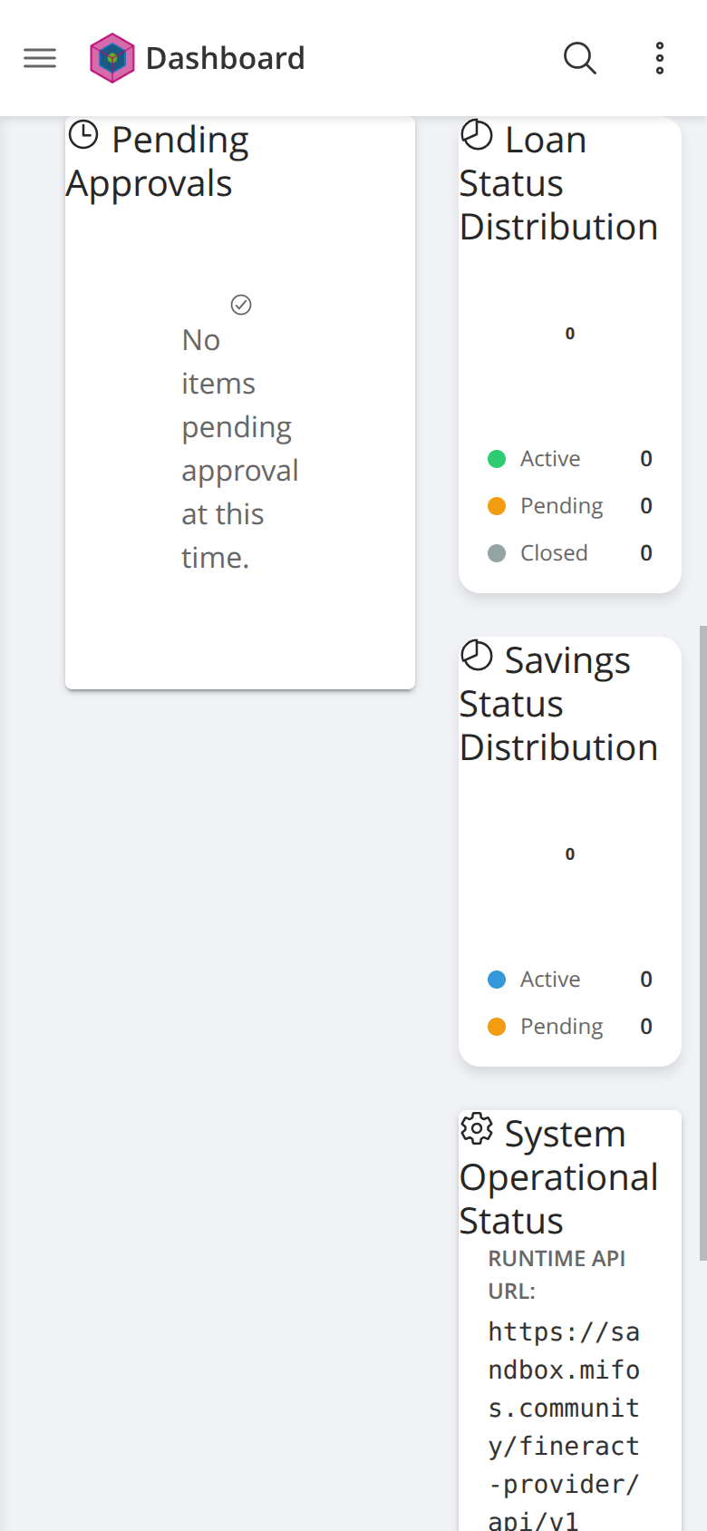
In the screenshot, "No items pending approval at this time." wraps to **six
lines, one word each**, and the runtime API URL wraps character-by-character.
Note also that the grid occupies only 318px of a 390px viewport, leaving a wide
empty gutter — the layout is not merely cramped, it is not using the width it
has.
## The app already has the pattern this row is missing
The four stat cards directly above this row (Total Clients, Active Loans,
Savings Accounts, System Health) collapse to a single column correctly at the
same width. So a working single-column mobile treatment already exists in this
screen — the widget grid simply was not given the same breakpoint.
That makes this a small, well-scoped fix rather than a redesign.
## Suggested fix
Extend the existing single-column media query to cover `.dashboard-layout`,
so the main and side columns stack below the same breakpoint the stat cards
already use. Both columns then get the full content width and the wrapping
resolves on its own.
Worth checking 360px as well as 390px while fixing, since 360px is still
common.
## Environment
Reproduced against a clean checkout of `main` (`a24a06ba`) served with `ng
serve`, backend `sandbox.mifos.community`, Chrome at 390×844 with mobile
emulation and touch.
--
This is an automated message from the Apache Git Service.
To respond to the message, please log on to GitHub and use the
URL above to go to the specific comment.
To unsubscribe, e-mail: [email protected]
For queries about this service, please contact Infrastructure at:
[email protected]

