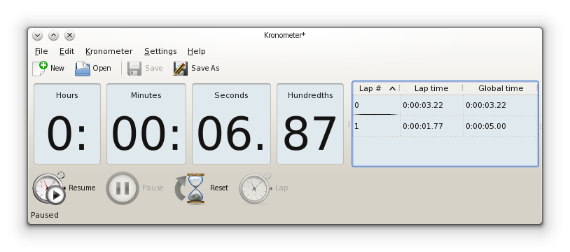
El Dijous, 17 d'abril de 2014, a les 20:04:07, Ingo Klöcker va escriure:
> On Wednesday 16 April 2014 12:56:01 Elvis Angelaccio wrote:
> > So, the choice is between the branch <test> and <test2>. Let me know
> > what do you prefer.
> >
> > For completeness the alternatives in details are:
> >
> > - branch <test>: no splitters, with dividers (i.e. 4 QFrames in a
> > horizontal layout):
> > http://abload.de/img/kronometer-no-splittevdklc.png
>
> This would look much better if you remove the ':' and '.' after the
> numbers. IMO the ':'/'.' are superfluous because the numbers are already
> clearly separated by the frame border.
>
> Also you should probably right-align the numbers. In particular, the
> hours. For the other numbers alignment probably doesn't matter.
> Moreover, I think it would look best if all four frames were the same
> size.
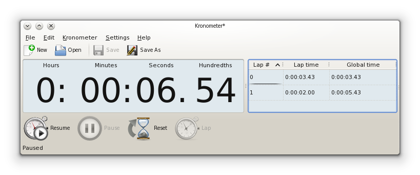
I think this is the one that may look the best, agree with Ingo that removing
the : and . probably makes sense.

Cheers,
  Albert

>
> > - branch <test2>:
> > no splitters, no dividers (i.e. single QFrame with a grid layout):
> > http://abload.de/img/kronometer-no-divideri4kce.png
>
> Here the ':'/'.' need to stay for obvious reasons. But you should try to
> make the spacing between the numbers and the ':'/'.' identical. Possible
> solution: Put the ':'/'.' into columns of their own. And right-align the
> hours.
>
>
> I'd also get rid of the upper toolbar. You do already have the essential
> tools in the lower toolbar and having two toolbars even with differently
> sized icons makes the UI look unnecessarily crowded.
>
>
> Just my two cents.
>
>
> Regards,
> Ingo
![]() signature.asc
signature.asc
Description: This is a digitally signed message part.