After some consideration I think I would pick anditosan's proposal. With
my second being Kver's fourth icon.
My reasoning is the following:
- It's so simple a child could draw it
- It's easily recognizable without being noisy
- It's simplicity allows both flexibility and works well at different sizes
All of the above fits Ken's 4th too. Now since I implicitly rejected the
others I want to give some feedback on them too, as I sadly didn't have
time to do so on the forum.
Quiralta's proposal is simple and uses a metaphor potential users are
very familiar with. However, it appears noisy. That mostly stems from 3
things:
- there are overlaps
- the overlaps have different sizes
- it shows a line of action
Now one can argue the first two point for anditosan's proposal too,
however, in combination these really stand out. For anyone who wants to
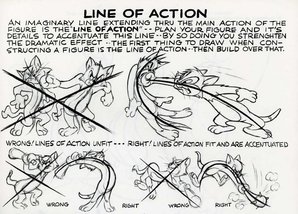
draw comics/mangas/anything involving moving objects one will eventually
find the "line of action" technique¹. Basically, we are able to infer
that objects/persons in picture/drawing have a motion to them because
one can draw an imaginary line through the object around which the
object[s] are structured. The more the line is bent, the more dramatic
the movement is.
AlexL's proposal probably fits best to the KDE logo and it is simply and
easily recognizable. However, it also suffers from the same problems as
the K-logo. The details of the gear are lost on smaller sizes, and width
at the base of the teeth is much bigger than the line connecting the
actual teeth with each other. Which especially at smaller sizes looks
muddled.
Then there's also the problem that the cog icon, while abstract, is not
abstract enough. It's an often use metaphor or settings/mechanism etc.
Combining the arrow with the cog does not manage to separate it from the
settings metaphor. So the unknowing will most likely search for meaning
in the cog metaphor first before exploring other possibilities when
trying to interpret the icon. Which leads to it looking strange, as on
the one hand it has a clear metaphor, while inducing ambiguity about its
actual meaning. Contrast that with anditosan's icon, which is abstract
enough to not immediately associate it with a common metaphor, while not
being completely foreign.
And last but not least the cog is quite harsh. It's associated with
industry, manual labour, and – more abstract – thinking, analysis and
work. While the round shapes for anditosan's proposal are more
humanizing, soft and overall more inviting and friendlier.
With all that being said: I would caution against on choosing the one™
solution too quickly. I think Ken has shown nicely that anditosan's
proposal is worthy of further investigation. We ought to flash out its
usage in different scenarios (think different styles, sizes, contrasts
etc.), so I would propose to hold a second round, so to speak where we
investigate the concept further to finalize it.
[1] An example from a carton visualizing the concept
http://photos1.blogger.com/blogger/1250/2135/1600/LofA.jpg
One can apply the same for real world situations.

Am 25.07.2016 um 20:54 schrieb Thomas Pfeiffer:
Dear Plasma development team, dear VDG,
the official deadline for the Plasma logo contest has passed yesterday.
We have five entries into the contest, with one actually consisting of
five different mash-ups and modifications of the other entries, and
one being Plasma's current logo.
You can find all the proposals here:
https://forum.kde.org/viewtopic.php?f=285&t=133836
I think we have quite a good selection here, and hope that we can find
something here which we can agree on.
In the contest thread, I promised a jury consisting of VDG members and
Plasma team members.
Now I've decided that since the whole Plasma team has to be able to
identify themselves with the logo, and all VDG members should have the
possibility to chip in as well, everyone who participates in the
discussion is part of the jury.
There won't be a voting process. Either we can agree on a logo, or
everything stays like it is (the official Plasma logo still being what
we have now, and the K logo being used for the launchers).
I'd give us a discussion period until Sunday, unless a clear agreement
can be reached before that.
Please refer to the logo proposals by the creator's forum name
(remember that our current logo is Uri's, not mine ;) ), and for Ken's
just say e.g. "Ken's fourth logo".
Happy discussions, here is to us finding a logo we can all (at least
more or less) identify with!
Thomas
_______________________________________________
Plasma-devel mailing list
Plasma-devel@kde.org
https://mail.kde.org/mailman/listinfo/plasma-devel
_______________________________________________
Plasma-devel mailing list
Plasma-devel@kde.org
https://mail.kde.org/mailman/listinfo/plasma-devel