On 4/20/11 9:44 AM, Kasper Pedersen wrote:
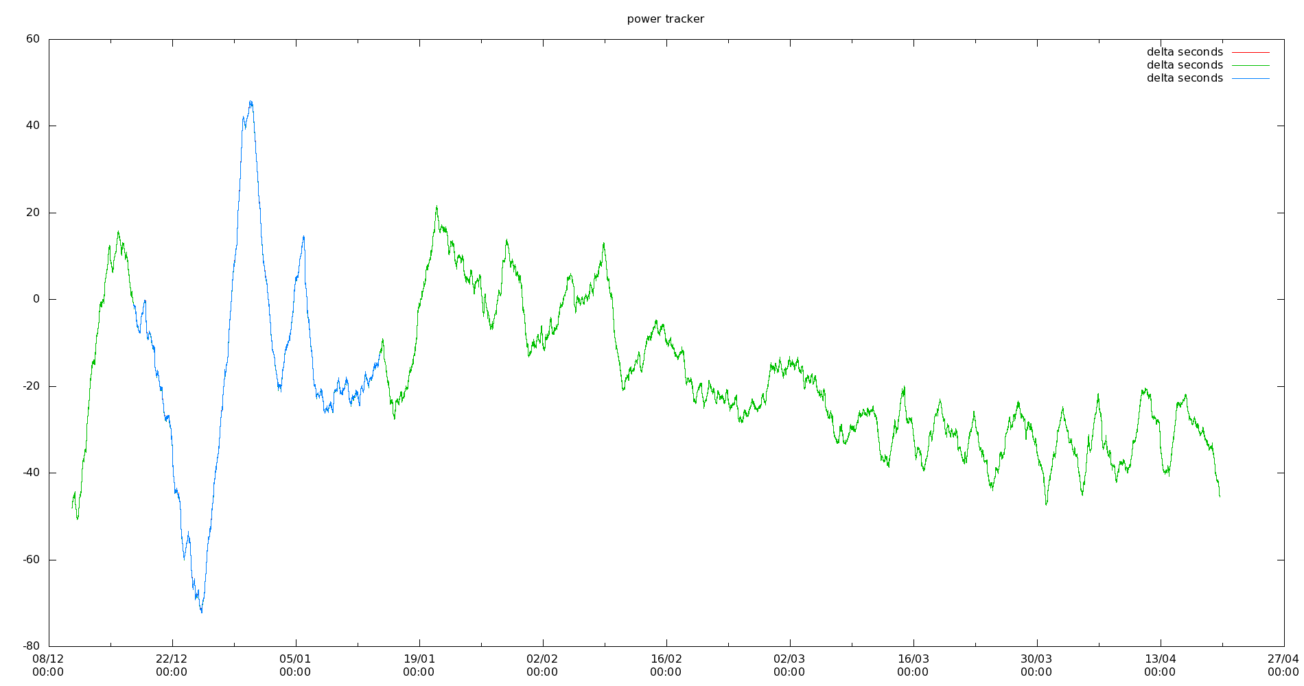
The mainland Europe grid (which you are not on, I know..) looks like this:

http://n1.taur.dk/grid/plt.png
http://n1.taur.dk/grid/pltw.png (very large with grid)

y axis is phase in seconds, x axis is time

The plot is 130 days long, 60sec/130d= 5ppm
but
in that plot is also 5 days in a row where the frequency is 230ppm high.
What's that huge excursion between Christmas and New Years? Is that a reflection of a big load or generation change during the week?
_______________________________________________
time-nuts mailing list -- [email protected]
To unsubscribe, go to https://www.febo.com/cgi-bin/mailman/listinfo/time-nuts
and follow the instructions there.